Web Accessibility Pt 3: Development

Developers who build for accessibility are better developers. That's because they're able to build websites and apps for everyone, and not just who may be considered a “typical” user. After designing products and experiences for a range of clients and users, our developers are huge accessibility advocates. So we’re sharing their best practices with the broader community, for anyone looking to level up their accessibility chops. At the end, you’ll find a list of reputable resources, to continue your research on your own.
If you’re new to the topic, we suggest you also check out our other posts on accessibility from different perspectives, like accessible web design principles and product management for accessibility. Otherwise let’s get into the nuts and bolts of developing for accessibility.
What is assistive technology?
Accessible websites are understood by assistive technology. This is a general term to describe any technology that helps people with disabilities to perform tasks. For instance, wheelchairs and crutches are types of assistive technology. In an online context, it often refers to:
screen readers, which read text aloud for people who are blind or have low vision, as well as people learning English and the elderly
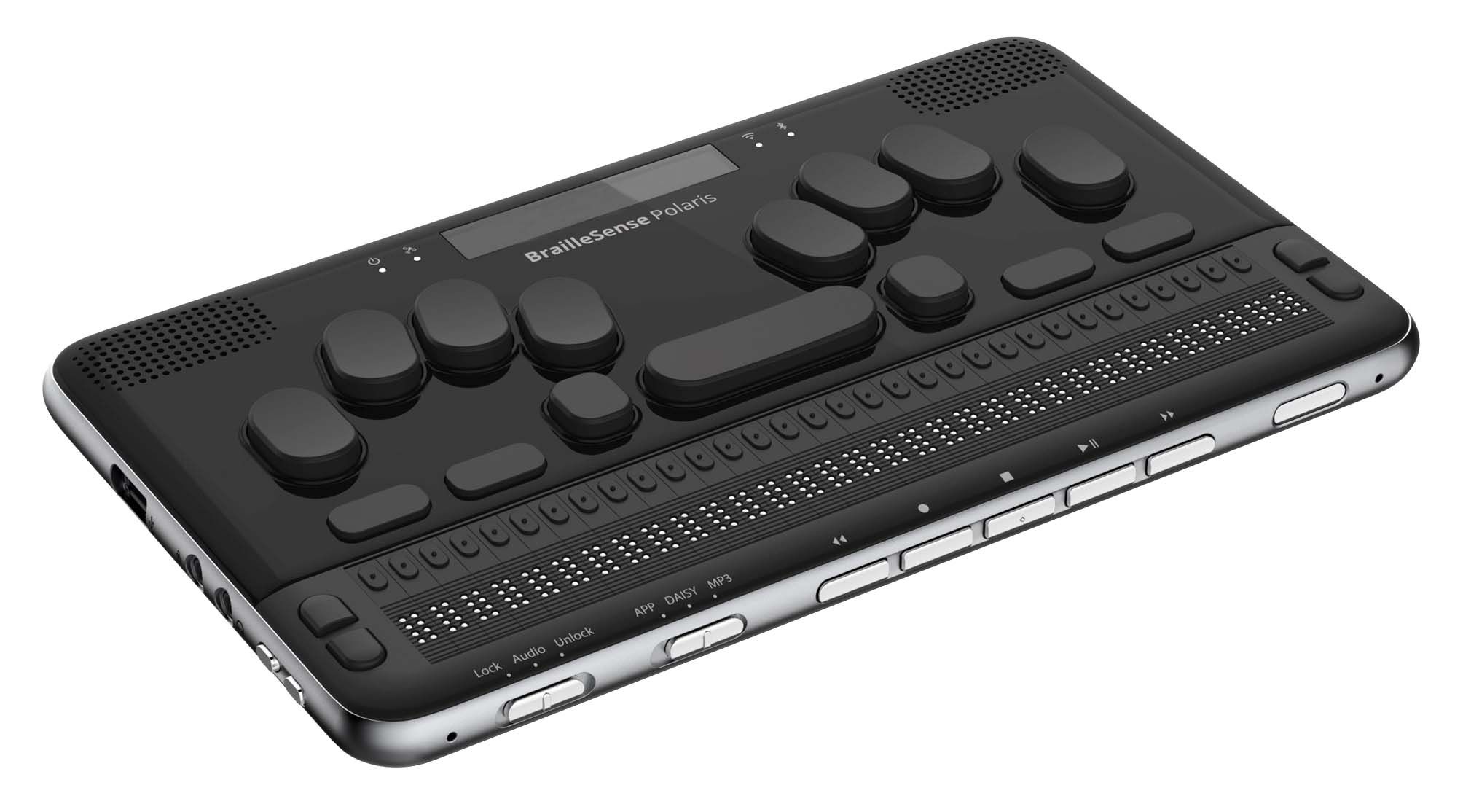
Braille display, for those who cannot see a regular computer monitor
screen magnifiers, for people with low vision
video captions, for those hard of hearing
voice recognition software and selection switches, for those who cannot operate a keyboard and mouse
People with low or no vision rely on screen readers to read text out loud, to navigate websites, and to interact with web pages using their keyboards instead of a mouse. For a website to be understood by assistive technology, it must use Semantic HTML.
Semantic HTML
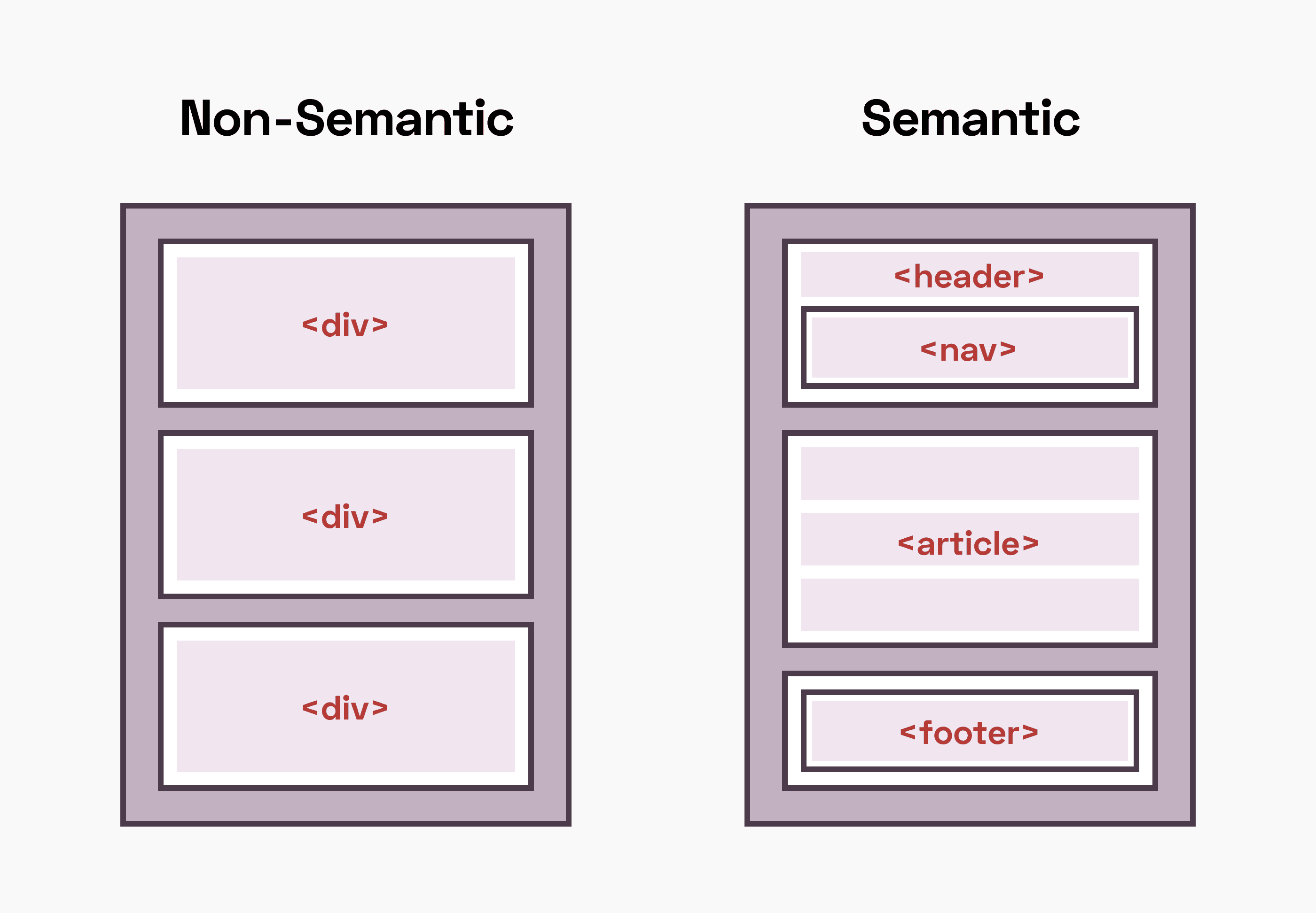
In general, “semantics” is the study of meaning, language or truth. In order for screen readers and other assistive technology to translate web content into other forms, Semantic HTML must be used. It is code that describes the content on a page and how it’s organized. In other words, it gives meaning to the rest of the code!
Semantic HTML should identify things like: page headers and footers, navigation, sections, headers, images, buttons, links and forms, among other elements.
8 Key Places to Use Semantic HTML
Here are the most common and important instances to include Semantic HTML into your web pages.
1. Heading Tags
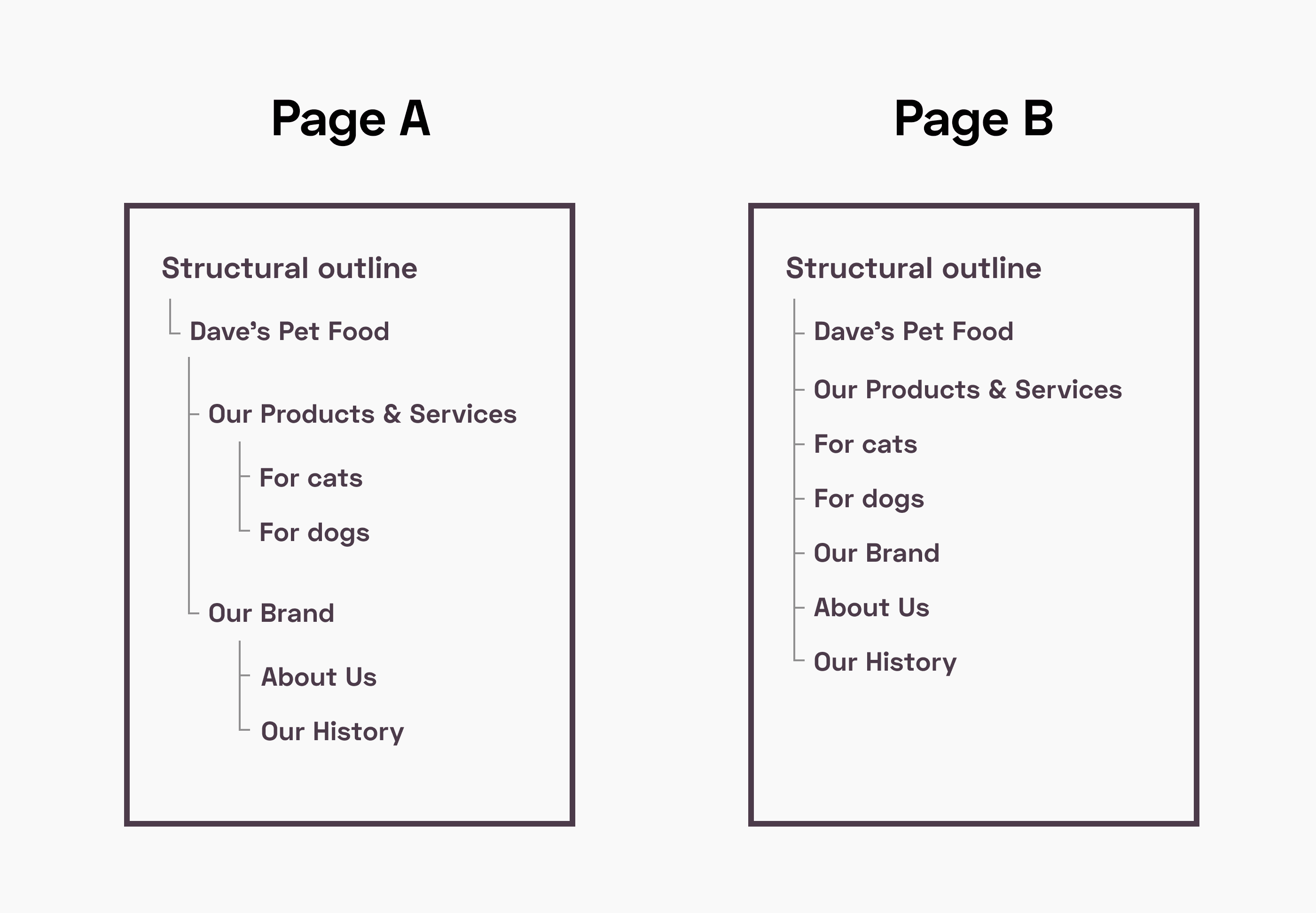
Heading tags allow screen readers to understand the hierarchy of page content. This helps users to locate a specific section of a page, skipping past parts that are less relevant. In the below example, Page A uses headers to organize content using a hierarchy; Page B does not. So if a visitor lands on Page B and wants to register as a member, they would have to first listen to everything else contained within the page instead of just the headers and skipping to the specific area of interest. It’s like calling customer service and listening to a long list of irrelevant options before the one that’s relevant to you. Frustrating, right?
2. Lists
Similarly, lists help screen readers (and those who use them) to comfortably navigate a page. It’s important to recognize when a list is used to group related elements, even if it doesn’t look like a numbered or bulleted list. For instance, navigation may not have bullets or numbers, but data is presented as a list. Or larger list items when presenting a group of articles that may not have bullets or numbers. By wrapping elements into a list item, the screen reader understands them as a group, so the user can easily select what’s most relevant.
3. Images
Images can carry an enormous amount of information. But not everyone is able to see them. That’s why it’s critical to include alt tags for any key image on a web page. These are short, straightforward descriptions of what’s displayed on an image for a screen reader to read out loud to a site visitor. Here’s a good resource for writing good alt text.
Just as important, decorative images should have a null, or empty alt text which looks like alt = “”. This tells the screen reader to ignore the image, rather than reading its file name out loud which would create confusion and a poor user experience. It’s recommended for any CMS to set the default alt attribute as an empty string.
4. Links vs. Buttons
The internet was built to link documents. But over the years, people began to style links as buttons, causing confusion between these two elements. Screen readers interpret buttons and links differently, and this can be problematic for people navigating a page using a keyboard.
A good rule of thumb: don’t confuse visitors with links designed to look like buttons.
Buttons should be used for on-page actions like “Download”, “Sign up” or “Log out”.
Buttons should not be used for navigation to other pages.
Links should only be used for navigation, and must include an href tag.
It’s also important to manage the expectations of visitors.
Use link text that describes the link’s purpose and destination, instead of a generic “Click here”.
Use link styling to clearly indicate links by underlining them, instead of relying on color or a color change. Not everybody has a colored screen.
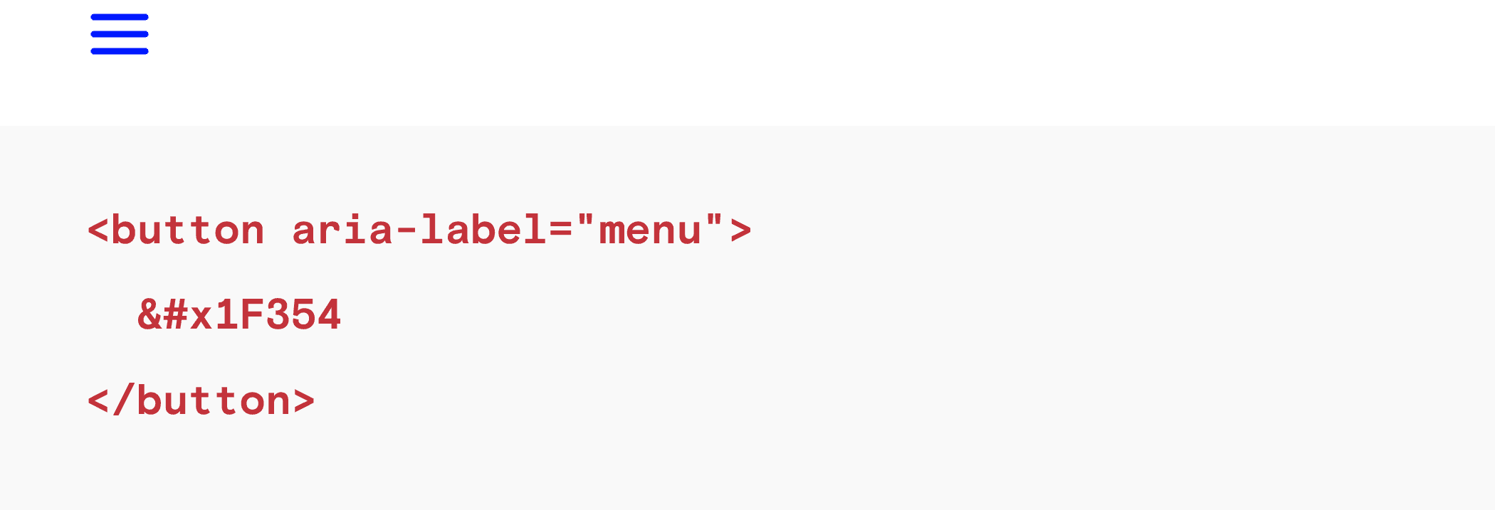
Clickable icons or buttons without text are a mystery to people using screen readers. Think about search icons, menu icons (especially on mobile) and cart icons, which are instantly recognized by someone without vision issues. Now imagine someone blind encountering a search icon on a web page. Unless some description text is coded in, there’s no way for that person to interpret that functionality. To make these elements accessible to all, use an ARIA label within the link to indicate the functionality or destination of that link.
5. Maximum Scale
This one’s straightforward yet we’ve seen it on many sites. It’s an optional viewport option that prevents visitors from zooming in too far, but this can be problematic for users with low vision who rely on browser zoom to read clearly. For this reason, it’s best to not use it at all.
6. Forms
Any time a form is used, it should be noted using the <form> tag. Within a form, always label specific types of inputs and buttons by name. There are 22 types of inputs to choose from, and it’s important to use these rather than simply styling a <div> tag due to the specific attributes around each type.
7. Select Dropdowns
This can be contentious because browsers don’t allow you to style the inside of a select element. So oftentimes clients prefer a custom select design, which can create accessibility issues. It’s advised to stick to the browser default select instead of designing something custom to avoid those problems.
Here’s a nice way to summarize the issue:
8. Other Interactive Elements
Accordions, tabs and menus are examples of other interactive elements that have their own accessibility requirements. Rather than go through the list here, we recommend taking the time to visit a reputable accessibility resource (see links to some below), and learning how to build the element in an accessible way. This is particularly important when an element is showing or hiding data, so that nothing gets lost for audiences relying on screen readers.
Further reading: reliable accessibility resources
To keep learning, here are selected resources:
Intro to Web Accessibility (Google Developers)
Basics of Semantic HTML (UX Collective)
Designing custom select dropdowns or not (24 Accessibility)
How to write good alt text (Moz)
22 Types of Form Inputs (MDN Web Docs)
This information is most useful when it’s shared across different teams. So designers and product managers understand the considerations that go into developing for accessibility, and vice versa.
That’s exactly why we created a series of posts on the topic:
The more familiar your entire team is with the topic, the better products you’ll design for an increasingly diverse audience.

