Web Accessibility Part 1: Design

Accessibility comes up in every project we do. It’s a massive and evolving topic, with many implications across product strategy, development, design and even compliance. So, we’re starting a series of blog posts to explore the many aspects of web accessibility. Welcome to the first part! We’ll start with a brief introduction to the concept itself, before diving into 10 key accessible web design principles recommended by Big Human designers.
Use this as a reference in conversations with internal teams, clients, and agency partners. We hope you find it as useful as we do!
What is web accessibility?
You may have seen the term pop up a few times in the last few years, depending on your role within the world of digital design and development. It’s one of those buzzwords that’s actually important — and it isn’t going away anytime soon. Put simply, web accessibility is about making a website (or app) functional for as many people as possible.
To start, accessibility factors in people with ability-based impairments. This includes individuals with:
low vision
screen readers
hearing impairments
physical or motor disabilities
dyslexia
placement on the autistic spectrum
Beyond this, accessibility also means factoring in situational considerations and aspects of someone’s identity that can affect how they receive information or interact with interfaces. This includes:
language requirements
gender diversity
racial and ethnic diversity
Why is web accessibility important?
According to the World Health Organization, 15% of the world’s population has a recognized disability, and this number is growing. It’s smart to design products with their needs in mind, for a few reasons:
It's the right thing to do.
It improves the user experience for everyone, beyond those with disabilities. Content that's clearly designed, intuitive and logical is appreciated by everyone!
It’s a legal requirement in many countries. Failing to comply can result in lawsuits.
It makes products available to as many people as possible...which means more users.
Let’s dive in!
10 Key Accessible Web Design Principles
Whether you’re evaluating your own website, are considering a redesign or are in the early stages of product development, here are 10 aspects of accessible web design to consider:
1. Create brand color palettes with contrasts in mind.
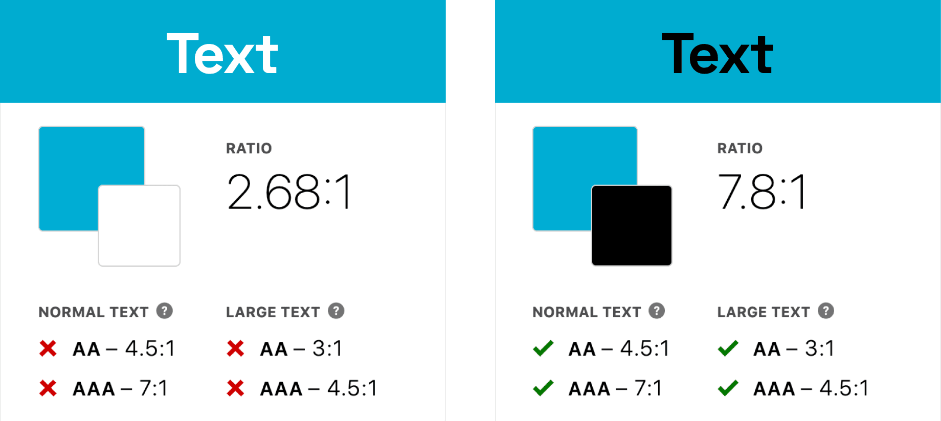
Not everyone sees colors the same way. A color that may look good to one person may be difficult for someone else to see. The relationship between colors can also have a huge impact on one’s user experience, especially when it comes to text and the color of a background.
Here’s an example of how a minimal adjustment of color can produce a dramatically better reading experience due to contrast:

The contrast between text color and background color must meet a certain threshold to qualify as “accessible” and this is defined using a set of ratios known as AA and AAA, which also look at text size. To check your color contrasts, our designers recommend a plugin like Stark.
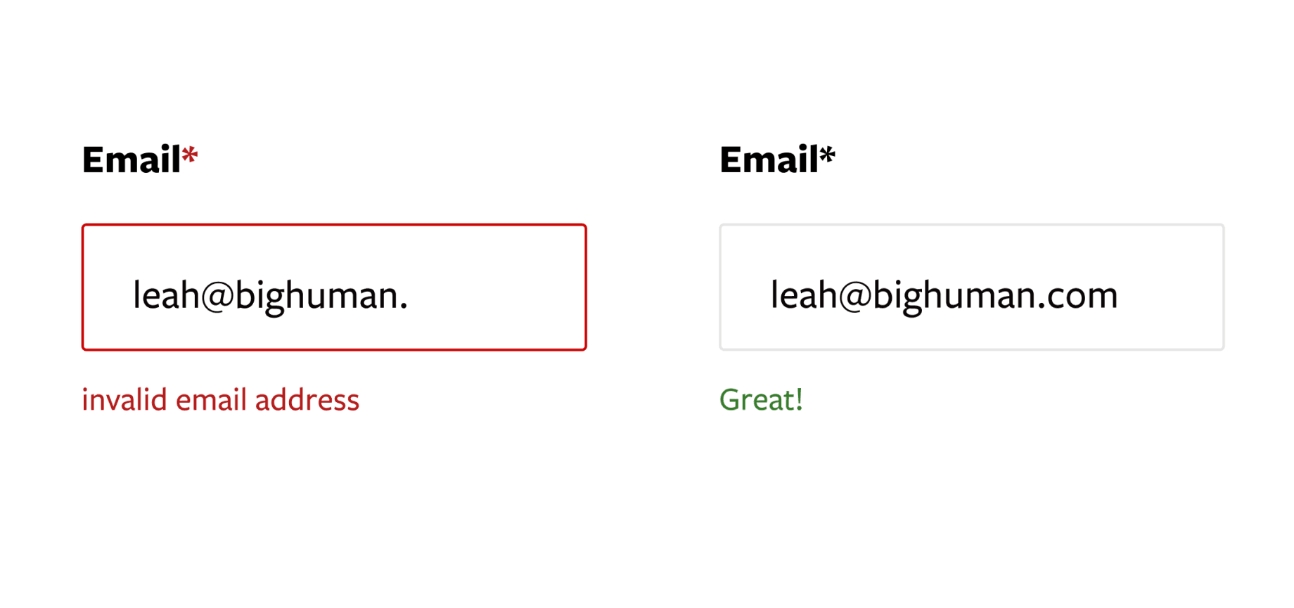
2. Label all inputs and buttons.
Labels communicate meaning and they shouldn’t disappear when typing, even in forms. The purpose of all buttons should be clear, so avoid using icons alone as buttons. As another accessible web design feature, add label text to clearly indicate the purpose of all buttons.
3. Use specific language.
Copy on buttons, labels and links should be more specific than “Click here!” It should clearly define what will happen if someone were to click or navigate elsewhere.
For example, try “Shop now,” “Contact us” or “Read more” instead of “Click here” to indicate the action triggered by each button or link.

4. Design for various screen sizes and devices.
This is second nature for digital product designers, but it’s not just about desktop versus mobile. The default is designing for new devices, but remember to consider earlier models when building accessible websites. Many people may have older phones, tablets, and laptops with varying screen sizes and capabilities. If you aren’t designing for these users, you’re limiting your audience and your brand or product’s full potential.
5. Accommodate various text sizes and support dynamic type.
One font size does not fit all. Designs should support dynamic type so readers can adjust for their preferred reading size or allow for different font sizes in your in-app settings.
To make sure your designs support dynamic type, specify a type ramp in your style guide. You should also show instances of overflow and how components react to changes in type size and length.
6. Include alt text.
All images should have detailed alt text that succinctly describes what is in the images. An important accessible web design principle, alt text is text that’s read by screen readers for people with vision impairments. Icons, buttons, and logos all require alt text.
7. Design for all genders, ethnicities, languages, and abilities.
This is an overarching principle that touches on many different aspects of web design, from designing forms and icons to selecting images and offering language translation.
For example, if you’re a beauty brand, include a wide range of skin tones. If your content will be available in other countries, take those languages and cultures into account. People from Latin American countries often have multiple last names, so you can either prompt them to use only one last name or make a larger input box.
8. Offer more than one way to get in touch.
The contact information on a site may not be something design has a lot of control over, but it is something we can watch out for and make suggestions on. Calling a phone number isn’t easy for those with hearing or mobility impairments, so include alternate communication methods like email, contact forms, and chatbots.
9. Don’t rely on color alone to convey a message.
Color isn’t the only way to communicate information and it may be difficult for some people to see or distinguish between colors. Rather than using the color red alone to indicate an error, include an icon or text that flags this as well.
A common example of this is using only color to indicate a text link, which isn’t user-friendly to people with visual impairments. Try using a different font weight or underlining text to indicate clickability.
10. Don’t rely on hover states.
Some people can’t use a mouse or a trackpad, which means they're unable to access information contained within hover states. It also isn’t the best for mobile and tablet. In the same vein as color, hover isn’t the only way to indicate things are clickable, editable or downloadable. Include icons and text that communicate this information.
Getting it right from the start
There are many dimensions of accessibility to consider when designing digital experiences, Since most of these considerations require collaboration between designers and developers, it’s important for them to be in touch about accessible web design right from the start. The earlier accessibility is considered in a project, the better your outcome will be — both for users and your brand.
For a deeper look at this topic, check out the Web Content Accessibility Guidelines (WCAG), a set of guidelines internationally recognized as the standard for web accessibility.
Otherwise, stay tuned for future posts as we explore the many paths toward building sites and apps designed for all!
