Web Accessibility Part 2: Planning
In case you’re just tuning in, this is Part 2 of our Web Accessibility series! Part 1 detailed our top 10 web design accessibility principles. Part 2 focuses on product managers and how to set projects up for success from the start.
A quick refresher: web accessibility is ensuring a website or app is functional for as many people as possible, especially those with ability-based impairments. About 15% of the world’s population has a recognized disability, so building products based on their needs is both smart and the right thing to do.
We make a point to weave accessibility into all of our processes, from planning to design to development. But it all starts with our biggest driving force: product managers. So whether you’re an accessibility planning pro or someone just diving in, our 10 planning best practices will help guide you through your next project.
Let’s get to it!
Advocate for accessibility
A product manager’s main role is making sure accessible design and development are implemented throughout the entire project. They encourage our team (and clients) to think about a wider range of audience personas, and more inclusive product experiences.
Planning for accessibility might add a few extra steps to your to do list, but they’ll become second nature in no time.
1. Get familiar with the accessibility roles for each team member
We’re not just talking about designers and developers. Strategists and copywriters have to think about accessibility too. When you familiarize yourself with everyone’s roles, you’ll know how it all fits into the bigger picture.
2. Keep the team accountable
This goes hand-in-hand with our first point. It’s easier to hold team members accountable when you know what everyone’s roles are. It’s up to the entire team to make accessibility a priority.
3. Communicate the importance of accessibility to your clients
Transparency is key. Your team should know why accessibility is important, and so should your clients!
Sometimes clients present color palettes that work for print products but not digital, or the color contrasts don’t quite meet the standards. You’ll need to communicate why some things don’t work and how you can tweak them so they do.

For example, you may have to update a client’s CMYK palette to work for RGB colorspaces, and add swatches to create enough contrast to pass accessibility requirements.
4. Collect accessibility requirements early in the project lifecycle
On the flip side, clients can sometimes have even higher standards than what’s typically required. Making sure everyone’s on the same page smooths out any bumps before they happen.
5. Dedicate part of your budget to accessibility
Implementing accessibility throughout a project takes a lot of effort! Verify that everyone’s time is accounted for and budgeted accordingly.
6. Create an accessibility checklist
A checklist is already a best practice when planning anything, but consider a living document that reminds you of a project’s needs. This helps make sure you aren’t missing anything!
7. Add accessibility to your list of criteria
When we think about a product, we tend to focus on its function and what it looks like. A product’s UX is already something we check for, but we should also think about how people with different abilities interact with it too.
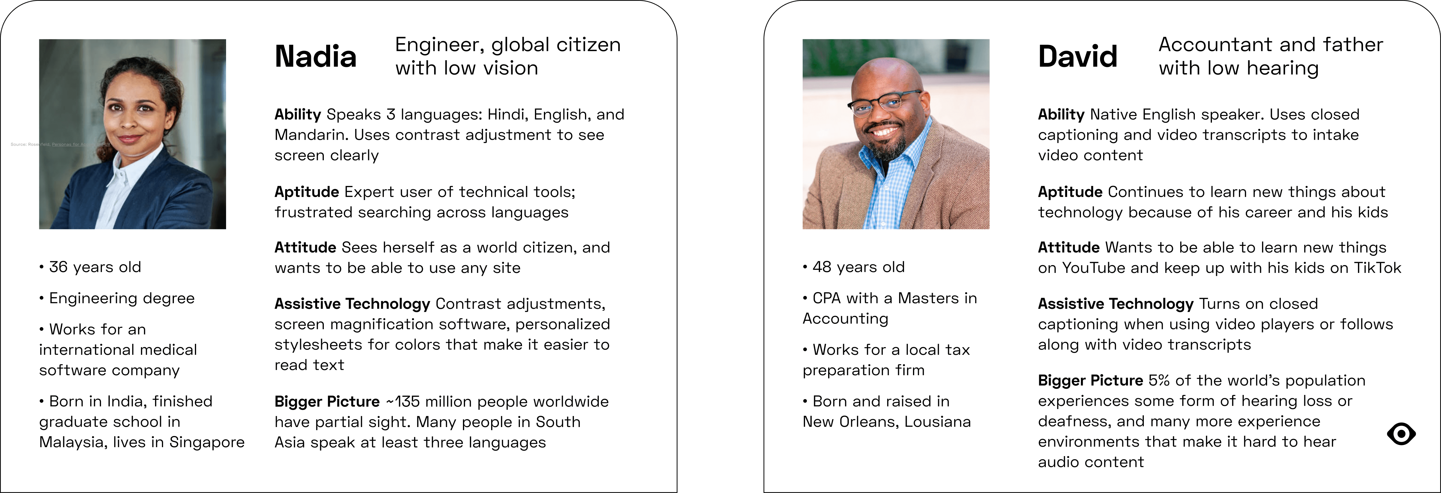
8. Include people with disabilities in surveys, interviews, and audience personas
Before you even start a project, ask if the pool of data you’re pulling from is as diverse as it can be. Are you interviewing people with vision or hearing impairments? What about users with physical disabilities?


There should be a wide range of people represented in the research you gather for any project.
9. Test accessibility after each sprint
Test a product’s accessibility as you go. Don’t save it for the end! The project will feel rushed and that doesn’t leave you any time to be thorough.
10. Recruit diverse user testers
Include the people you survey in your testing phase too. Who better to assess the accessibility of a product than the people you’re designing for?
Guide the process
Product managers are our movers and shakers, guiding projects from start to finish. While everyone has a role to play, it’s a PM's job to make sure accessibility is considered in every step. This starts with the planning stage, and should be built into each project's workflow.
Stay tuned for Part 3 of our series where we’ll explore a developer’s role in web accessibility!
