Fastly
Giving a cloud computing enterprise a competitive edge
Fastly is one of the world’s leading edge cloud computing companies, dedicated to building the future of the web. Through its edge cloud platform, Fastly provides its customers with the technology they need to build innovative apps and optimize the user experience — all while keeping speed and security top of mind.
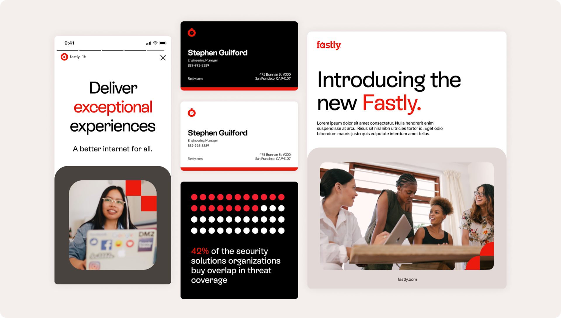
In 2022, after 12 years of delivering cutting-edge experiences, Fastly came to Big Human looking for a rebrand and website refresh that brought the enterprise company to the next level but retained its approachable personality. Over the course of the project, we blended the mature with the modern, giving Fastly a distinct character that celebrates a new chapter in the company’s history.
- Research
- Strategy
- Branding
- UX/UI Design

Research & Strategy
Standing out from the competition
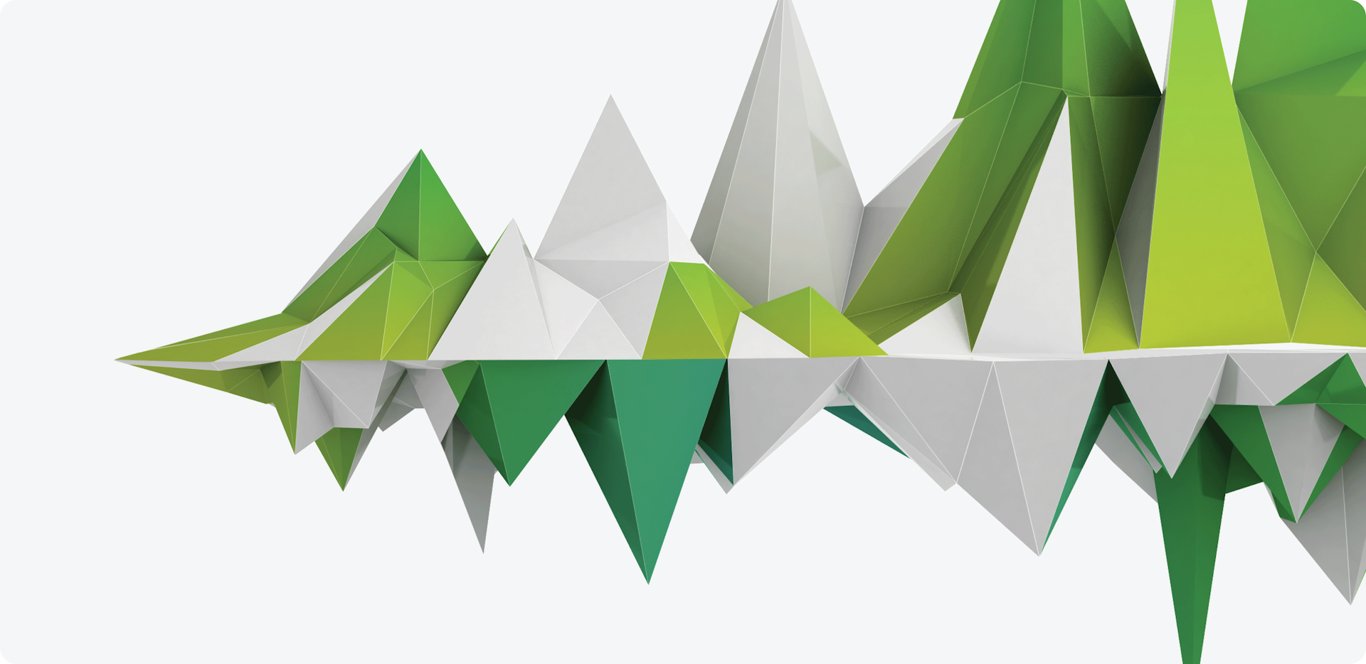
Fastly’s rebrand was a balancing act; the idea was to give the enterprise a new look while still retaining the identity its customers were familiar with. Early in our Discovery phase, we noted the essential elements of the Fastly brand its team wanted to keep: the logo, primary brand color (red), and company values. With these as our foundation, we conducted a competitive analysis to see how Fastly could differentiate itself from similar companies in its field. Our findings confirmed our hypothesis: for Fastly to stand out, it needed to lean into its dynamic character by bringing a colorful energy to its visual design language.
Branding
Adding color to the brand experience
While there were some pieces of the Fastly brand we couldn’t change, there were still plenty of areas where we could add a creative spin. A key step in Big Human’s rebranding process was translating what we learned about Fastly and its values into internal brand pillars that would help inform external messaging, design, and product experiences.
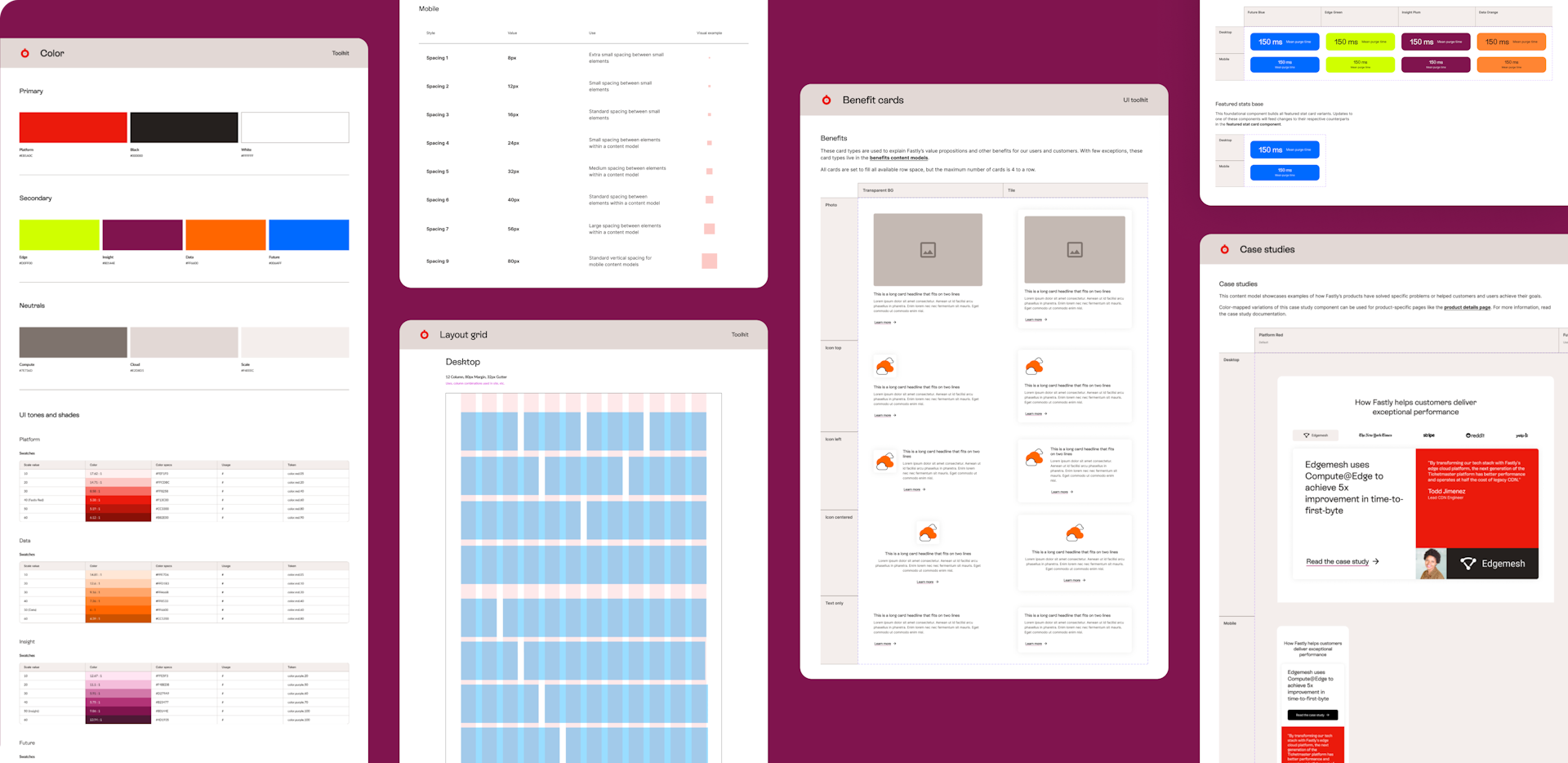
During our Discovery stage, we found that most of Fastly’s competitors had limited color palettes, often sticking to just one or two main colors; even Fastly’s leading brand color (an emphatic Platform Red) was a deviation from its competitors. With that in mind, color purposefully became our anchor, an immediately recognizable element Fastly could own. It was also a simple yet nuanced way to expand Fastly’s brand expression and add personality to the high-tech world of cloud computing. The trick was building a multidimensional color system that works in harmony with Platform Red but also elevates Fastly’s business goals, so we embraced the boldness and emphasized the company’s dynamic brand personality.
We created a primary color palette to act as the company’s first impression across every touchpoint. To add variety, vibrancy, and flexibility to the overall brand experience, we iterated on Fastly’s other brand colors to craft a secondary color palette that would be used for additional assets like CTAs, photography, illustrations, product icons, and more. We complemented the boldness of both the primary and secondary palettes with a series of neutrals to help with accessibility and color vibration.
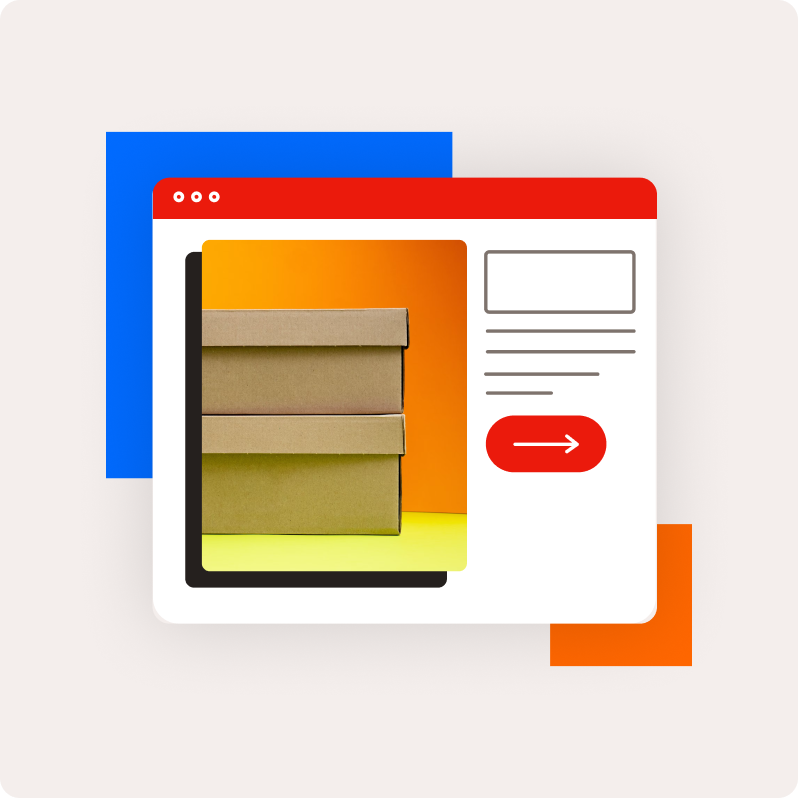
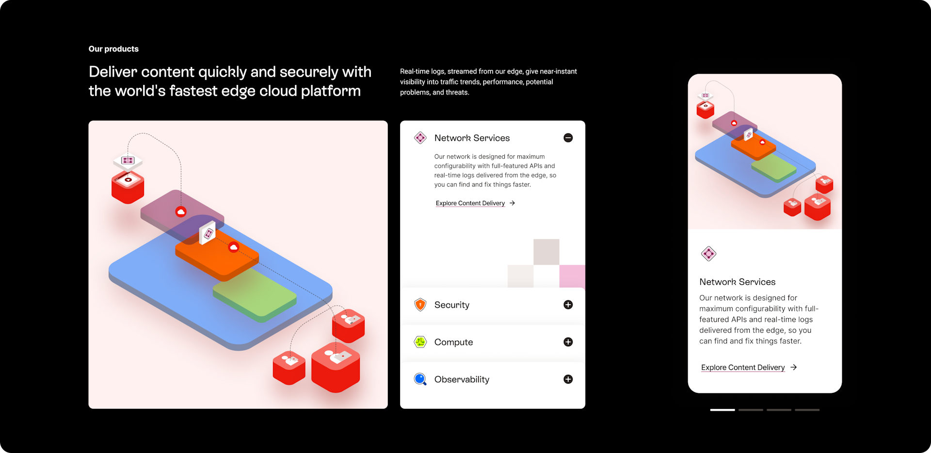
The secondary palette served a dual purpose; its colors can be tied to Fastly’s core product offerings to give them distinct identities — Insight Plum for Network Services, Future Blue for Observability, Edge Green for Compute, and Data Orange for Security. All content and resources related to these offerings on Fastly’s new website would be identified by and connected to their respective colors.
Branding, cont.
Producing a detailed design system
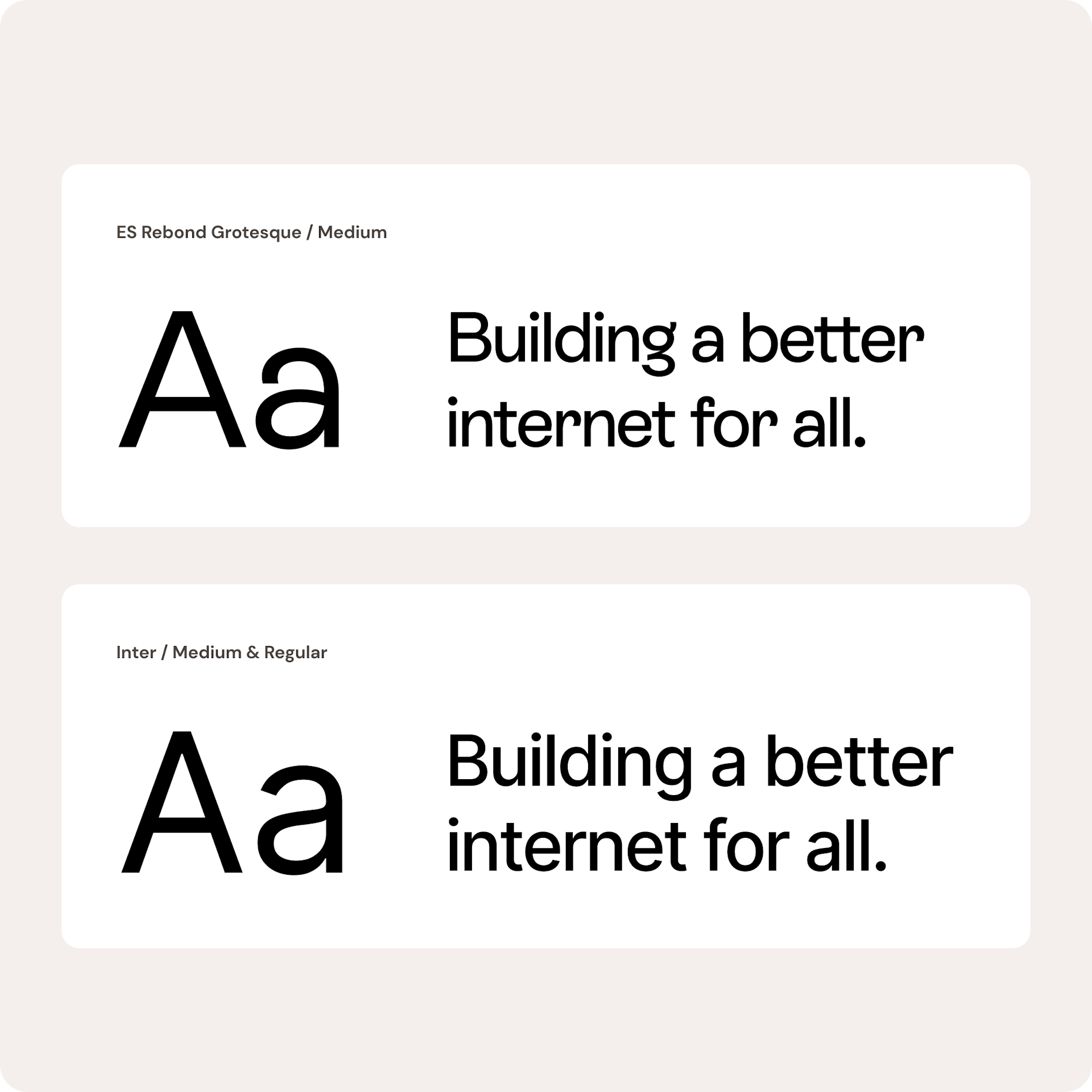
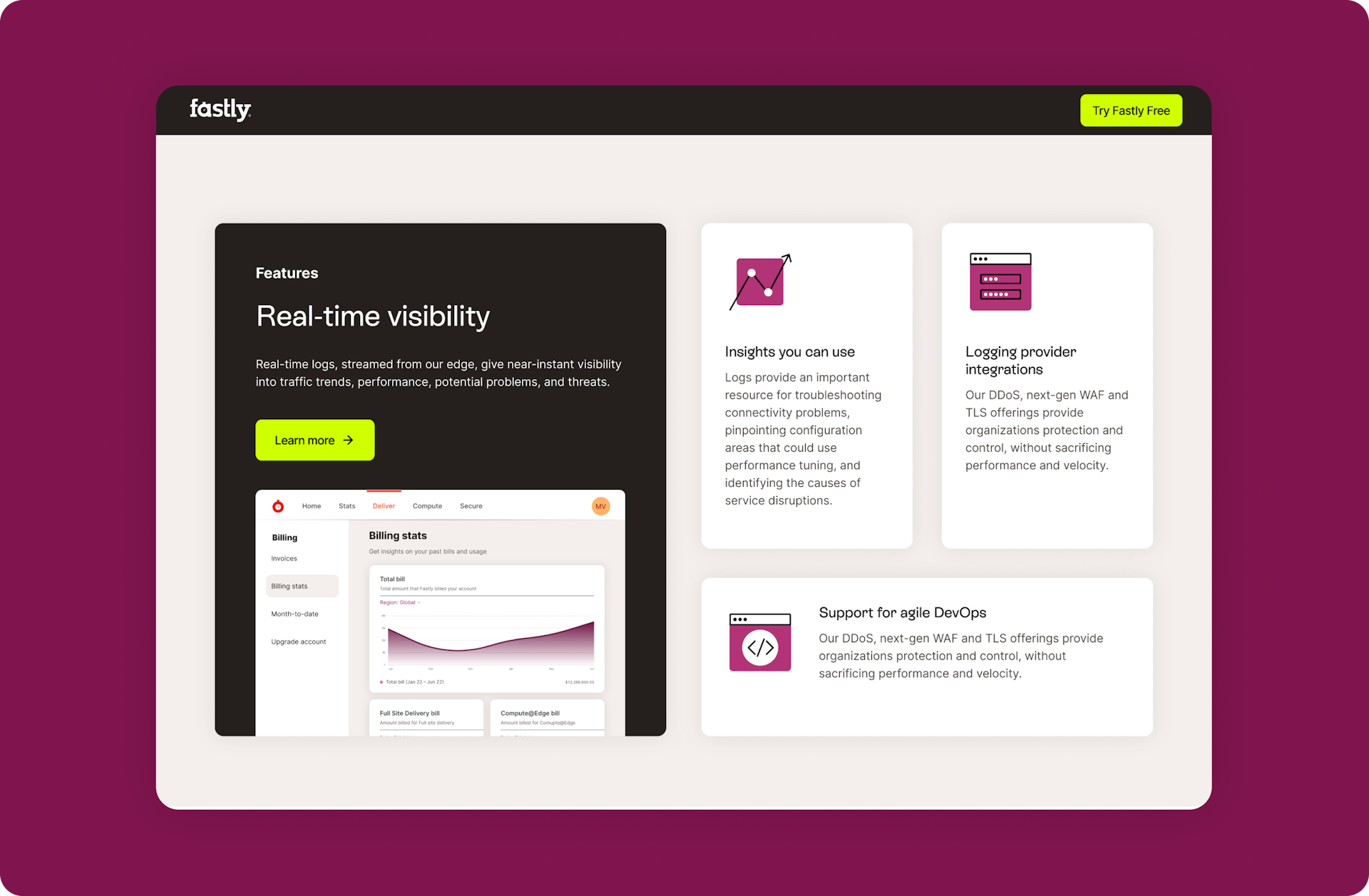
Echoing its new modern colors, Fastly’s typography was updated with modern display typefaces. To emphasize legibility and localizability while maintaining individuality, we opted for ES Rebond Grotesque. This sans-serif type adds character to headlines and other key information. We kept Inter (another sans-serif Fastly was previously using) and designated it for body copy, buttons, navigation, and other areas where content needed to be clear and readable.
It was important for these typefaces to be localizable; Fastly operates in several countries outside of the US, so both ES Rebond Grotesque and Inter were chosen because they support Latin-based characters, allowing them to effortlessly adapt to different languages. We also tacked Noto Sans JP onto the brand typography to account for character-based languages like Japanese, and to accommodate longer translations, we included scaling instructions for all headlines.
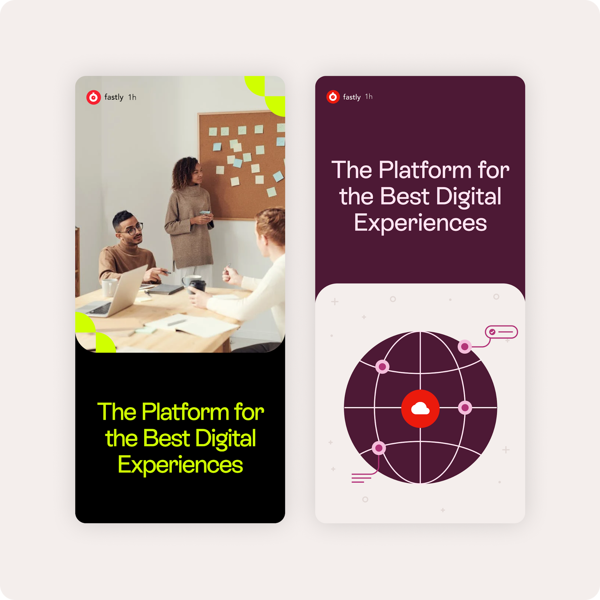
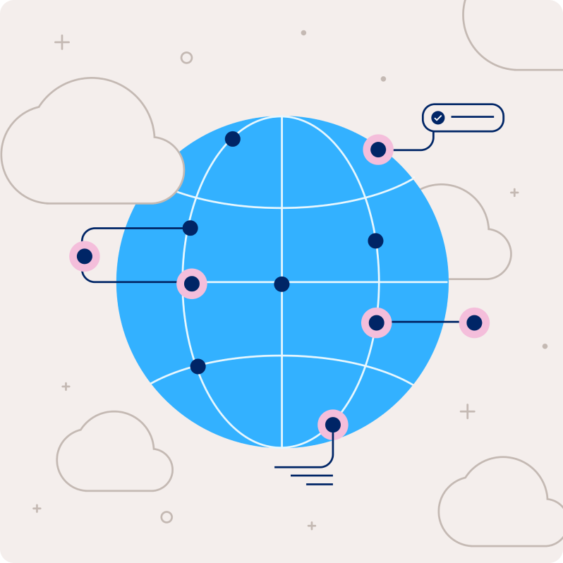
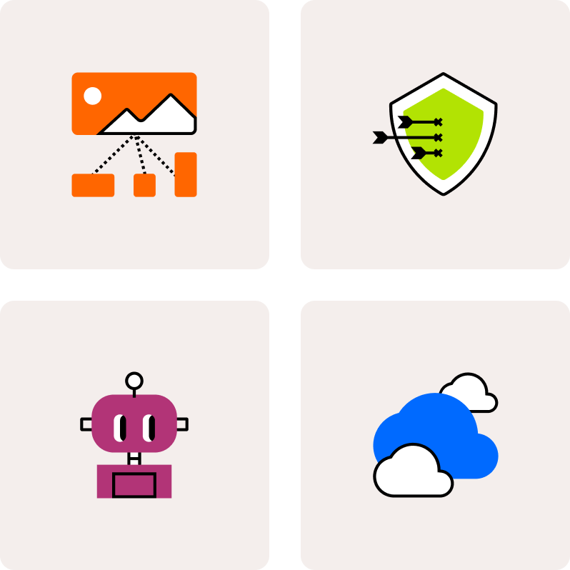
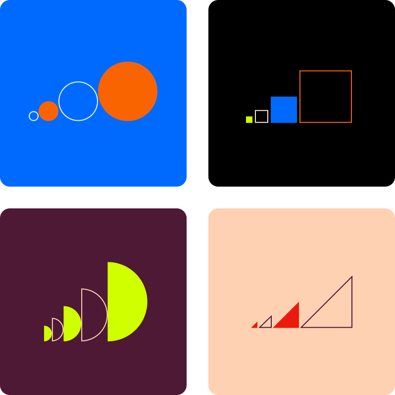
Fastly’s complex content is often bolstered by icons, diagrams, and other visual components. Its team already had a library of hand-drawn illustrations and pictograms, but it needed a contemporary overhaul. To revamp the catalog, Big Human designers brought in elementary shapes (squares, circles, triangles, etc.) to build the foundations for every graphic device in all of Fastly’s communications. The designs are done in a flat style, so we gave them some depth with drop shadows and layered effects.
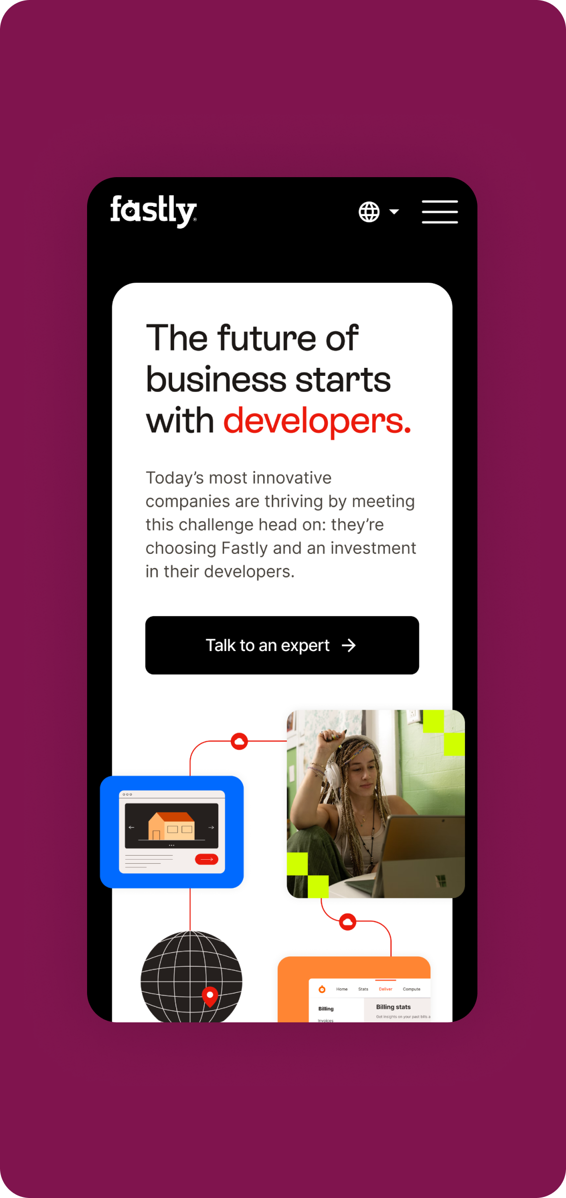
To enrich the brand experience, we designed custom hero illustrations with ornamental elements (data lines and dots) that referenced Fastly’s original branding. We envisioned these hero assets as animations, so we also gave the Fastly team directions on how to add movement to each of them. Like all of our branding projects, the brand guidelines we created for Fastly include specifications for accessibility requirements, graphic device creation, and logo, color, typography, and photography usage.
UX/UI Design
Connecting every touchpoint of the digital experience
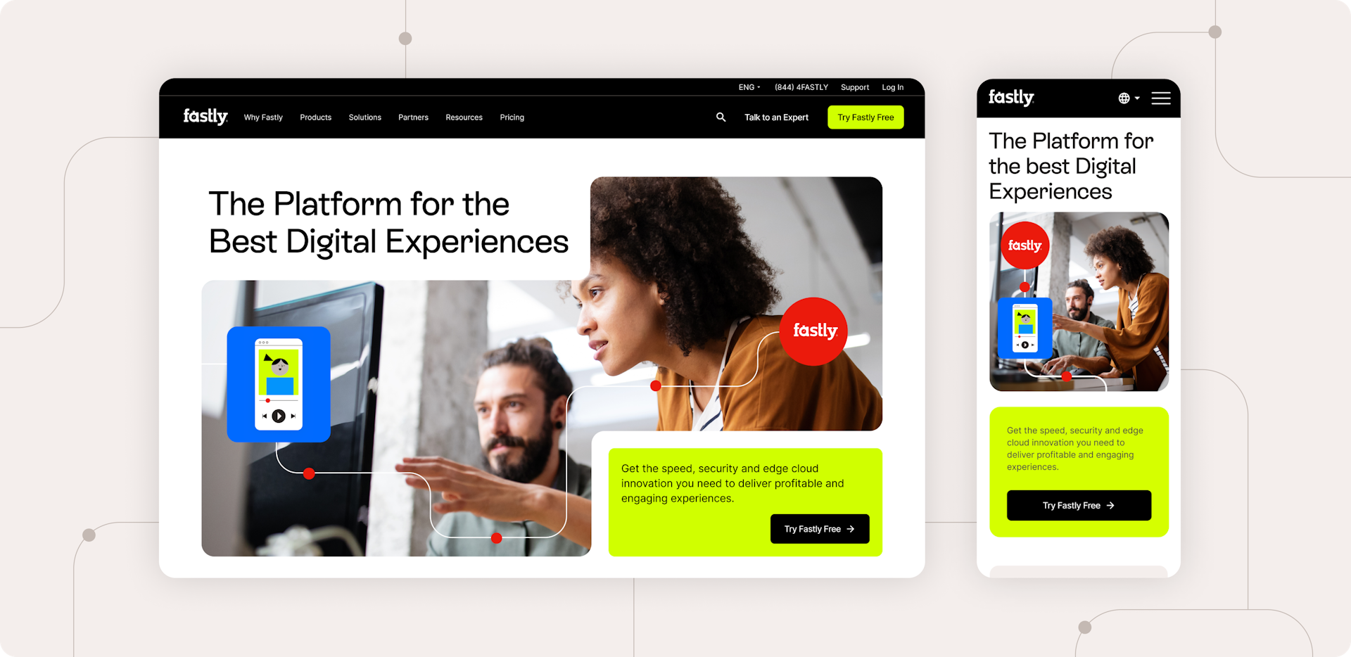
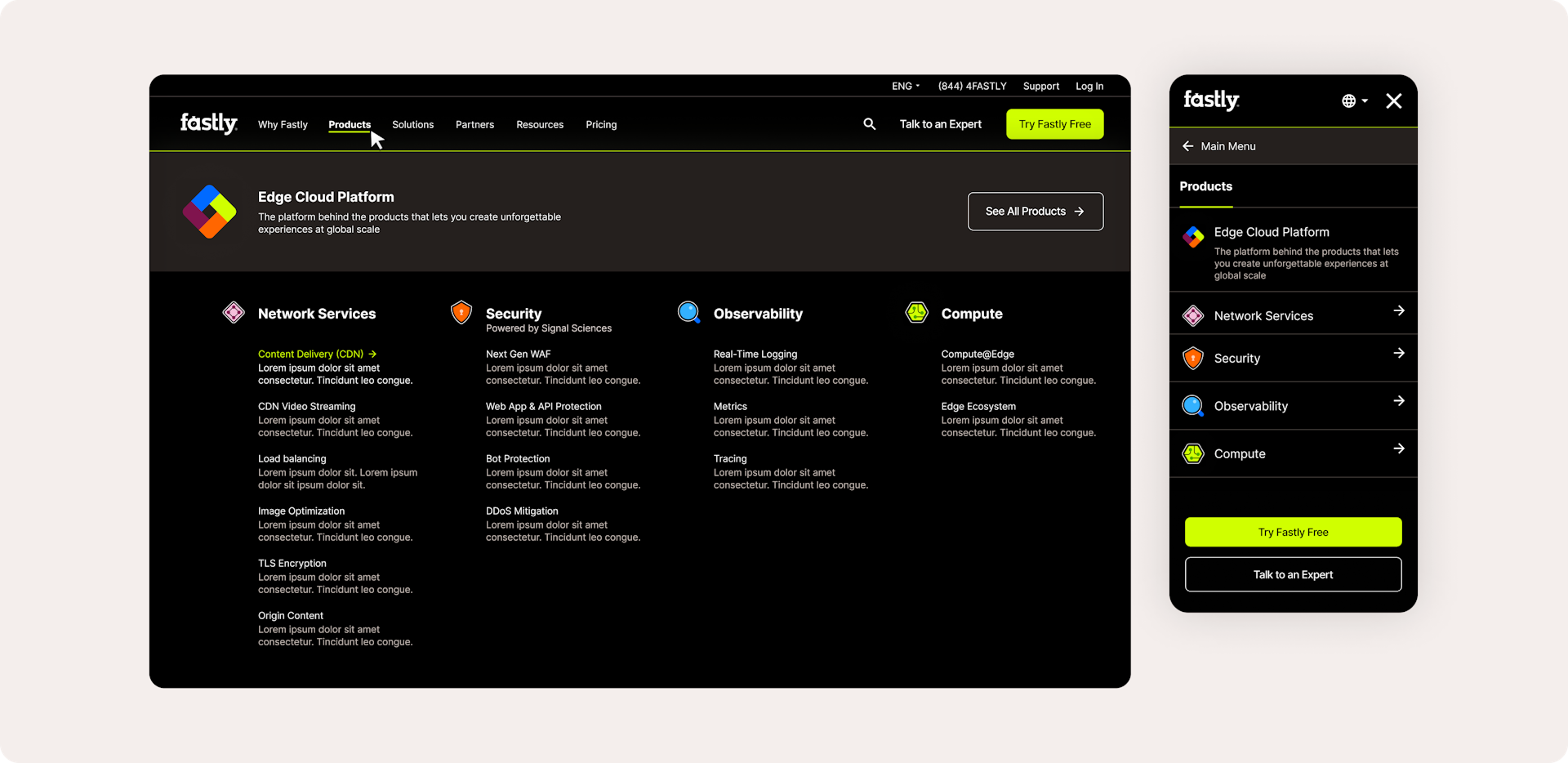
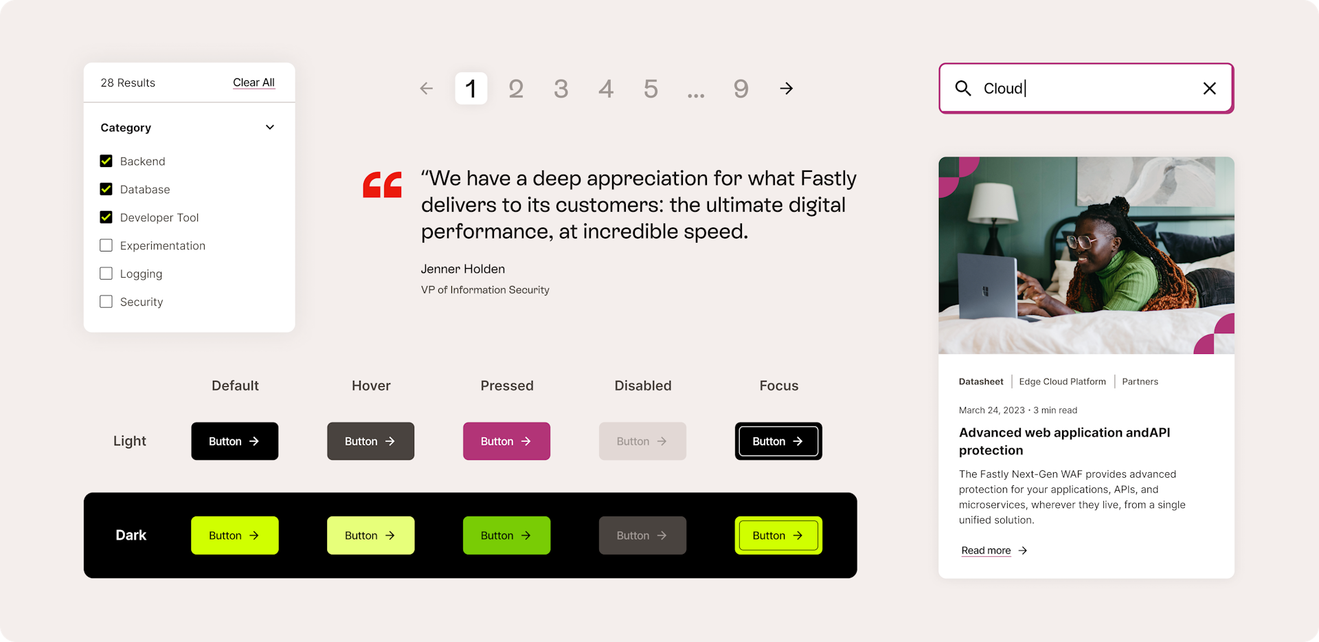
Fastly wanted to bring a sense of consistency and fluidity to its new website, so its users could have a connected digital experience. After reorganizing and simplifying the site’s architecture to streamline navigation and make content easier to find and filter, Big Human designers made an Overview page that had a quick breakdown of all of Fastly’s offerings and services. This page would serve as an all-encompassing directory, linking out to landing pages with more detailed product descriptions. To reiterate the rebrand’s dynamism and help Fastly further stand out, we added interactive elements to several places on the website. A user’s scrolling activity pilots the movement and rhythm of animations featured on the homepage, diagrams, marquees, and stats.
While the site’s homepage and product pages received bespoke touches, we built templates to make the creation of new site pages faster and more flexible. Since the website has around 300 pages (and growing), we introduced the Fastly team to a componentized design approach. Essentially, every section on the Fastly website is a component made out of other components — all of which can be customized as needed. This would help account for new site pages, articles, and global changes to overseas versions of the website.
Results
Handing off thorough documentation
At the end of our engagement with Fastly, we left them with comprehensive visual and written documentation that ensured a seamless handoff and uncomplicated site build. The new Fastly.com went live in November 2023.