RentHop
Fusing product and campaign strategy on the NYC Subway
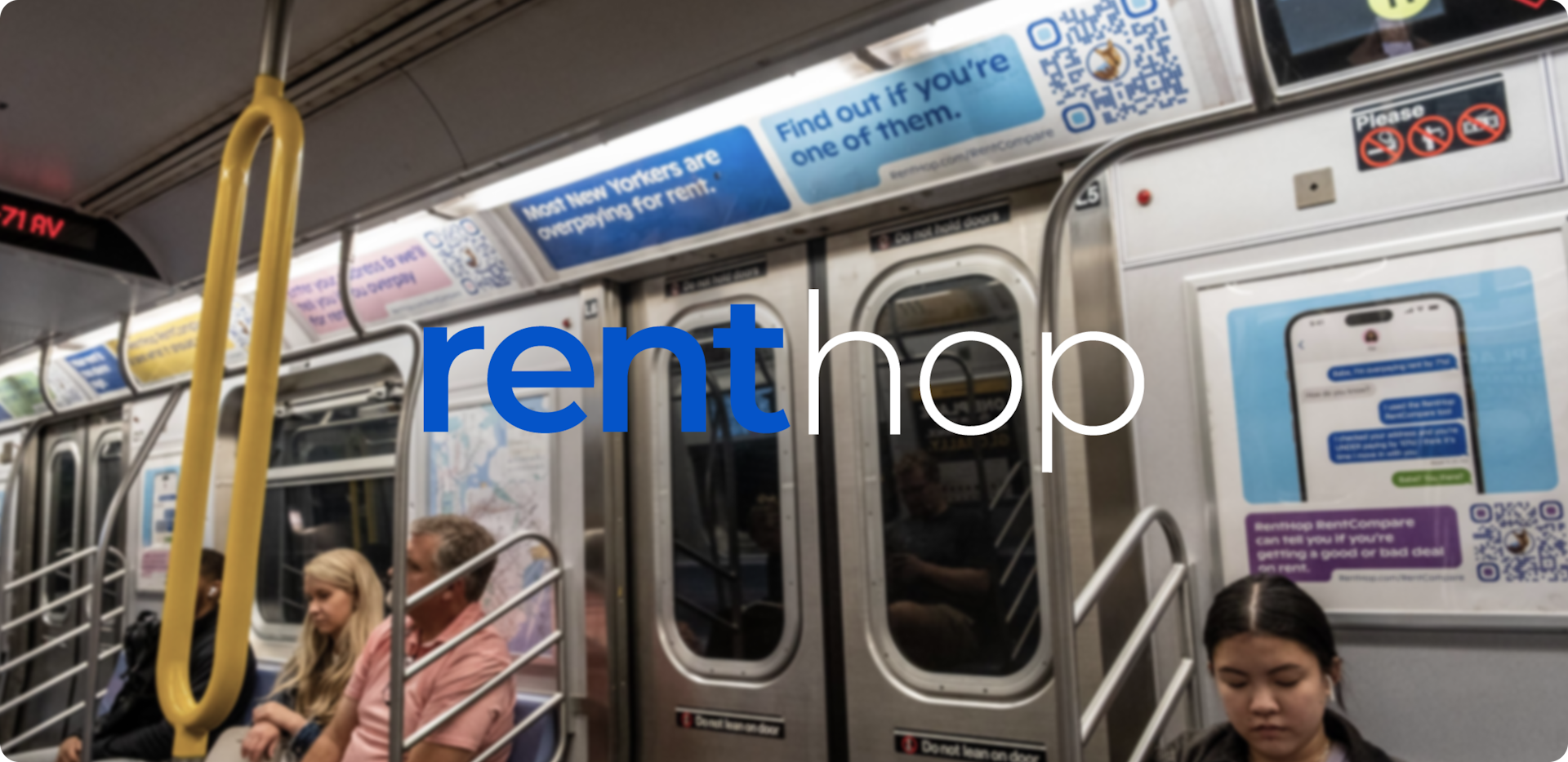
While Big Human may move in mostly digital spaces, there are times when our work makes its way into physical form. Case in point: RentHop’s 2023 New York City Subway ads.
The rental listings platform initially came to Big Human looking for help with copywriting and design on their newest marketing initiative: an ad campaign. It soon became clear that in order for the ads to have a significant impact, we’d need a more compelling call to action. As Big Human leads with a product-first mindset, we developed the concept for RentHop RentCompare, a tool that appeals to renters looking for a new apartment as well as those who may move within the next 12 to 18 months (but more on that later).
While the RentHop team worked on developing the product itself, Big Human spearheaded the messaging and design of 12 ad variations. We utilized a nimble-yet-thoughtful approach as we refined and executed the final versions, eventually bringing both the product and campaign strategy to life across 570 Metropolitan Transportation Authority (MTA) cars.
- Product Strategy
- Campaign Strategy
- Brand Positioning
- Copywriting
- Design
Strategy
Creating the compelling angle
Through these ads, RentHop wanted to engage those New Yorkers with apartments they loved as well as those on the hunt for something different. The first question we had was obvious: What type of message would get people to visit a rental website, even if they aren’t currently in the apartment search process? We had to find that magical balance of broad appeal (the ads needed to captivate a wide breadth of people) and specificity (most people only look up from their phones if something strikes them as relevant). Our second question was about expected campaign results: How would we capture mindshare and keep RentHop top of mind after the campaign came to an end? The campaign and product would need to encourage email address collection.
This is what sparked our idea for RentHop RentCompare, a tool that allows users to see if they’re paying too much (or too little) in rent compared to their neighbors as well as those in similar properties. Who doesn’t want to know if they’re getting a good deal or not? Similar to how homeowners receive updates about their home value, it would also generate quarterly email updates stating whether they’re over or underpaying in regard to rent value. Like checking in your stock market portfolio, users would be able to access how their current rent is “performing.”
RentHop RentCompare would do it all: attract the masses, inspire action, raise awareness, and provide RentHop with potential customer data.
Copywriting
Finding a message that resonates with New Yorkers
Translating the product and campaign strategies into ad form began with the message itself. We wanted copy that was punchy and potent — but nothing too aggressive, as it needed to be approved by the MTA. Our copywriters also had to be aware of the estimated character count. The ad campaign required three different-sized ads, so the exact amount of copy would vary by dimension.
After numerous brainstorming, writing, editing, and rewriting sessions, we aligned on several variations in copy that all harkened back to one central theme: As a New Yorker, are you paying too much for rent?
Design
Attention-grabbing design
Any design that felt too busy or complicated would deter from the campaign message, but the overall appearance still needed to pop. How else do you get busy New Yorkers to stop and actually read your ad? Our designers leaned into the usage of bright colors: Pantone 305 cp, Pantone 2935 c, Pantone 2036 c, Pantone 353 c, and Pantone 1205 c, among others. Along with the copy, there also needed to be room for the RentHop brand character — a wallaby named Wally — and the QR code that takes users to RentHop RentCompare.
The final print-ready package included four variations that would work in the 11x46 ad space, four for the 11x70 space, and four for the 21x21 space — all of which would appear in varying spots on the Subway car.
Results
Live from New York…
RentHop’s NYC Subway ad campaign — as well as the RentHop RentCompare tool — went live at the end of March 2023, just one month after the engagement began. Between April 1 and September 30, 2023, over 52,000 unique users visited RentHop RentCompare and submitted search queries to find out if they were overpaying for rent. In total, the QR codes were successfully scanned 11,708 times during the campaign.
