What is Human-Centered Design?
In this blog:
The definition of human-centered design is relatively straightforward: It’s design that focuses on creating products that meet the needs, behaviors, and goals of people. The iterative process involves thorough research, prototyping, and testing — continuously refining the product based on user feedback to enhance usability and satisfaction. The end goal? An intuitive, user-friendly product.
At Big Human, we take it one step further by remembering that we’re designing for people. Not groups, demographics, or the nebulous concept of “users.” People are at the heart of every product. They naturally seek safety, predictability, comfort, control, accomplishment, self-expression, beauty, and joy.
To fulfill these needs, we follow seven key human-centered design principles — highlighted below.
7 Human-Centered Design Principles
Navigation
As humans, we always want to know where we are. How did we get here? Where can we go, and how do we get back? In human-centered design — whether it’s in an app or in the physical world — this translates to the desire for clear navigation.
Take airports, for example. Most are designed with lots of signage and clear wayfinding systems that help travelers get to the correct terminals, through security, and, finally, to their gates.

Another example of effective real-world navigation is Burning Man, the creative music and arts festival that happens every year in the Nevada desert. Finding your way around the festival, especially at night, is near impossible; there are no standard highway signs or street signs to show the way. The creative community, however, needed to find a way to solve this problem. Enter: sculptures. One of the largest and most recognized sculptures, “The Man,” sits at center camp and helps orient burners as they navigate from camp to camp.

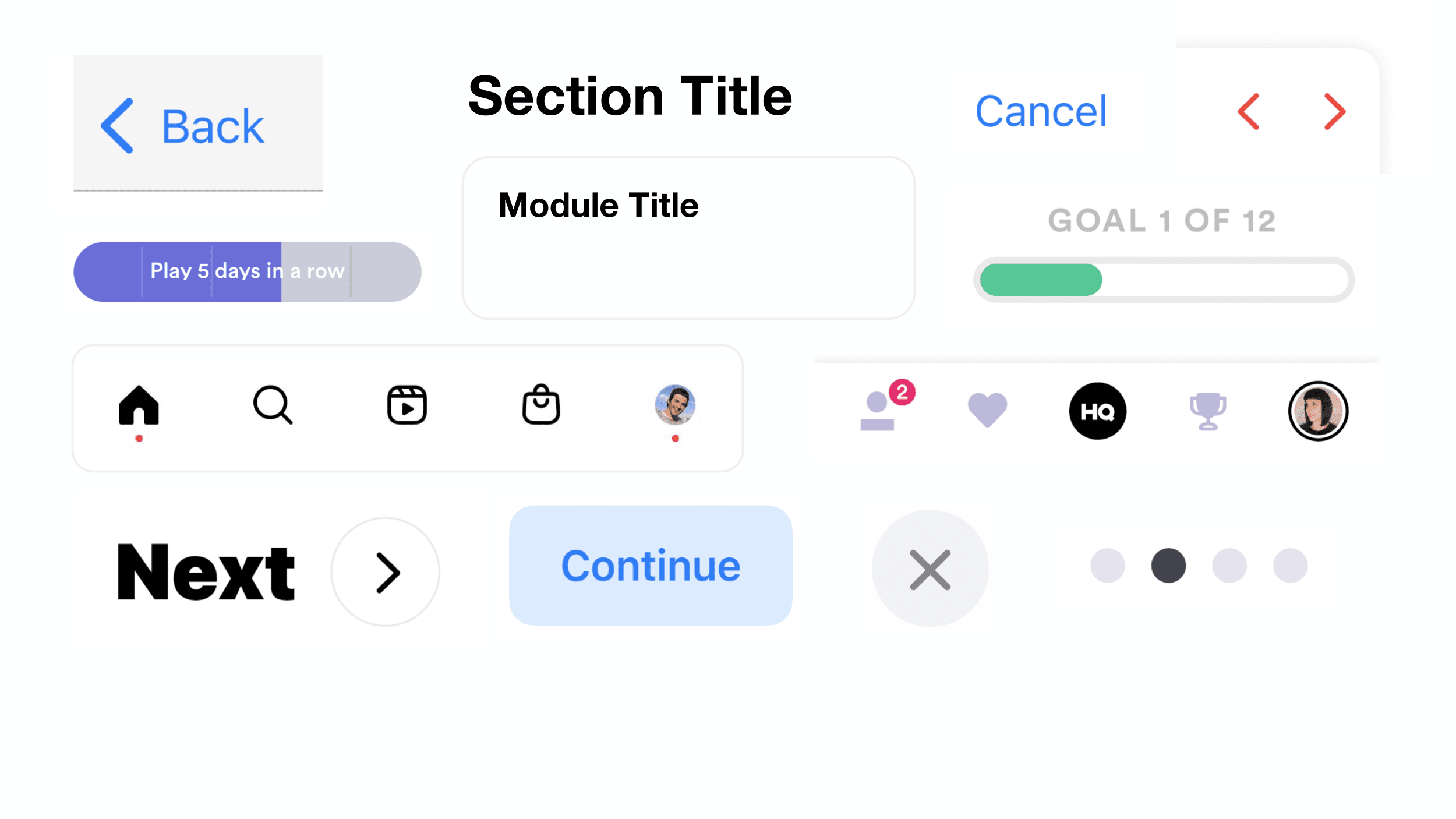
Now, think about navigation on your phone versus IRL. Having clear signals and signs for where you are in an app is just as important for wayfinding and giving users that sense of orientation. If your app doesn’t clearly demonstrate where users are and how they can go backward or forward, you’re not using human-centered design. This is easily fixed by creating navigation buttons, labeling each screen, and adding titles to every section of your app.
Feedback
Technology products — phones, laptops, VR headsets — are living, breathing things; they can be in a number of states or modes at any given moment. In order to fulfill that human desire to be in control, the best products give users a sense of what's happening and how it's been affected by their input. Like your car when the check engine light comes on, an app should provide feedback and notifications regarding its current state.
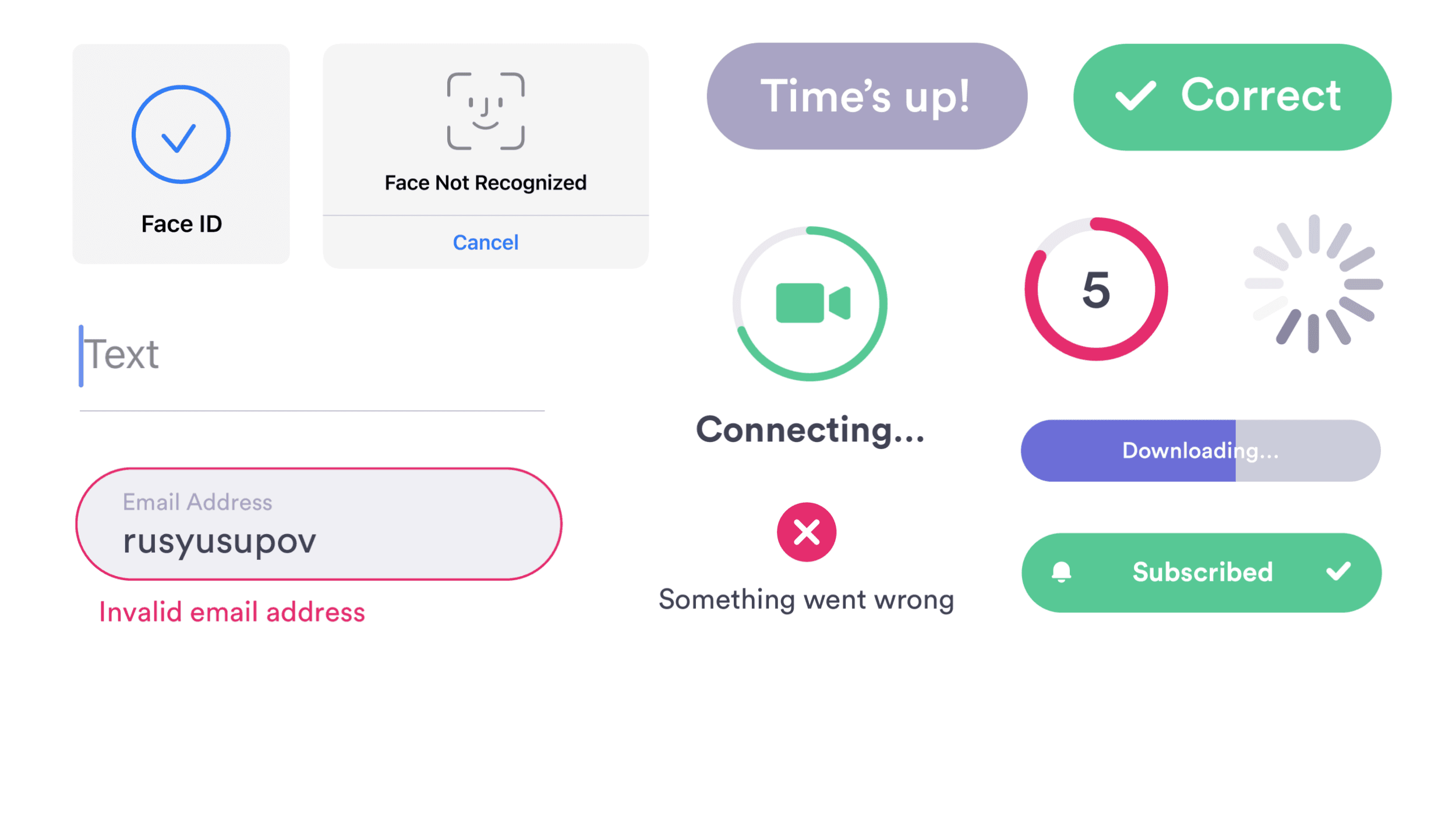
Examples of feedback features include notifying the users the app is loading, the internet has cut out, or when a button has been pushed and something is about to appear. You can use icons and color; an input field can turn red if it's incomplete; or, if there's an error, you can use audio and haptics. This is what we used in HQ Trivia. The phone vibrated gently, letting you know that time was running out and you needed to answer the question.
Consistency
Consistency is a best practice across a range of industries and skill sets — including human-centered design. When all the components in your design system behave the same way, users can reliably expect the same outcomes for their actions. If the first link your user sees in your app is blue, for instance, they'll expect all other blue text to also function as links. The look of all the elements in your app — the text, buttons, iconography, colors, and interactive components — should also follow a cohesive and consistent look. If your designs don’t follow an internal set of rules around how things look, the user can become confused and frustrated with your product.
Here's an example of a consistent style guide, which was developed for Quinn. The style guide outlines the look of buttons, typography, interactive components, colors, and more.
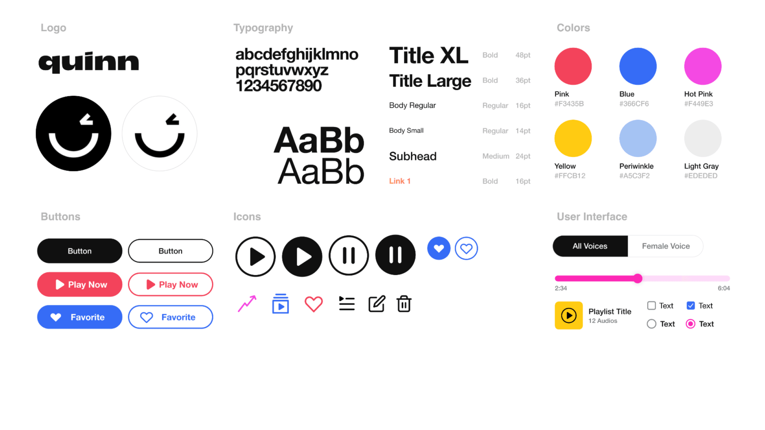
Style guides serve as hard-and-fast rules, but they can also be updated over time. New treatments can be created when a new behavior is needed in your app. Before creating a new treatment, however, first look at your existing design system and see if there's something that can be reused.
Affordance
The affordance design principle is all about the relationship between a person and an object. Affordances are visual cues that make certain actions possible and other actions less possible.
You can see affordance in the below lamp designed by Wilhelm Wagenfeld. The pull cord has a little ball on it, which affords us the ability to pull on the cord and turn on the light.
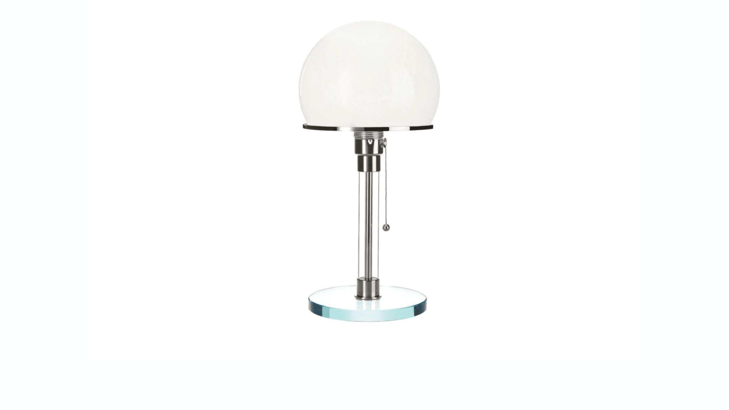
This principle also applies to apps. Your app should clearly indicate how your user can interact with it. Doing something as simple as rounding a corner of a rectangle can make an object look like a button, affording us the ability to tap on it.
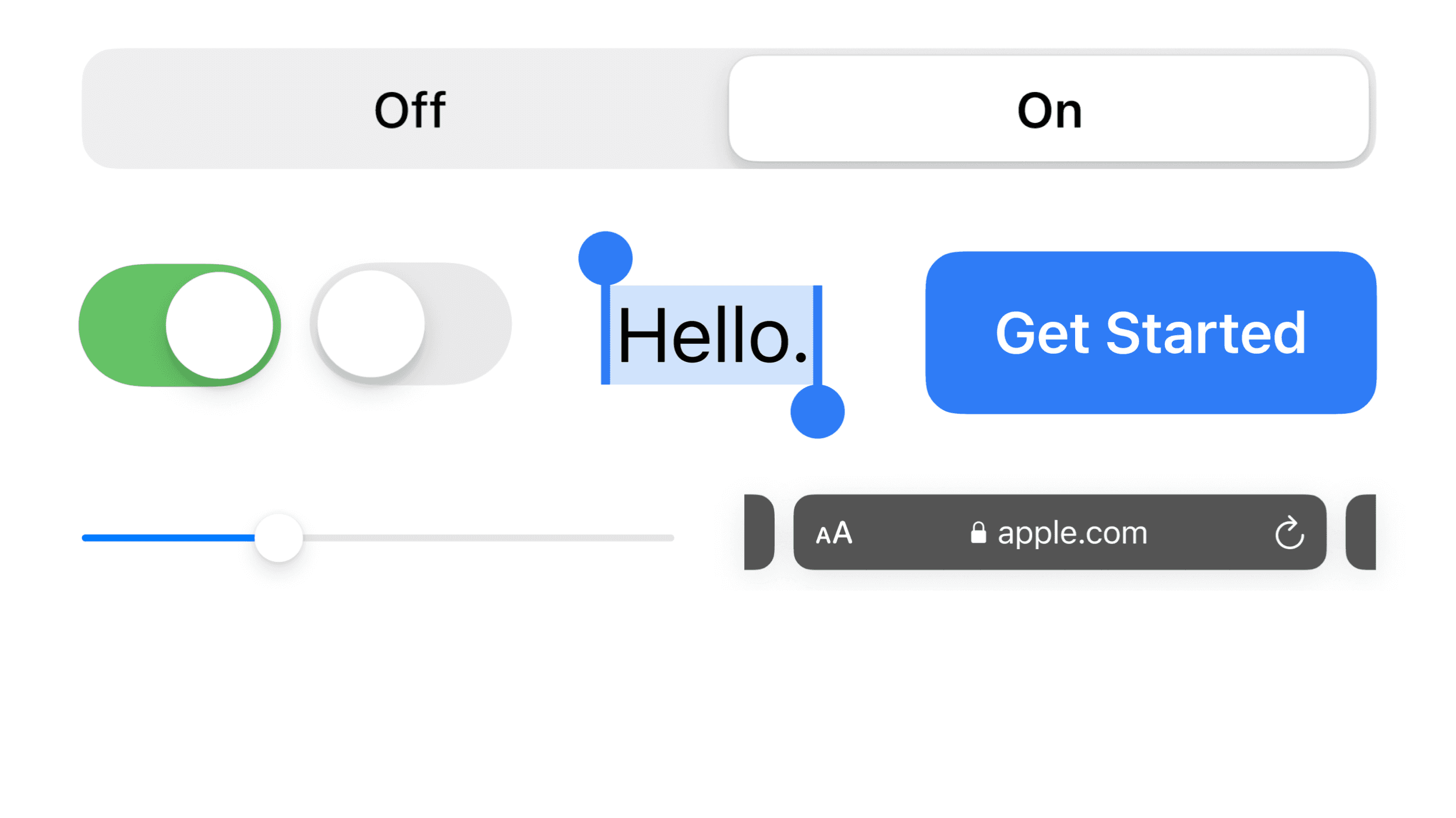
Sliders afford dragging objects along a track. Check boxes afford us the ability to fill a box with a check. Subtle drop shadows or shapes can suggest further actions. A list bleeding off-screen shows you can scroll. People love discovery. We get a reward response in our brain when we learn something new; it’s a core human emotion.
Regardless of how you use visual affordances in your app, it's important to indicate which actions are possible. Otherwise, your users will use the app in ways that are not supported, leading to confusion.
Symmetry
There's something about symmetry that appeals to the human brain — whether it’s in nature or some of the best architecture and design in the world. In the picture of a zebra, you’ll notice bilateral symmetry, where the forms on one side are reflected on the opposite.

And here, in this picture of a starfish, we have radial or rotational symmetry, which is symmetry around a central axis.

There is also translational symmetry, as seen in this picture of fish scales, where a form is repeated and its position is offset without changing the underlying structure or the form of the shape.

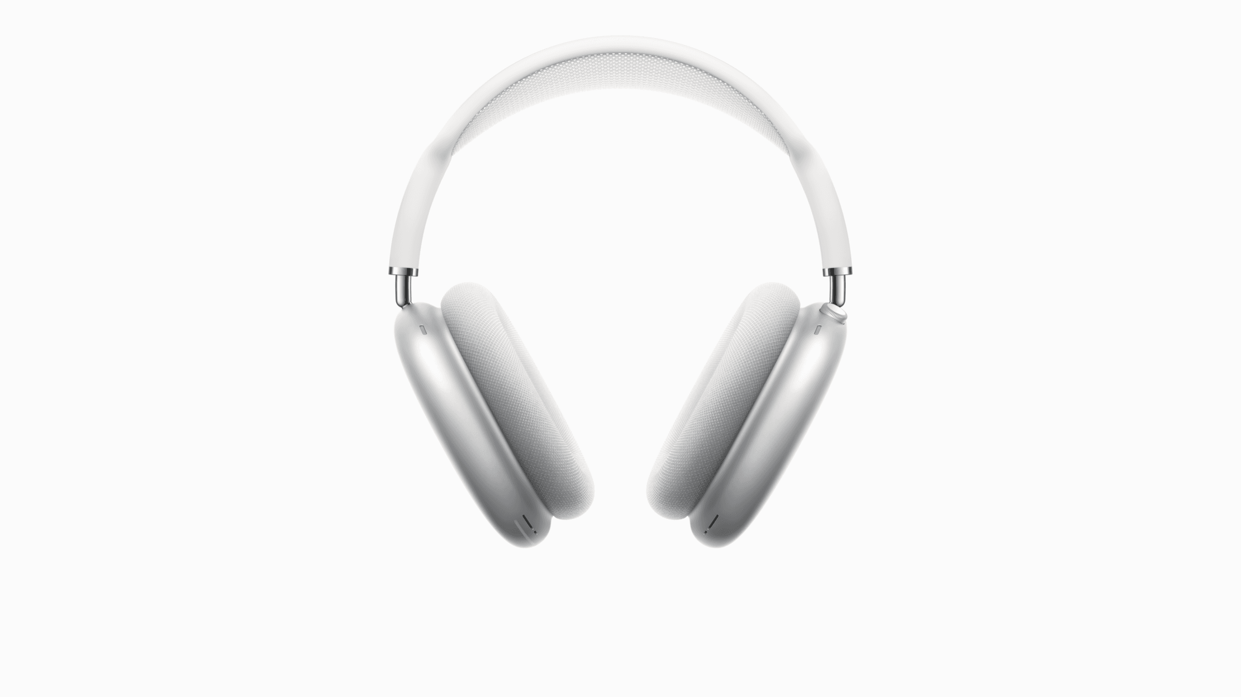
Because humans find symmetry so appealing, it shows up in most manmade objects — architecture, of course, and products like these headphones, which are symmetrical along the Y-axis.
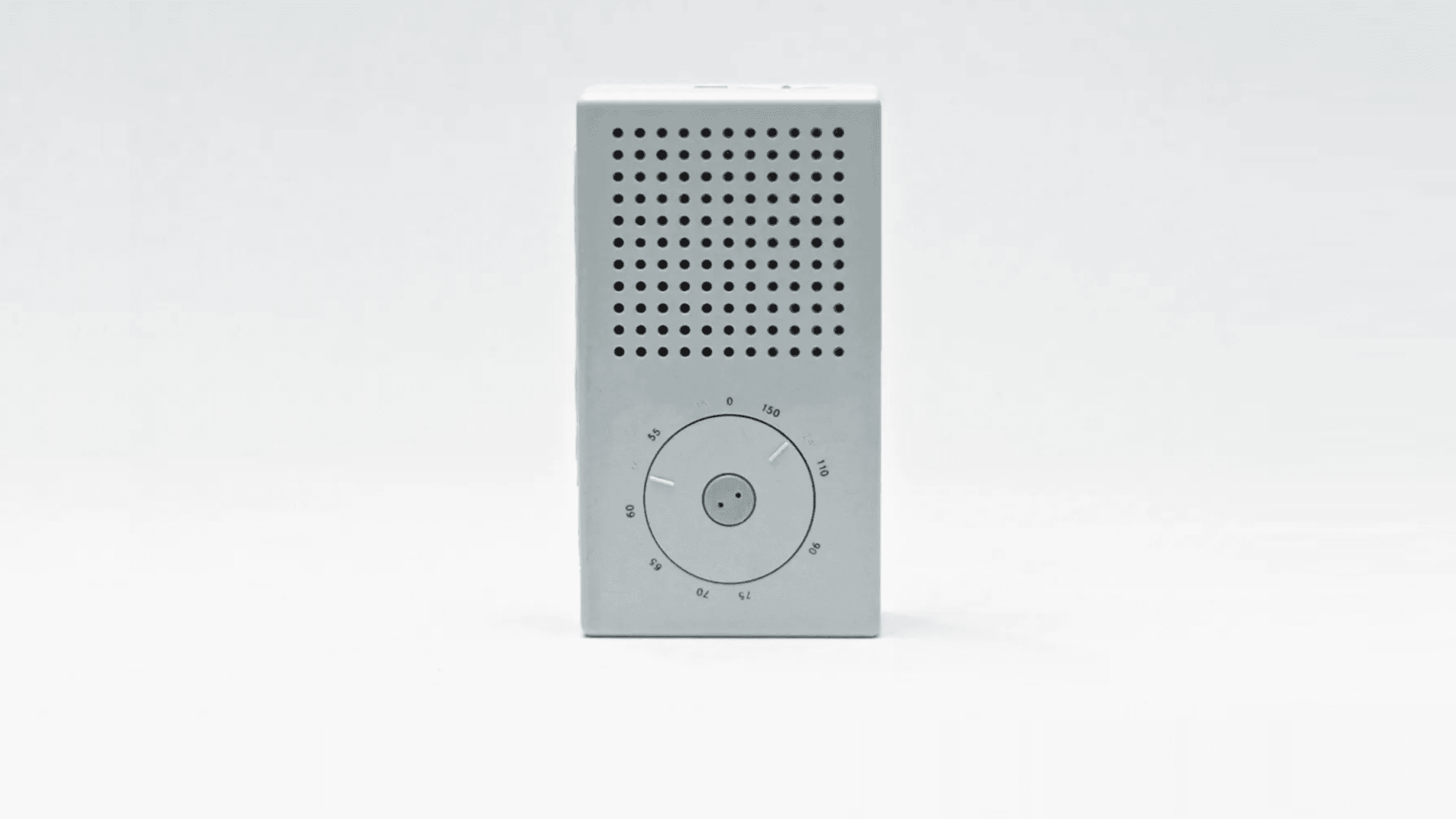
Now, let's look at a couple of examples of how symmetry can be applied in product design to achieve a sense of balance, calmness, and quality. In Dieter Rams' T3 radio design, which inspired the iPod, you’ll see the translational and bilateral symmetry in the speaker holes, as well as the radial symmetry in the dials.
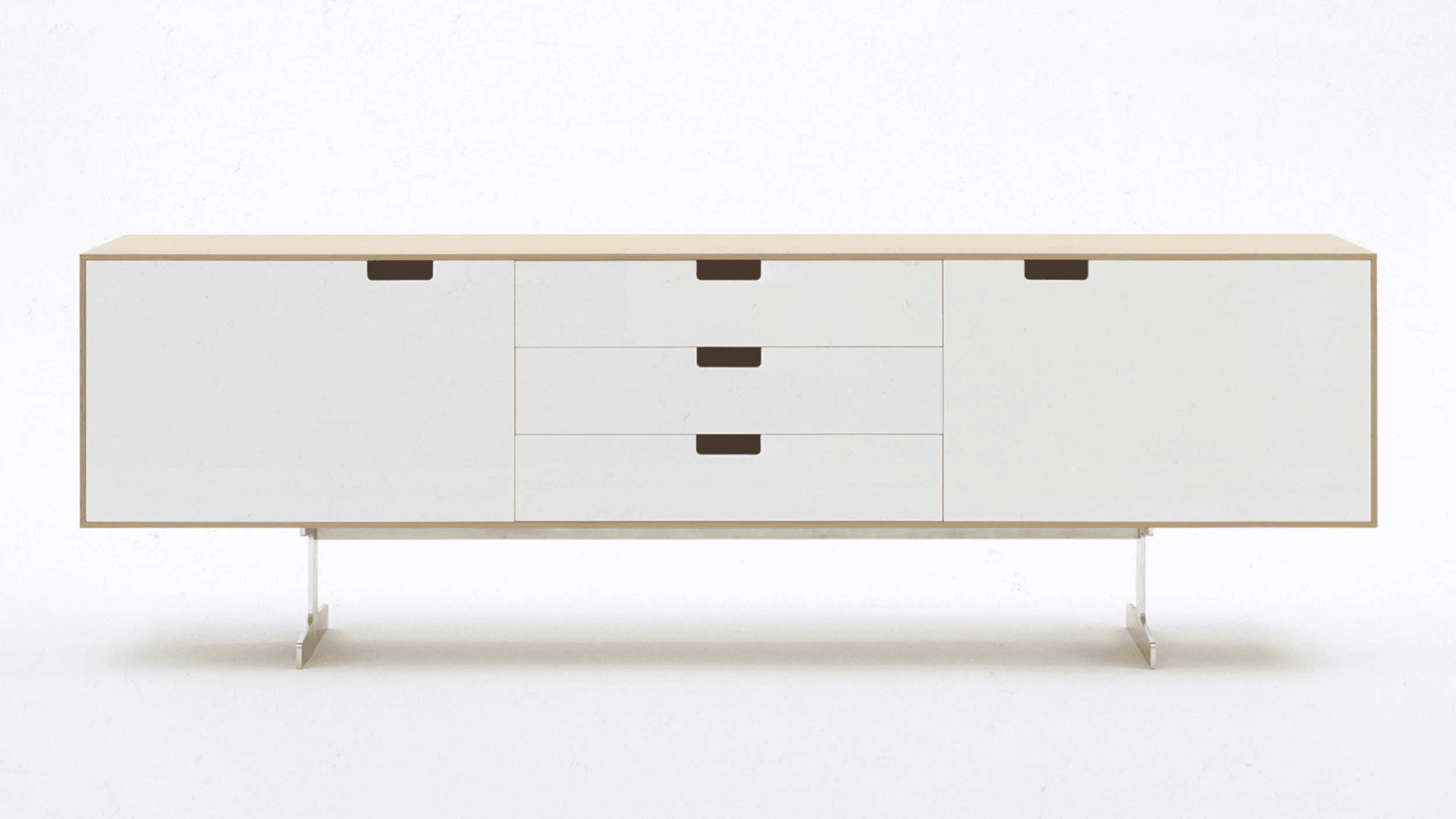
This cabinet design also has perfect symmetry.
In the Vine camera, notice how the progress bar, the camera image, and the button are aligned and centered on the Y-axis.
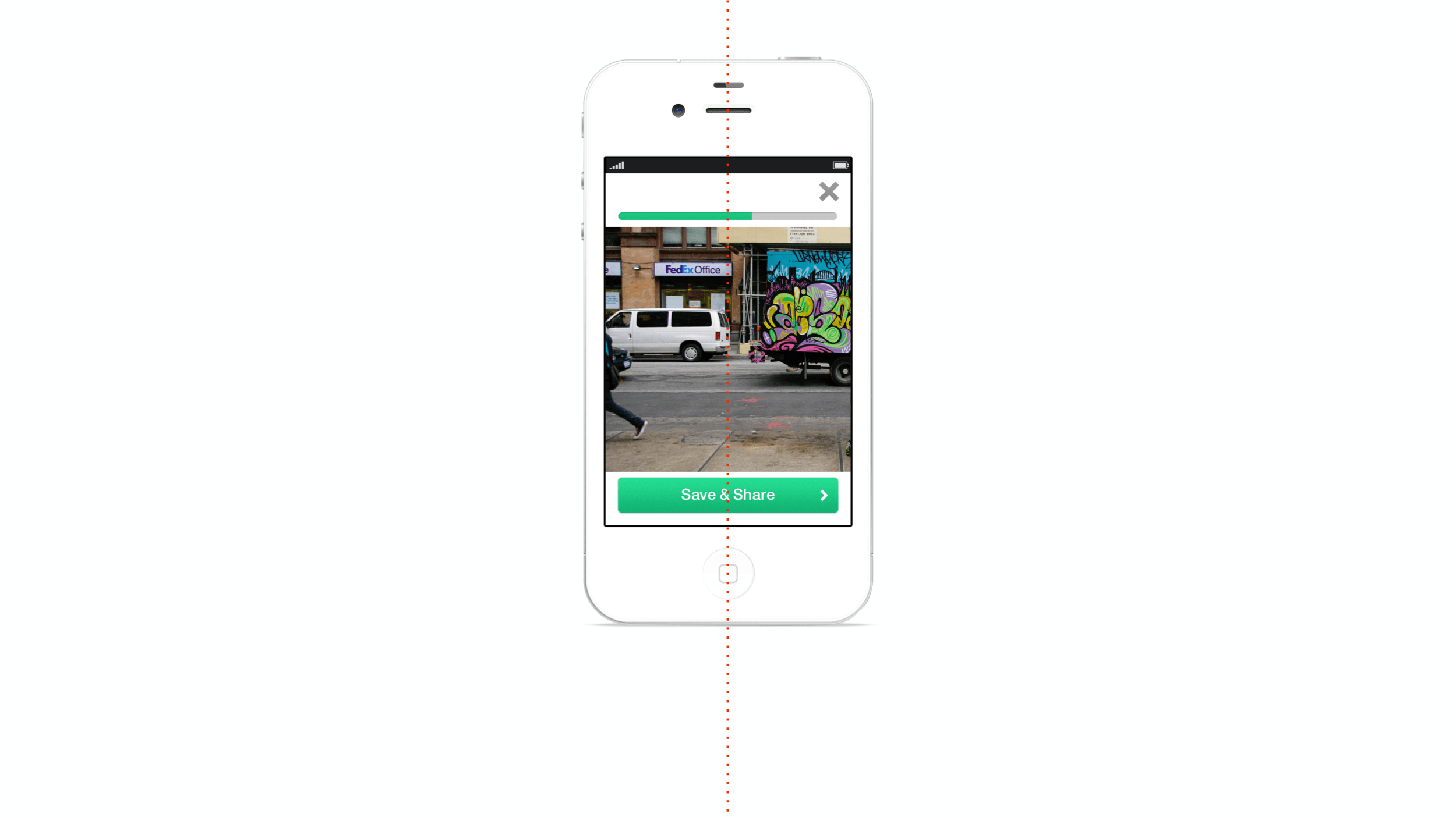
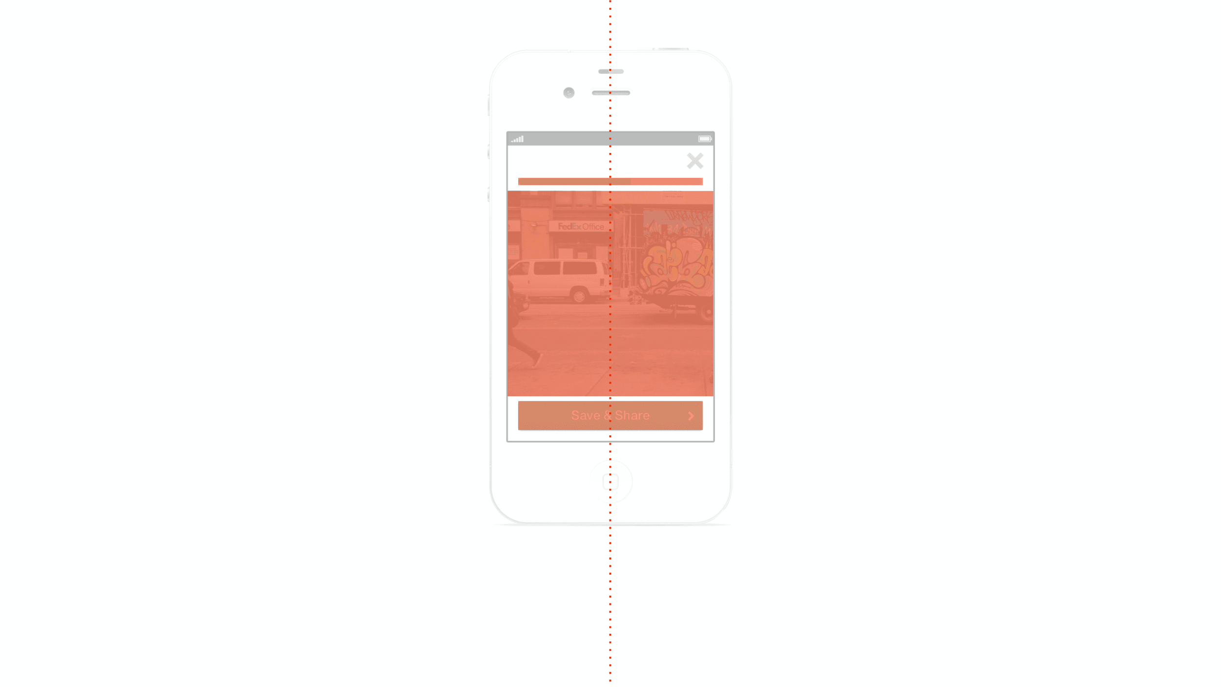
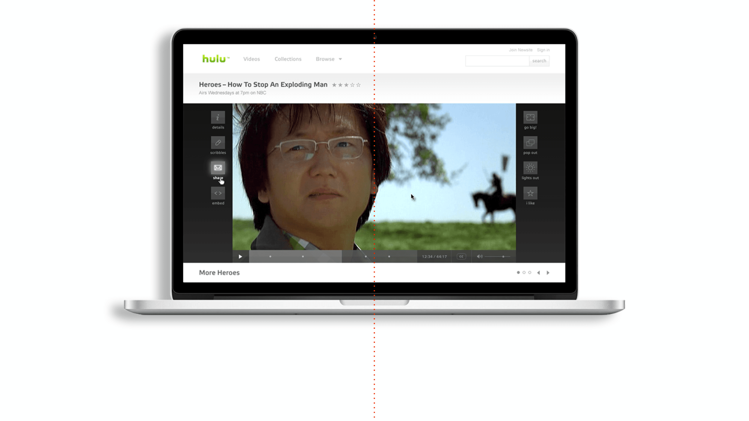
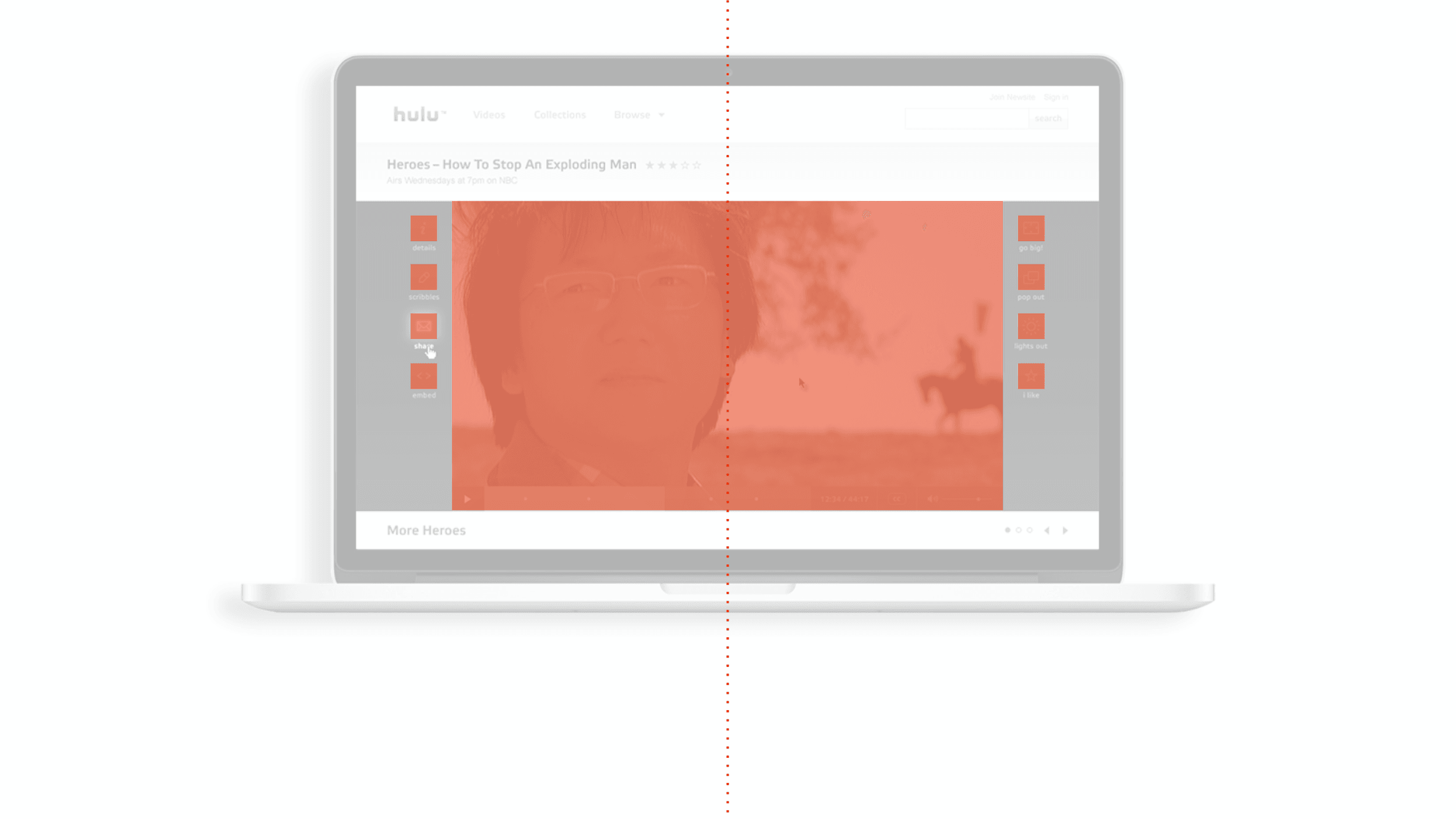
In 2007, as the lead designer for the first version of Hulu.com, I used symmetry to achieve a sense of balance when presenting video. See how the video controls are reflected along the Y-axis; this bilateral symmetry makes the interface feel calmer and more direct.
Focus
The goal and intent of every screen within an app should be maximum focus. We like to lean on the Bauhaus teaching of removing elements and ornamentation; focus is achieved not when there is nothing more to add, but when there is nothing left to take away.
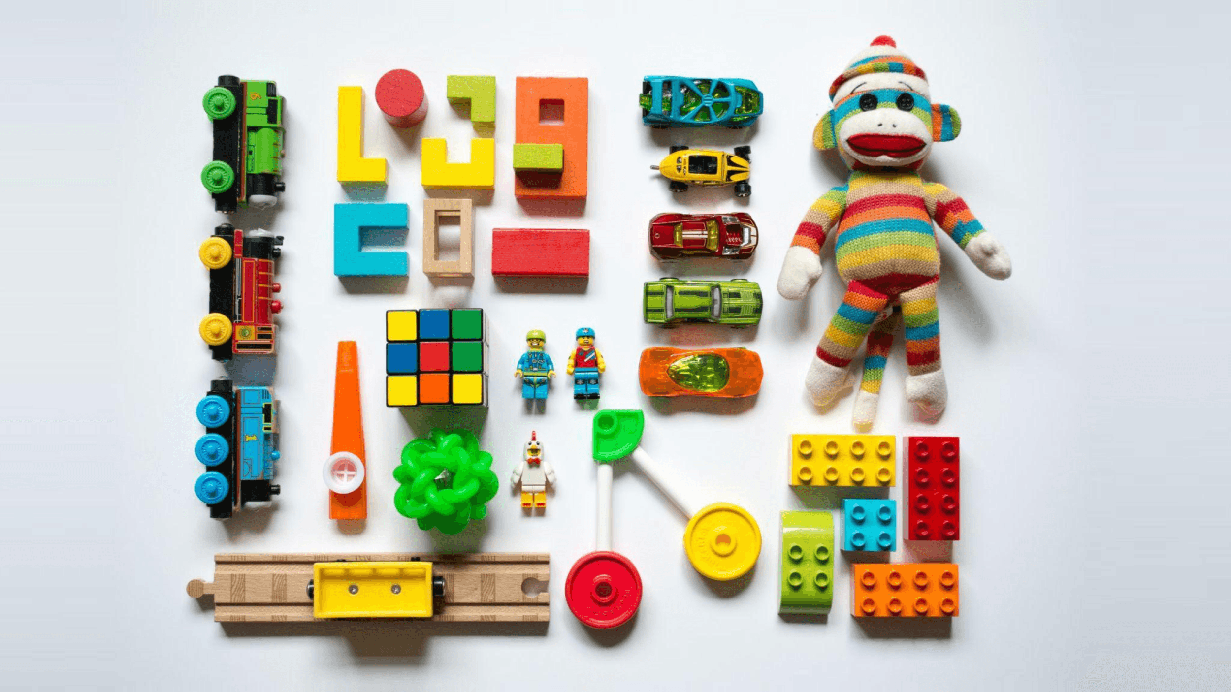
It’s a concept that connects back to Clay Christensen’s idea that the next big thing in technology will emerge as a “toy.” Toys are designed for children — for play and for learning — and most are designed with primary colors, with very few components, and with a single purpose. When you’re developing human-centered designs, you should approach design problems as a toy designer, focusing on the core utility and stripping away everything else.
Don’t worry about it being too simple or even “childish.” Technology advances at such a rapid pace that something as simple as a toy can be built on and improved upon; the potential of your product will increase exponentially as well.
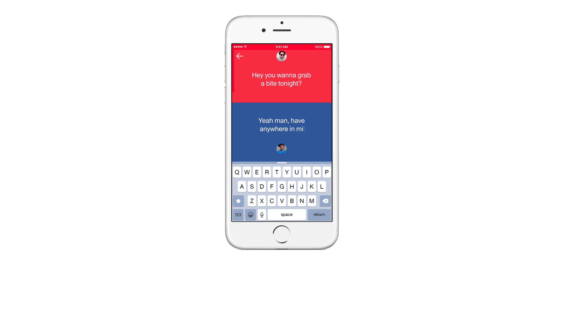
TL;DR: Focus on doing one thing really, really well. You'll make your app easy to use and allow the greatest number of people to adopt it. Growth and potential will follow suit.
And if you’re struggling to focus the design, try one of two techniques: the 80/20 rule or progressive disclosure.
80/20 Rule
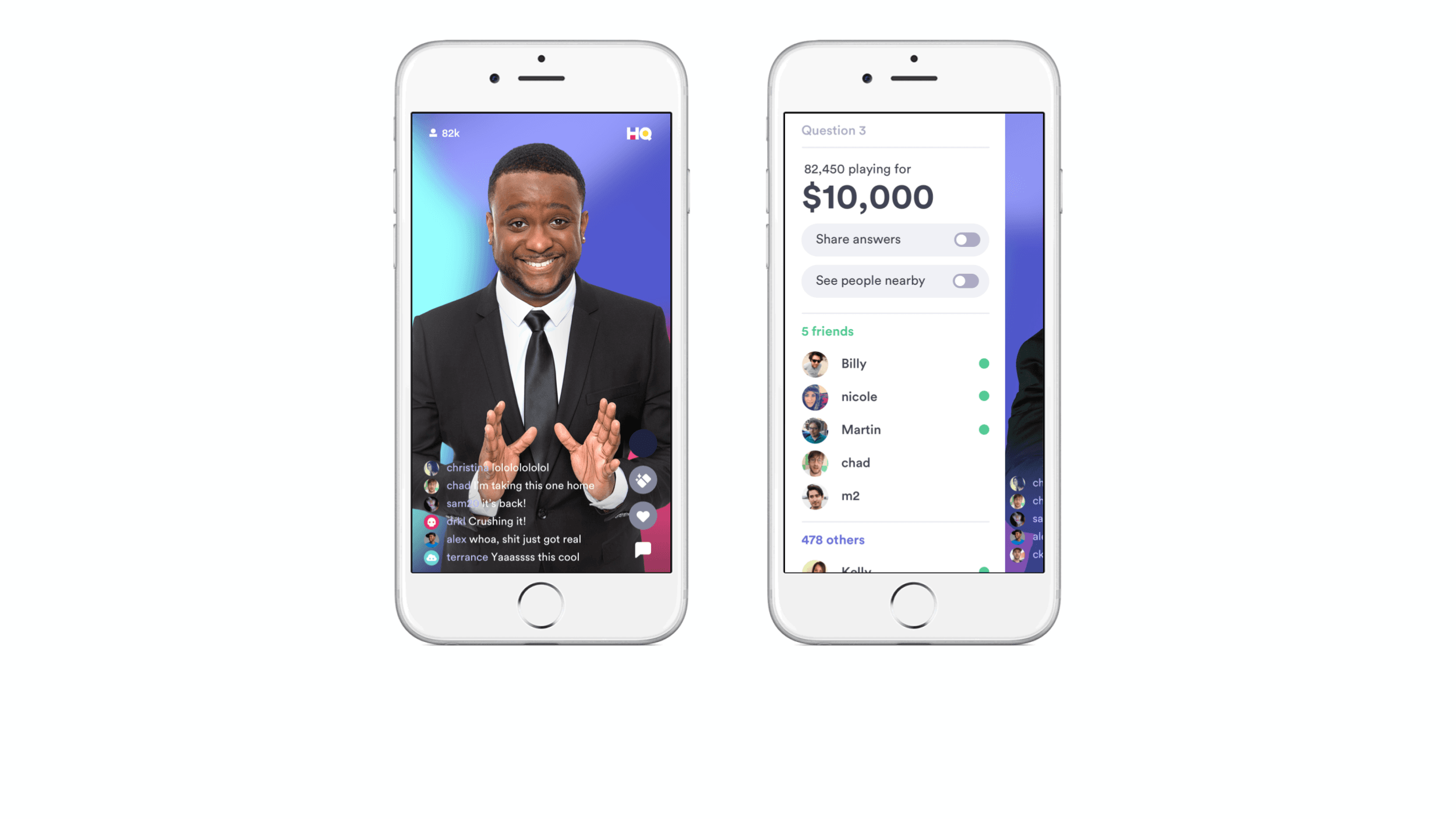
The 80/20 rule states that 80 percent of a system’s impact typically comes from just 20 percent of its elements. HQ Trivia exemplifies this approach. The primary focus is the host asking questions (the 20 percent), but additional features — like the question number, prize details, and the player list — are available through a swipe, keeping the main experience focused.
Progressive Disclosure
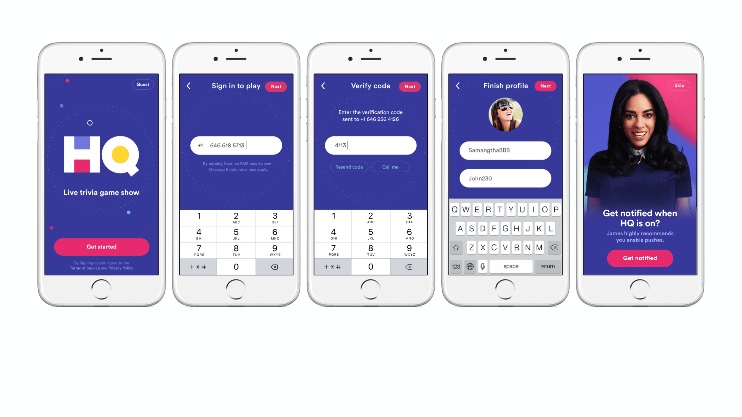
Another technique to manage complexity is called progressive disclosure. This means you progressively disclose information across multiple screens; instead of overloading one screen with multiple requests for information, you sequence it over the course of many steps (e.g. setting up a profile on a dating app).
Mental Models
Our prior knowledge influences how we perceive and how we behave when we encounter a system or an interaction. These are called mental models. As a designer, it's important to understand the mental models of your users — even if they’re not aligned with your own.
Take a look at this faucet, for example.

This design is very intuitive. It's clear that when you turn the left handle, you'll get some hot water, and when you turn the right handle, you'll get some cold water. You could adjust the flow of the water coming out of each.
Now, looking at this faucet design. Are you confused?

We often come across intuitive designs and not-so-intuitive designs. This mismatch of mental models between the designer and the user is what causes frustration.
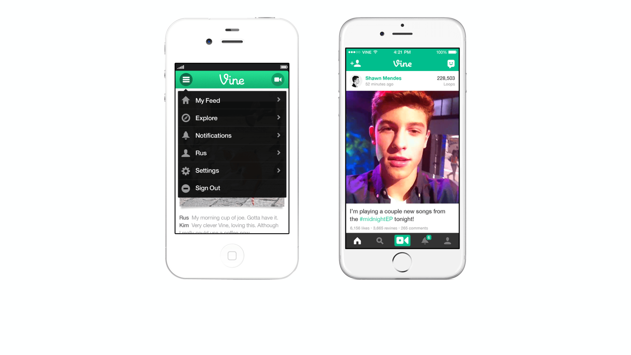
A very early version of Vine had the main navigation in a dropdown menu in the top left of every screen. This turned out to be a frustration point for our users. We later improved the experience and implemented a tab bar at the bottom of the screen. This allowed users to more comfortably move around the app.
Understanding your user's mental models is a kind of empathy for the user. Pay close attention to this.
Benefits of Adopting Human-Centered Design
Increased User Satisfaction and Retention
Human-centered design is all about creating products that authentically meet people’s needs. When you prioritize users throughout the design process, you develop products that are more intuitive and enjoyable to use. This enhances customer satisfaction and fosters loyalty.
Better Usability and Accessibility
By emphasizing function and ease of use, you remove the barriers that prevent users from interacting with your product. Human-centered design makes your product more accessible to different audiences and a wider range of users, expanding your reach.
Reduced Costs and Time
Identifying usability issues and leveraging user feedback early on in the design process reduces the risk of costly redesigns during the development phase. Iterative testing and continual improvements also streamline the path to launch, minimizing the time and resources needed for potential corrections.
Competitive Advantage and Brand Differentiation
Today’s consumers value usability above all else, so products with a great user experience tend to stand out. Companies that design their products through a human-centered approach are also seen as more inventive and customer-centric, which can strengthen brand reputation.
Heightened Innovation and Creativity
Human-centered design encourages looking beyond traditional approaches and instead considers new perspectives. This naturally leads to unique solutions that more effectively address users’ needs and pain points.
Common Misconceptions about Human-Centered Design
“Human-centered design and design thinking are the same thing.”
Design thinking focuses on creative problem-solving to tackle broader, high-level challenges across many different fields and industries. Human-centered design also involves creative problem-solving, but it centers around iterating on and improving a specific product or service to align with deep-rooted human needs.
“Human-centered design is just about user-friendliness.”
Human-centered design is more than making products functional, accessible, and intuitive. It’s about understanding people — their needs, problems, values, behaviors, and expectations. This approach requires designers to look at their audience as humans, not just as users.
“Human-centered design is only relevant to designers.”
Understanding the user serves every part of the product development process, including product strategy, engineering, and marketing. The human-centered design approach fosters collaboration between teams and guides them toward more impactful solutions that both benefit users and align with business goals.
“Human-centered design is one-size-fits-all.”
Human-centered design adapts to every unique target audience, their particular contexts and experiences, and the industry a digital product operates in. This process requires ongoing research and iteration, which means that one solution rarely fits all users or situations.
“Human-centered design only applies to digital products.”
While it’s most commonly associated with digital products, human-centered design applies to several areas and disciplines — from physical products to architecture and public services. No matter the space or form, human-centered design still has one goal: to understand and meet the needs of the end-user.
Interested in bringing human-centered design to your digital product? We’d love to talk.
