The Big Human Guide to Graphic Design Styles

A great designer is a good researcher. The best draw from a deep library of graphic design styles to communicate clearly and intentionally. It’s rooted in understanding where visual language comes from, how it evolves, and why it works.
At Big Human, our team of designers understand the effect and impact of these styles so that we can strategically push design forward. Graphic design trends rise and fall, but their influence can be timeless.
Likewise, knowing when and how to use them can elevate branding, strengthen product experiences, and create work that feels meaningful. On every client project, we decide which ideas to draw inspiration from and which to bend so the end result feels uniquely tied to the product.
Below, we break down some of the most notable graphic design styles — based on their influence on contemporary approaches — and explain how to use them across branding and digital design.
What Influences Graphic Design Styles?
Graphic design movements mirror their eras. They respond to culture, technology, and shifting values — borrowing from what came before or rejecting it outright. Swiss Style, for example, simplified layouts in the 1950s to make communication clearer across borders, while skeuomorphism in the 2000s helped people adapt to a new, touchscreen-based world.
As tech advances and expands a designer’s toolkit, it opens up new creative possibilities and techniques. From the printing press to modern design software, each technological shift has opened new ways to share information and capture attention. Today’s styles are part history, part innovation — and understanding both sides makes it easier to use them intentionally. Moreover, understanding how they shape perception, usability, and brand meaning is what makes them valuable in practice.
The Role of Graphic Design Styles in Branding and Digital Design
Graphic design styles are the backbone of branding and digital design — and they’re more than aesthetic choices. The style you choose shapes how people interpret your brand’s values, how they feel when they interact with your product, and how quickly they recognize you in a crowded market.
Different graphic design styles evoke distinct emotional responses. Bauhaus emphasizes function, structure, and clarity. Swiss design communicates order and precision. Postmodernism introduces contrast, personality, and tension by intentionally breaking conventions. These associations matter, and they follow your brand wherever it lives.
In digital product design, style directly influences usability, hierarchy, and how easily people process information. Minimalism and flat design thrive in interfaces because they support clarity and scalability, while expressive design styles bring richness to brand-focused experiences. Striking that balance is the real work.
Design Styles Should Guide Decisions, Not Dictate Them
Most brands don’t struggle because of style; they struggle because they lack intentionality. Design styles are only useful when they serve a purpose. Problems arise when teams treat a style as a fixed aesthetic to apply uniformly, rather than a set of principles to interpret and evolve. In those cases, decisions become arbitrary, interfaces prioritize appearance over usability, and visual language stops responding to real-world needs.
At their best, styles function as frameworks for thinking. They help teams make consistent decisions across layout, typography, motion, and interaction — but without locking them into rigid rules.
“At Big Human, we are not constrained by specific styles,” John Kim, Big Human’s Director of Design, said. “Instead, we borrow principles, test them against real use cases, and adapt them to the product, audience, and constraints at hand. The goal isn’t to ‘look minimal’ or ‘feel expressive,’ it’s to communicate clearly and intentionally.”
We help teams choose styles that support both brand and function, then translate them into scalable systems. We design human-first experiences that feel intentional, expressive, and usable across products and touchpoints.
Historic Design Styles Influencing Modern Digital Design
Many of the styles still shaping digital products today originated long before screens, web design, or apps. They emerged in response to cultural shifts, new tech, and changing ideas about how information should be organized and communicated.
The styles that follow are best understood as sources of design principles teams can draw on, adapt, and combine — not as fixed templates to apply literally. In modern digital design, these movements rarely appear in their purest form. Instead, their ideas show up in layout systems, typography choices, interaction patterns, and visual hierarchy blended to meet the needs of contemporary products.
Swiss (a.k.a. International Style)
Developed in the 1950s, Swiss Style — or International Typographic Style — expanded on early modernist movements. Rooted in ‘form follows function,’ it emphasized clarity during a time when increased global exchange and multilingual publishing demanded visual precision.
Swiss designers introduced asymmetric grid systems, clean sans-serif typefaces, and photography-driven layouts, prioritizing readability over decoration. It was one of the first modern design movements to set elements asymmetrically within a grid, emphasizing simplicity and readability. It’s rational, highly structured, and has since shaped countless design systems. (In fact, Swiss style remains an influence in Big Human’s approach to visual systems and accessibility.)
Key Characteristics:
Sans-serif fonts
Asymmetric grid-based layouts
Clean structure, consistent spacing, and visual restraint
Swiss Style in Context
You’ll see Swiss principles across a lot of our work, like TD Ameritrade’s interface, where clear hierarchy, strong grids, and disciplined typography are critical for making high-level info feel simple and actionable.
Bauhaus
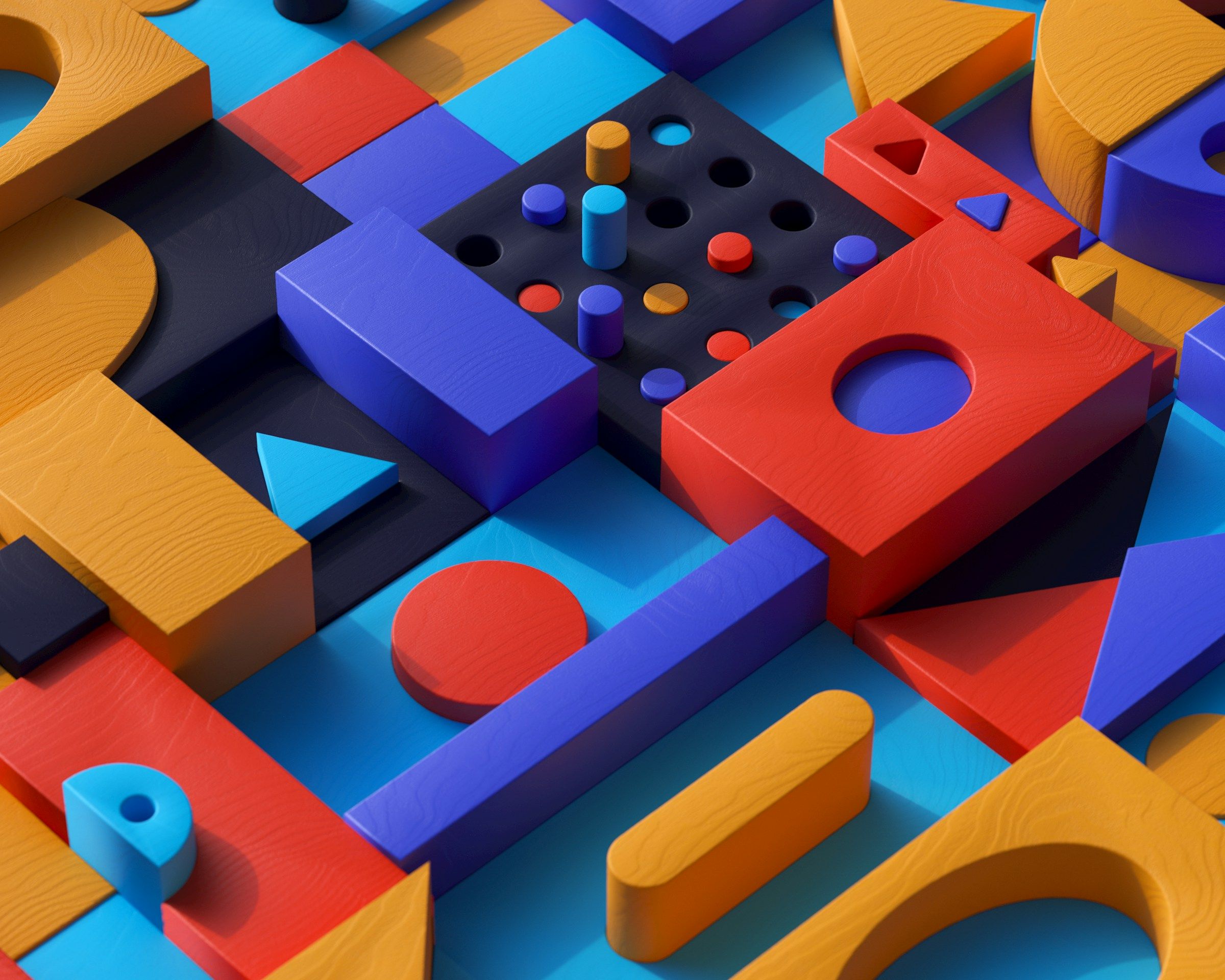
Emerging in the early 20th century,Bauhaus fundamentally reshaped how designers think about form, function, and systems. Rather than treating design as decoration, the movement positioned it as a practical discipline rooted in clarity, efficiency, and purpose.
Bauhaus embraced geometric shapes, rational layouts, and functional typography as tools for communication. Circles, squares, straight lines, and modular grids weren’t aesthetic choices alone; they were a way to easily make design reproducible, scalable, and accessible across mediums. The guiding idea was simple but radical for its time: Design should serve people first.
That philosophy continues to influence modern digital design. Bauhaus principles underpin many contemporary interfaces, from grid-based layouts and modular components to system-driven design languages that prioritize usability over ornamentation. When applied thoughtfully, Bauhaus isn’t about looking stark or minimal — it’s about creating order that makes complex systems easier to understand and use.
Key Characteristics:
Geometric forms and modular composition
Strong alignment, hierarchy, and visual structure; vivid colors
Function-first approach to layout and typography
Bauhaus in Context
Bauhaus principles often come into play when products need to communicate dense or complex information clearly. In Big Human’s work with Fusion Worldwide, geometric systems and structured layouts helped organize large volumes of data into interfaces that felt logical and approachable.
Art Deco
Art Deco transcended design fields. At its height in the 1920s and 30s, its influence could be seen in interior design, architecture, fashion, and visual arts. As a more structured response to Art Nouveau, it embraced modernity, technology, and the optimism of industrial expansion after World War I.
The style is defined by bold geometry, symmetry, and visual richness. Saturated colors, metallic finishes, and strong vertical emphasis were used to signal luxury and progress. Typography tended toward bold, capitalized forms, reinforcing a sense of scale and glamour. Art Deco felt forward-looking without abandoning sophistication, which made it especially effective in advertising and premium branding.
Designers reference Art Deco today when they want to evoke refinement, authority, and a sense of grandeur.
Key Characteristics:
Strong geometric forms and vertical emphasis
Bold, vibrant colors and metallic finishes
Decorative structure layered over clear hierarchy
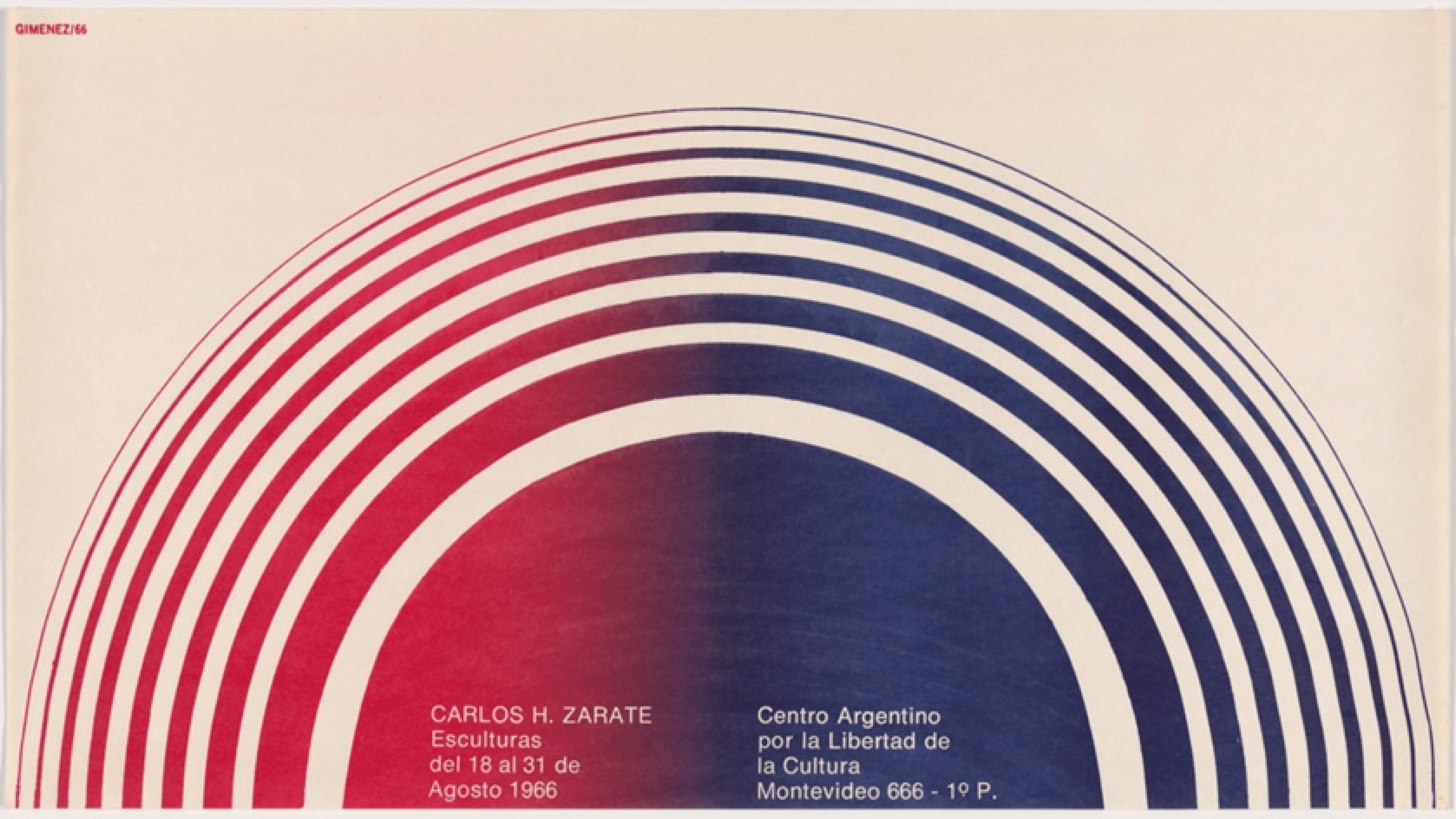
Constructivism
 Constructivism rose alongside the early Soviet era as a radical departure from decorative art, positioning design as a practical tool for mass communication and collective action rather than individual expression. It was influenced by the forward momentum of Futurism and treated design as something to be engineered for clarity, impact, and purpose.
The style is defined by bold geometry, strong contrast, and dynamic composition. Diagonal layouts, striking typography, limited color palettes, and montage techniques were used to create a sense of motion and urgency. Like Futurism, Constructivism embraced energy and progress; like Bauhaus later on, it rejected ornamentation in favor of structure. Every element served a purpose, and excess was stripped away in service of clear, directive communication.
In modern digital design, Constructivism’s influence is used less as a literal design style and more as a strategic approach to hierarchy and direction. Its principles inform systems that need to command attention, guide focus, and communicate decisively. When applied thoughtfully, Constructivist ideas help designers cut through noise and create experiences that feel deliberate and assertive.
Key Characteristics:
Bold geometric forms and diagonal composition
High-contrast color palettes and typographic emphasis
Utility-driven design focused on clarity, motion, and impact
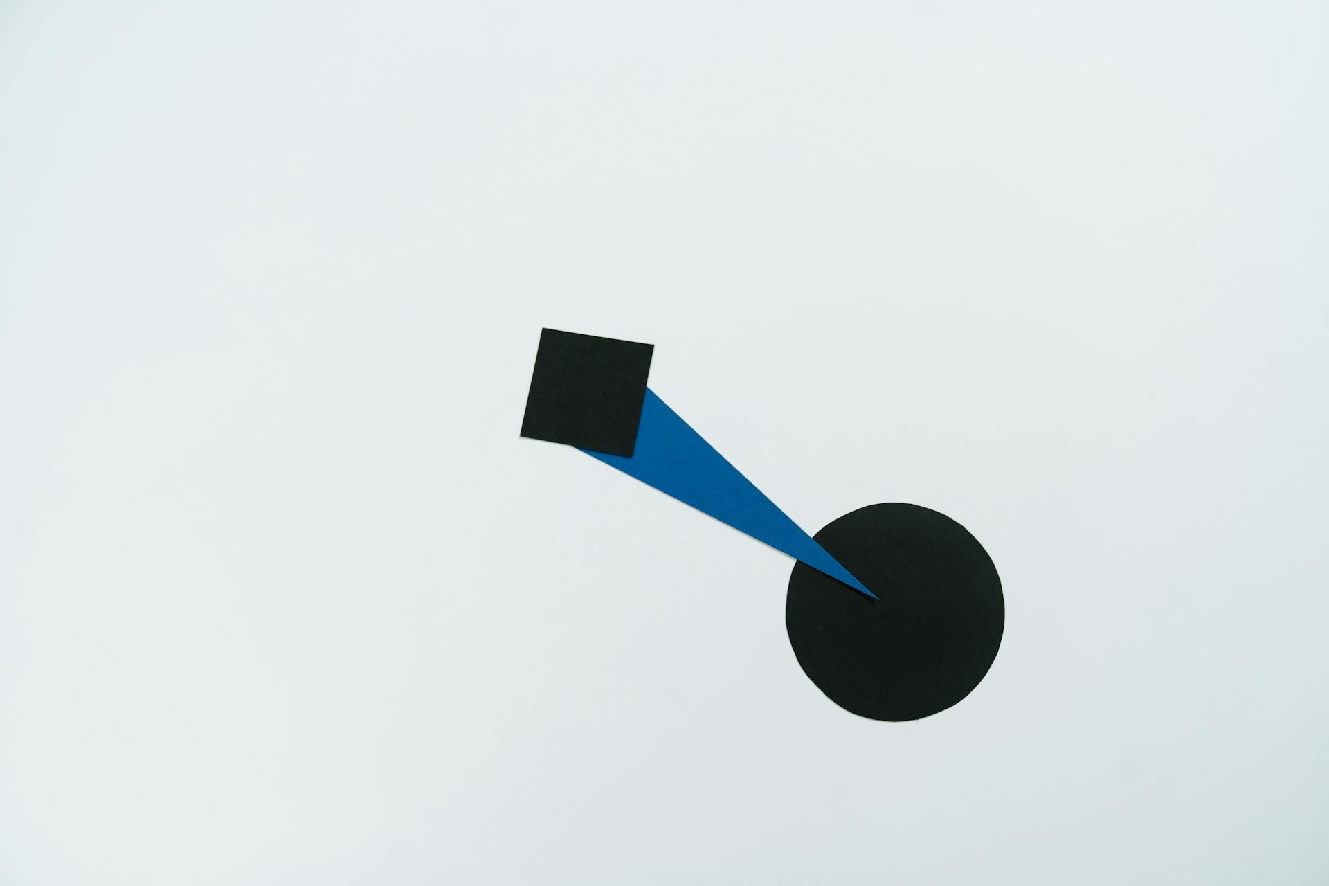
Minimalism
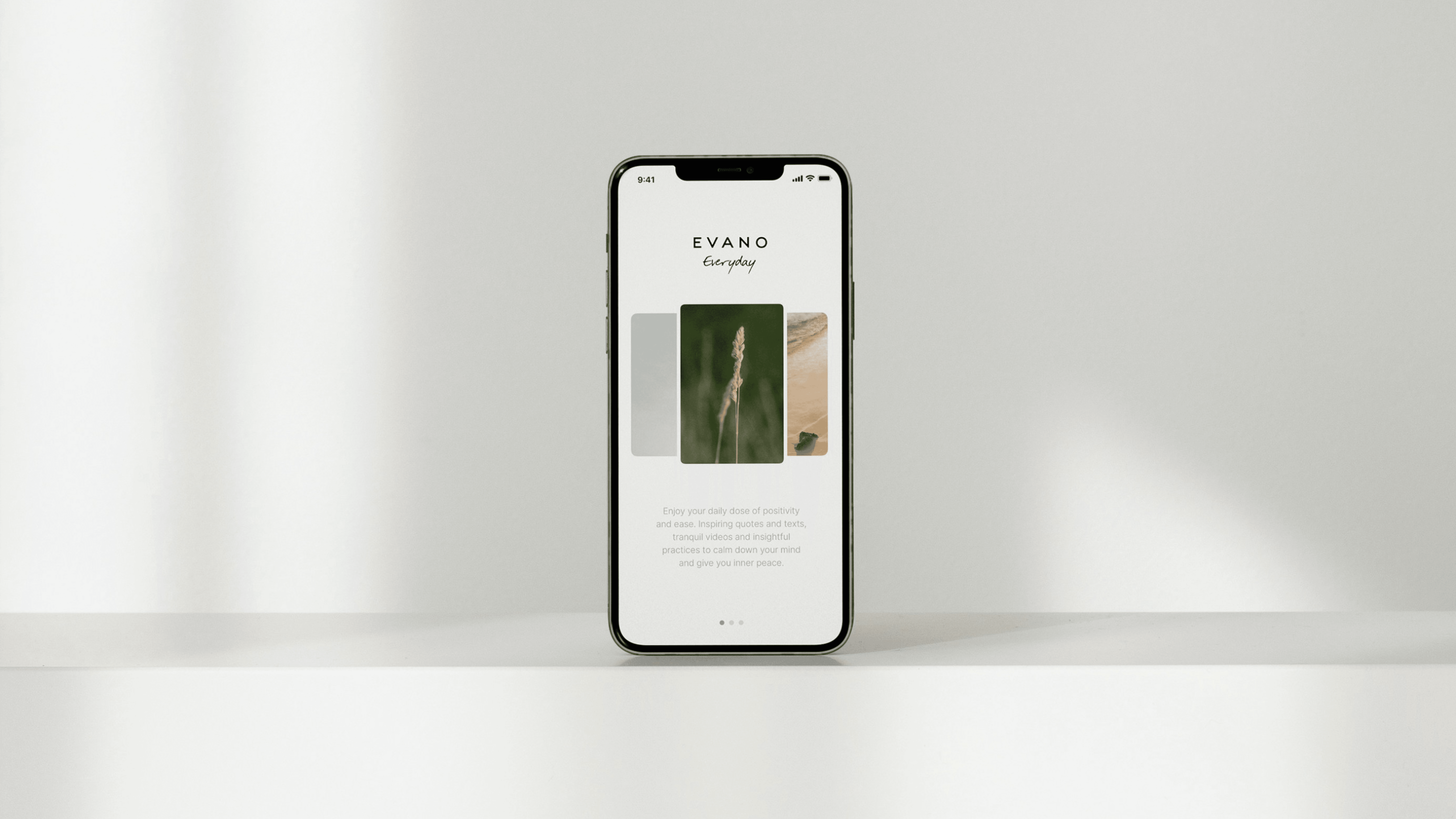
Minimalism isn’t empty — it’s intentional. While minimalist principles have surfaced throughout design history, the movement gained prominence in the 1960s as a response to visual excess in earlier art and advertising. The style re-emerged in the 2010s with the rise of digital product design, where reducing visual noise improved usability and accessibility across screens.
By stripping away unnecessary design elements, minimalism emphasizes function and focus, allowing content to stand out in its simplest form. Clean typography, thoughtful negative space, and limited color palettes create calm, focused compositions where content takes priority. Every element earns its place, and hierarchy is established through spacing rather than embellishment.
When used intentionally, minimalism clarifies. When applied by default, it flattens personality and erases nuance, producing products that function well but fail to express what makes them distinct.
Key Characteristics:
Generous negative space that improves focus and readability
Limited color palettes
Clean, functional typography and strong grid systems
Minimalism in Context
Minimalist design is a common starting point in our product work, especially for enterprise dashboards. We use minimalism to highlight hierarchy, guide decisions, and keep complex tools from feeling overwhelming.
Postmodernism
Postmodern design was a response to the strict rationality and uniformity of modernist design styles, like Swiss. Where modernism emphasized order and clarity, Postmodernism reintroduced experimentation, personality, and contradiction. It often embraces the unexpected through bold color schemes, eclectic typography, and unconventional composition.
Postmodernism doesn’t reject structure, though; it plays with it. Designers blend high and low cultural references, remix historical styles, and use irony, humor, and collage to challenge visual norms. Retro design (think ‘60s, ‘70s, ‘80s) and alternative movements like grunge drew from these ideas, translating Postmodernism’s expressive freedom into rougher, more deliberately imperfect visual languages.
The style injects energy and attitude into design systems, particularly for brands speaking to creative, youth-driven, or countercultural audiences. The key isn’t chaos for its own sake, but knowing when breaking the rules reinforces the message.
Key Characteristics:
Mix-and-match typography and visual elements (sometimes hand-drawn)
Bright colors with combinations that often clash
Layered, collage-style layouts that favor expression over uniformity
Brutalism
Brutalism takes inspiration from post–WWII architecture, translating an emphasis on utilitarian motifs into contemporary digital design. Rather than polished interfaces, Brutalist design exposes its construction. It favors visible grids, hard edges, oversized typography, and unapologetically direct layouts.
In digital products and branding, Brutalism’s defining philosophy is clarity through confrontation. Components appear raw or unfinished by design, using stark contrast and minimal ornamentation to draw attention to function and hierarchy. While it may look aggressive on the surface, effective Brutalist work is highly intentional.
Brutalism also shares DNA with more abstract design styles. It reduces interfaces to their essential parts, embraces tension over harmony, and uses visual friction to provoke attention and emotion. It communicates confidence, transparency, and a willingness to break convention — making it especially compelling for editorial platforms, experimental products, and brands that benefit from standing apart from the mainstream.
Key Characteristics:
Exposed grids, heavy borders, and sharp edges
High-contrast, deliberately assertive color palettes
Oversized, utilitarian typography and visibly constructed components
Contemporary Digital Styles
Contemporary design styles formed directly from the realities of digital products: evolving platforms, new interaction patterns, changing user expectations. They develop through practice, shaped by what scales well, what performs clearly across devices, and what feels intuitive.
Like historic styles, these approaches are best understood as flexible systems rather than fixed aesthetics. They reflect current limitations and opportunities in digital design, and are most effective when adapted to a product’s goals, audience, and context — not followed as trends for their own sake.
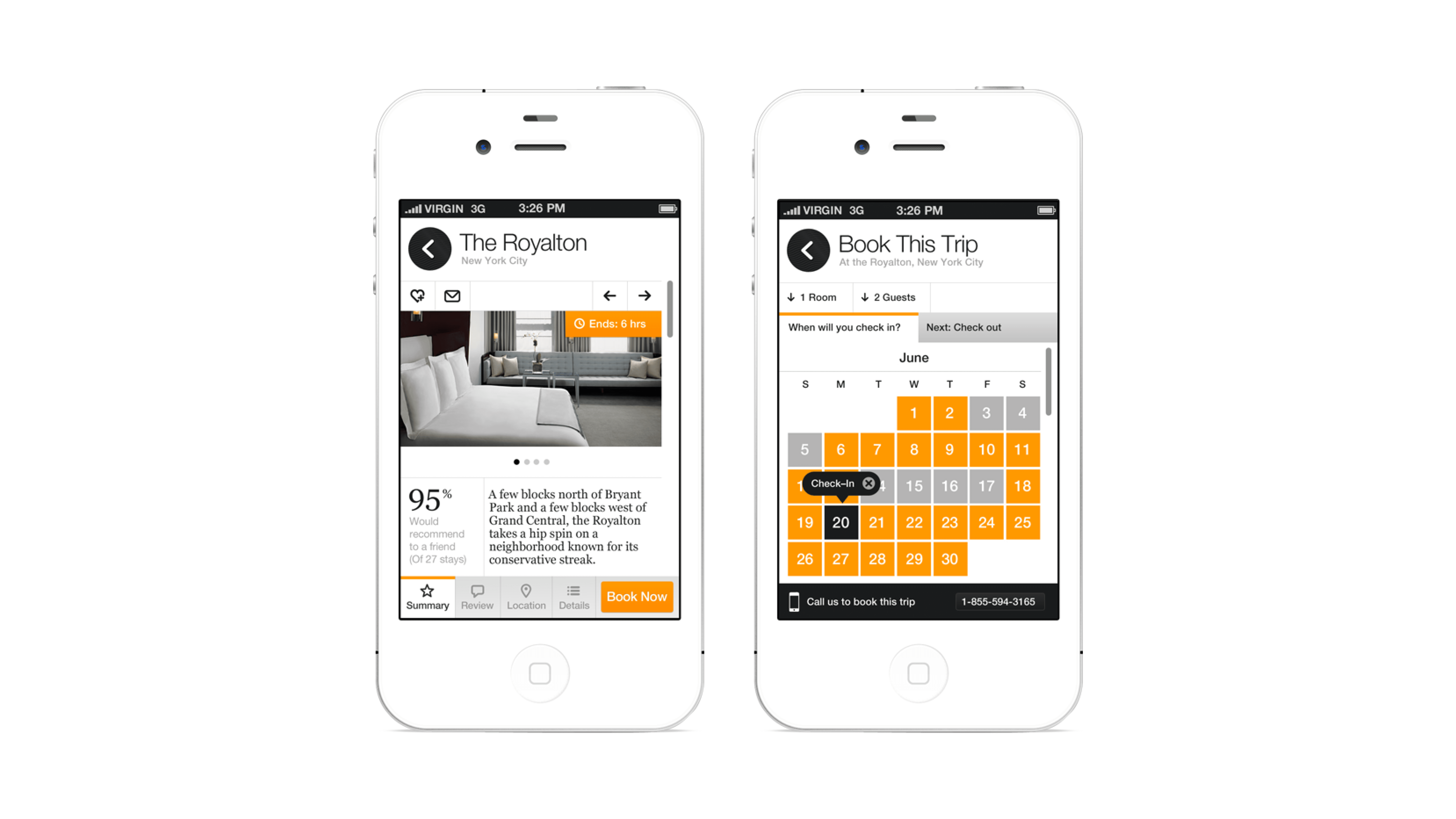
Skeuomorphism

Skeuomorphism was popular in the early days of interface design as a practical response to a new challenge: helping people understand unfamiliar technology. While its roots stretch back to physical product design, it surged in popularity with early desktop interfaces and again with the launch of Apple’s first iPhone in the mid-2000s.
Skeuomorphic design imitates real-world objects to communicate purpose and functionality — think note apps that resemble paper, switches with realistic shadows, or buttons that mimic raised surfaces. By using depth, texture, and lighting, it lowers cognitive load and makes interfaces feel immediately familiar.
Skeuomorphism is less common today, but its principles remain useful in onboarding flows, educational tools, and experiences that benefit from real-world cues.
Key Characteristics:
3D, tactile shapes and elements
Digital elements modeled after real-world objects
Use of shadows, gradients, textures, and depth for realism
Flat Design
Flat design gained prominence as interfaces matured and users no longer needed realistic visual cues to understand how digital products worked. As skeuomorphic patterns faded, flat design offered a cleaner, more efficient approach that translated well across screens and devices.
Influenced by minimalist principles and shaped by the demands of digital products, flat design reduces visual depth in favor of crisp 2D elements, clear iconography, and focused use of color and white space. The emphasis is on usability and legibility — simple forms, balanced composition, and visual cues that guide attention without relying on shadows or texture. It became a defining approach in early mobile interfaces and continues to influence current interface design.
Key Characteristics:
Simple 2D shapes and interface elements
Clean lines and intentional color palettes
Heavy use of iconography, pictograms, and illustration
Flat Design in Context
Flat design shows up often in our dashboards because it boosts speed, accessibility, and scalability. On platforms like Quinn, we rely on hierarchy, typography, and imagery to do the heavy lifting that shadows and textures once provided — making interfaces easier to evolve as products grow.
Neumorphism
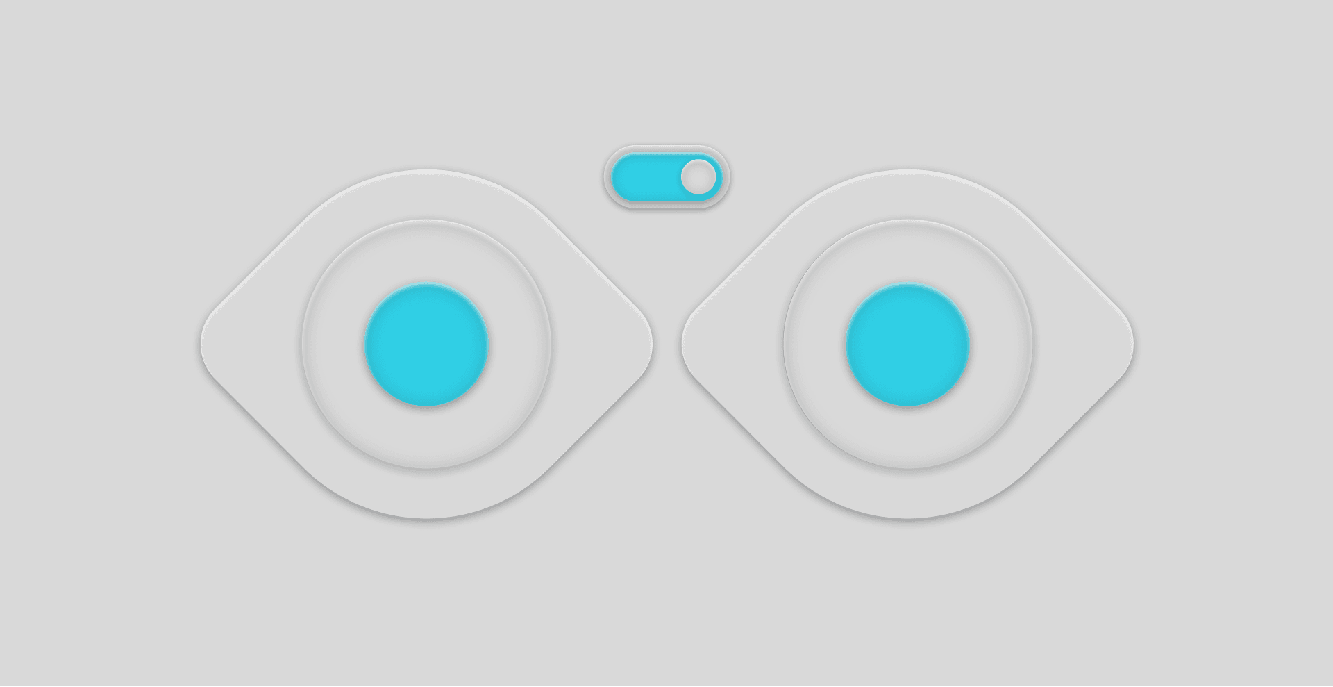
Neumorphism was an experimental counterpoint to flat design. Where the latter intentionally removes depth and shadow, neumorphism reintroduces them subtly — blending minimalist layouts with the tactile cues of skeuomorphism. Soft highlights and drop shadows create interfaces that appear gently extruded from the background, giving a smooth, almost physical presence.
Visually, neumorphism can feel refined and contemporary. Practically, it introduces real challenges. Because the style relies on low contrast and ultra-soft shadows, important interface cues can be difficult to perceive for some users. This raises accessibility and usability concerns that limit its effectiveness at scale. Critically, neumorphism rarely works as a system-wide approach.
When used selectively, however, it can add warmth and dimensionality. Applied to individual components rather than entire interfaces, neumorphic elements can enhance tactility without compromising clarity.
Key Characteristics:
Soft, extruded shapes that appear molded from the background
Subtle highlights and shadows instead of strong gradients; monochromatic or muted colors
Low-contrast, tactile visuals that require careful accessibility consideration
Neumorphism in Context
Neumorphism works best as an accent. We might use drop shadows to soften a card or button, like the cards on TaskRabbit’s interface where accessibility issues are less likely to develop because of the logical gridwork. Used this way, it adds visual interest without introducing friction or accessibility risk.
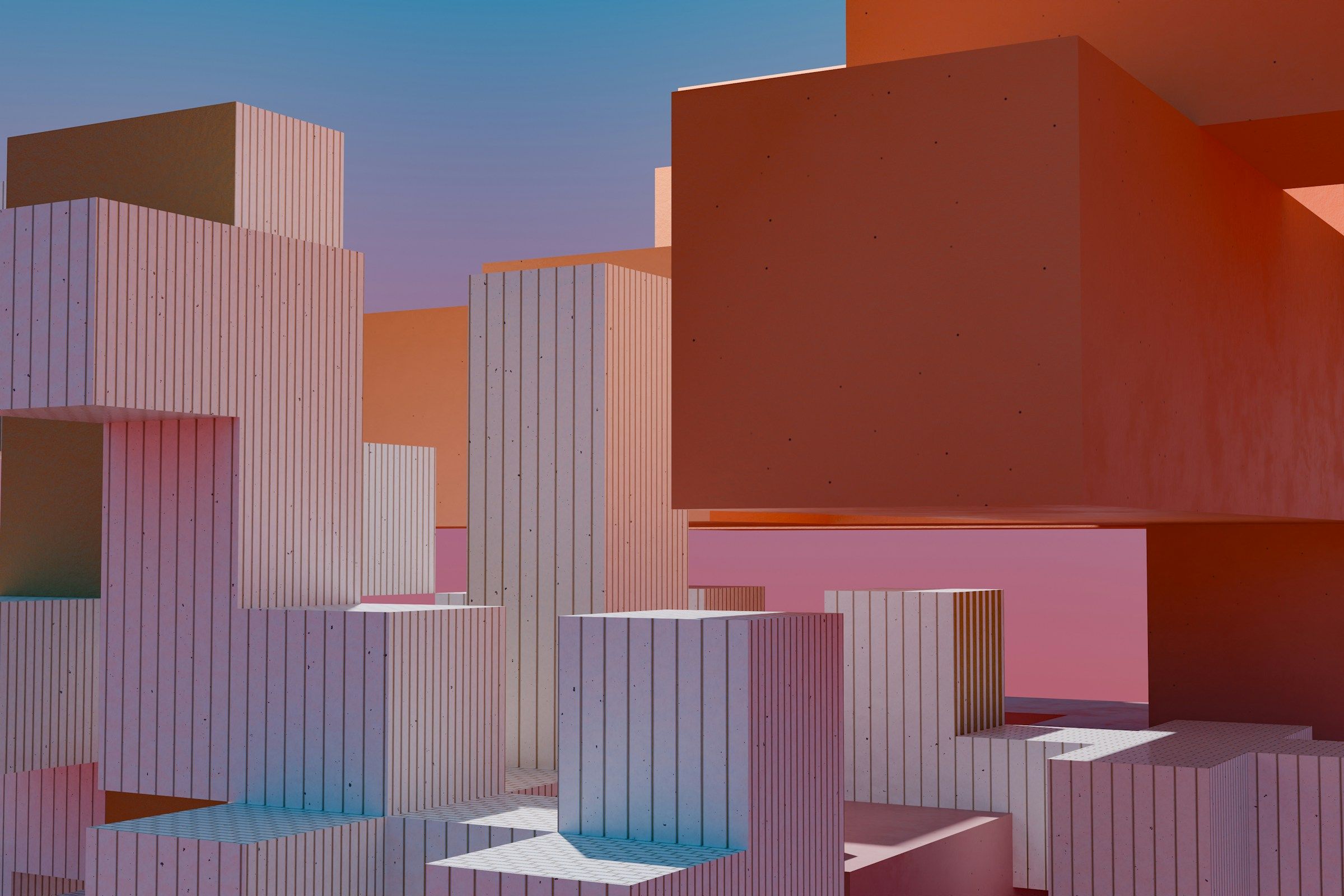
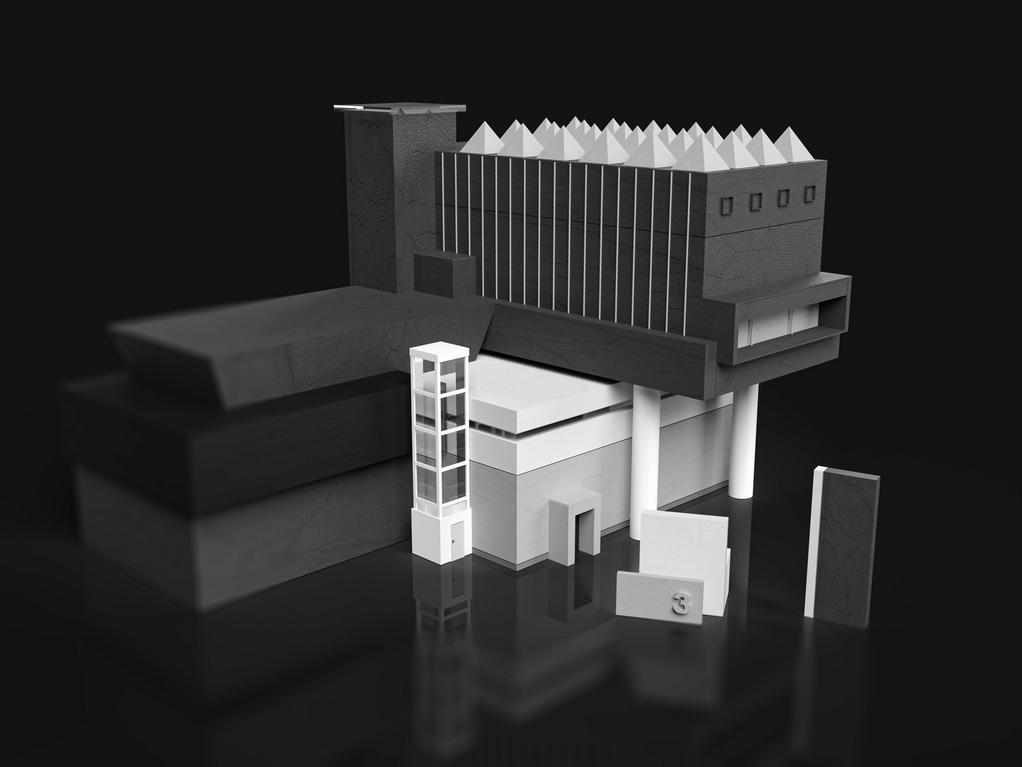
3D Design
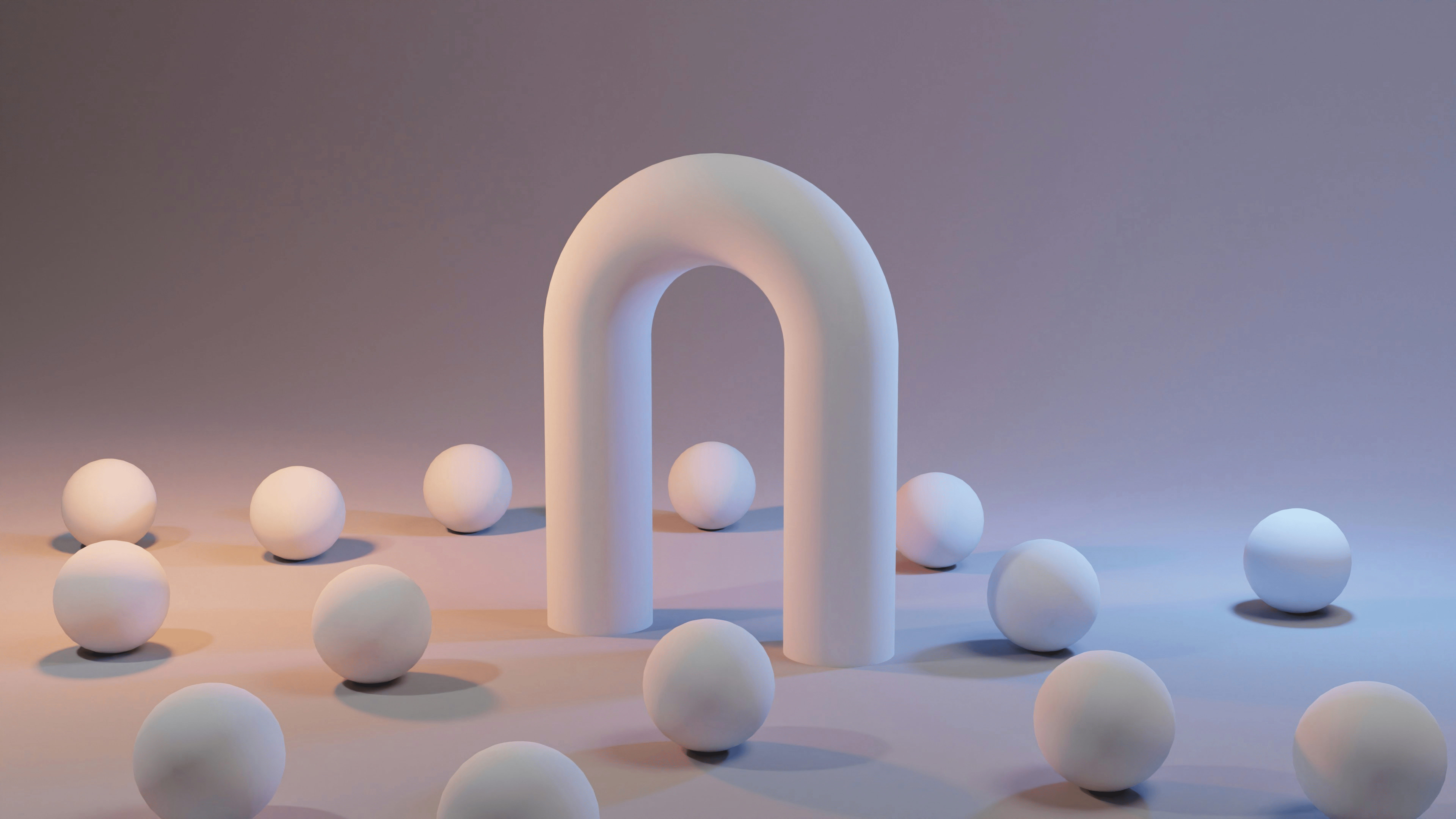
3D design introduces spatial depth and dimensionality, enabling digital experiences that feel immersive, tactile, and expressive. It originated as a rendering approach for realistic product visualization, then expanded into animation, gaming, and interactive environments — especially as real-time rendering and tooling have advanced.
Like skeuomorphism, 3D relies on light, shadow, and surface detail to create dimensional forms. Unlike skeuomorphism, it isn’t limited to mimicking physical objects. 3D design spans everything from photorealistic imagery to fully abstract worlds, allowing brands and products to communicate emotion, scale, and motion beyond the constraints of 2D layouts.
In modern digital design, 3D is most effective when used to enhance storytelling, brand expression, and immersive experiences rather than serving as a default interface layer.
Key Characteristics:
Photorealistic or stylized dimensional forms
Dynamic lighting, shading, and texturing
Immersive visuals suited for branding, motion, and experiential design
Glassmorphism
Made popular by Apple’s “Liquid Glass” design system, Glassmorphism reintroduces depth and layering without abandoning the clarity of flat systems. The style uses translucency, blur, and subtle motion to imply spatial relationships between interface elements.
Visually, glassmorphism relies on frosted backgrounds, soft shadows, and layered surfaces that allow content to sit ‘above’ or ‘behind’ one another. It doesn’t mimic physical objects, though; communicating hierarchy through transparency and depth instead. When carefully applied, this creates interfaces that feel light and contemporary without becoming overly ornamental.
Like neumorphism, glassmorphism introduces accessibility considerations. Excessive blur or low-contrast layering can reduce legibility, especially when background content competes for attention. As a result, glassmorphism works best as a selective system applied to panels, navigation layers, or other elements where hierarchy and contrast can be tightly controlled.
Key Characteristics:
Translucent surfaces with background blur
Layered depth created through opacity and motion
Soft shadows and highlights that suggest elevation
How to Choose the Right Graphic Design Style for Your Brand
Choosing a graphic art style isn’t a surface-level decision; it’s a strategic one. This is where brand strategy, positioning, and messaging come into play. For our clients, it starts long before visual exploration, rooted in brand strategy, positioning, and a clear understanding of what the product needs to do in the real world.
Here’s how we approach it.
We start with audience, context, and constraints
Before any visual direction is explored, we work with teams to understand who the design is for, how it will be used, and where it needs to perform. A FinTech dashboard, a consumer-facing app, and an editorial brand all place very different demands on design.
We also look outward. By analyzing competitors and category norms, we identify where a brand can align with expectations… and where it can intentionally diverge to stand out.
We translate brand values into visual principles
Graphic design styles only work when they reinforce a brand’s personality and values. Rather than picking a style outright, we define a small set of visual principles — clarity, warmth, confidence, expressiveness — and evaluate which styles support those traits.
Certain graphic design styles may align better with your brand values, which will naturally reinforce the identity you want to project. Most often, the right solution isn’t a single style, but a thoughtful blend.
We design for the medium (not just the mood)
A style that looks compelling in a brand deck can fall apart in a real interface. That’s why we stress-test visual directions against actual use cases: navigation, dense data, onboarding flows, responsive layouts, accessibility requirements.
Some styles naturally scale better in digital environments, while others need to be adapted or restrained. Swiss Style and flat design are popular in digital-first industries because of their adaptability and accessibility. Our job is to make sure the visual language works just as well in production as it does in concept.
We build systems, not static aesthetics
Once a direction is established, we codify it into a design system that can grow with the product. This ensures consistency across platforms (from SaaS websites to social media), speeds up execution, and gives internal teams the flexibility to evolve the brand without starting from scratch.
In practice, this is how graphic design styles move from inspiration to execution, becoming the visual elements that create a living system rather than a fixed look.
Choosing the Right Style (and Executing It Well)
Great design isn’t about following what’s trendy — it’s about choosing a visual language that supports your product, aligns with your brand, and resonates with your users.
At Big Human, we help teams navigate these decisions with clarity. Whether you’re building a brand from scratch, refreshing an identity, or launching a new digital product, we translate design styles into systems that scale — from research and prototyping to experience and interface design, engineering, and ongoing iteration.
If you’re ready to make thoughtful, strategic design choices (and bring them to life), connect with us to build something great together.

