Skeuomorphism in UX Design: Guide and History
In this blog:
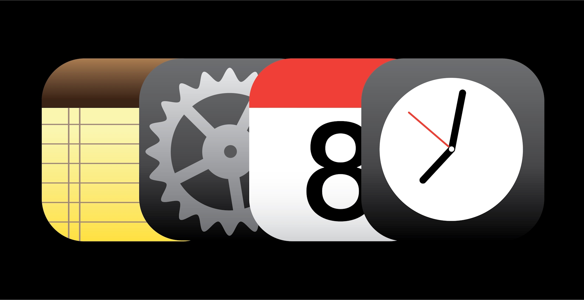
Design trends come and go, but some may argue that none have influenced our digital worlds more than skeuomorphism — the method of pulling characteristics from or outwardly mimicking the design of another object. From the very first personal computer to the mobile phones found right in the palm of our hands, we interact with Skeuomorphic Design every day. In the past few days, you’ve probably jotted down a couple of to-do lists on your Notes app, a virtual representation of a physical notepad.
Skeuomorphism is responsible for introducing us to the functions and functionalities of our favorite digital devices. There’s a short summary about it in our Guide to Graphic Design Styles, but we thought skeuomorphic design’s influence and impact deserved a longer look.
Here, we break down what skeuomorphism is and how it began.
What is Skeuomorphism?
Skeuomorphism is a design technique that’s most often used in UI/UX design. A skeuomorph imitates real-life counterparts in order to express its functionalities. Essentially, skeuomorphic designs embody “affordances,” or actions a user can take depending on the object. This makes objects on an interface feel more familiar and easier to understand. Skeuomorphs are ordinarily three-dimensional to emphasize the similarities between the digital objects and their analog equivalents.
The Origins of Skeuomorphism
The skeuomorphism design style can be traced back to the 1890s, where it was applied to material objects that had decorative representations in art and architecture. But there were two major digital shifts that sparked skeuomorphism’s resurgence: in the 1980s after the advent of computers and in the mid-2000s when Apple introduced the first iPhone.
As personal computers became more widely available, software companies created a graphical user interface to flatten the learning curve, allowing people to comfortably interact with the interface. Before this, users had to manually enter direct instructions to get their computers to perform different tasks — a skill set the average consumer lacked. This is around the time we were introduced to the trash can at the bottom of our desktop screens, a symbol for the virtual repository for our deleted files.
Former Apple CEO Steve Jobs is often credited as one of the most influential skeuomorphism pioneers. He believed computers should be simple and approachable, so that the humblest of beginners could become accustomed to it just by following their instincts. When the first generation of iPhones was released in 2007, touchscreens were relatively new, but their interfaces were almost immediately familiar. For instance, a gear symbolized the Settings app, informing users that clicking on the icon let them reconfigure their phone. The YouTube app was represented by a small TV and Voice Memos had a microphone.
However, as more and more digital novices evolved into digital natives after the 2010s, skeuomorphism started to evaporate. Users no longer need real-world objects as touchstones on their devices. Instead, designers now favor two styles: flat design, a technique that’s less intuitive but improves readability and responsiveness; and neomorphism, an approach that applies both skeuomorphic and flat design to identifiable elements in both our digital and physical worlds.
Skeuomorphism Design Principles
There are specific principles that make skeuomorphism’s distinct style instantly recognizable. The style is guided by making digital objects look and feel as physical as possible.
Analog objects as digital objects
The most defining characteristic of skeuomorphic design is its inspiration. It pulls physical objects into the digital world.
3D shapes and elements
Skeuomorphs are often depicted in 3D to emphasize the comparison to its real-life counterparts.
Gradients and shadows
Skeuomorphism plays with light, shadows, and dimensions in order to make 2D objects look 3D.
Examples of Skeuomorphism
You really don’t have to look far to see examples of skeuomorphism and its influence. If you’re reading this on an iPhone, the icon may be flatter but the Camera app mimics a physical DSLR camera and the Settings app is still represented by the well-known gear. For those who take virtual meetings through Google Meet, you’ll recognize the shape of a video camera — albeit a little more abstract.
Want to know more about other design styles? Start with the Big Human Guide to Graphic Design Styles.
Skeuomorphism FAQs
Is skeuomorphism an outdated technique?
What are the disadvantages of skeuomorphism?
What is the opposite of skeuomorphic design?
What is the difference between flat design and skeuomorphic design?
Is skeuomorphism considered a bad practice?
