The Beginner’s Guide to Typography

Typography is a design technique that’s often overlooked, but we see it every day — on advertisements, on our phones, and in our favorite brands. It’s easy to dismiss it as just nice-looking words on a screen, but typography is really more of an art form. It’s simple on the surface, but there are dozens of components that work together to bring text to life. With typography, the devil is in the details and the smallest tweaks in type can have the biggest impact.
To help you get started on your typography journey, we’ve put together this beginner’s guide that details everything you need to know about typefaces, fonts, and technical elements like leading and kerning.
What is typography?
At a high level, typography is the way characters and letters are arranged to make the copy clear and visually appealing. Typography design uses typefaces, font styles, font pairings, appearance, and structure to influence how content is conveyed and how users understand and interact with specific messages.
Why is typography important?
In terms of product design, typography impacts the user experience. It sets the tone and emphasizes messaging, creating a visual hierarchy that guides audiences and informs them what piece of information is the most important. Good typography designs command and hold a reader’s attention, and that ultimately affects how much time a user spends on your app or website.
Typography also builds brand recognition, and it’s often included in a company’s design system or brand guide. If used consistently, typefaces become instantly recognizable elements of a brand. When people see Avant Garde Gothic, it’s difficult to not associate it with Calvin Klein.
There’s also a subconscious emotional element to typography designs. They have the ability to elicit different moods and attitudes, or even transport us back in time. A traditional Times New Roman feels bookish and scholarly while a geometric Betty Noir is a time capsule of 1920s Art Deco.
Typeface vs Font
Typeface
A typeface is an entire collection of fonts. It’s a set that defines features, spacing, and balance for letters and characters. Typefaces have a few sub-categories:
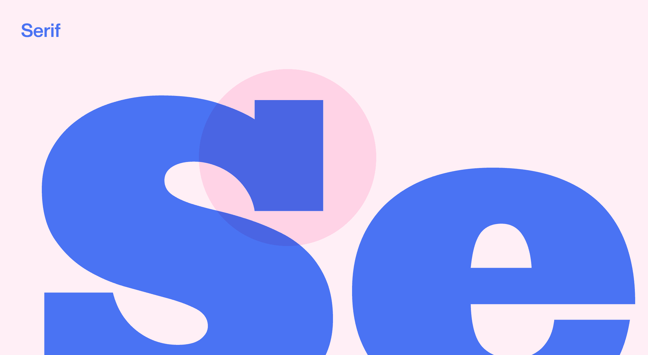
Serif typefaces have extra strokes (serifs) at the ends of letters, and they’re regarded as more classic styles. Serifs make longform text easier to read, which is why they’re often used in books and academic papers. Examples of serif typefaces include Garamond, Georgia, and, of course, Times New Roman.
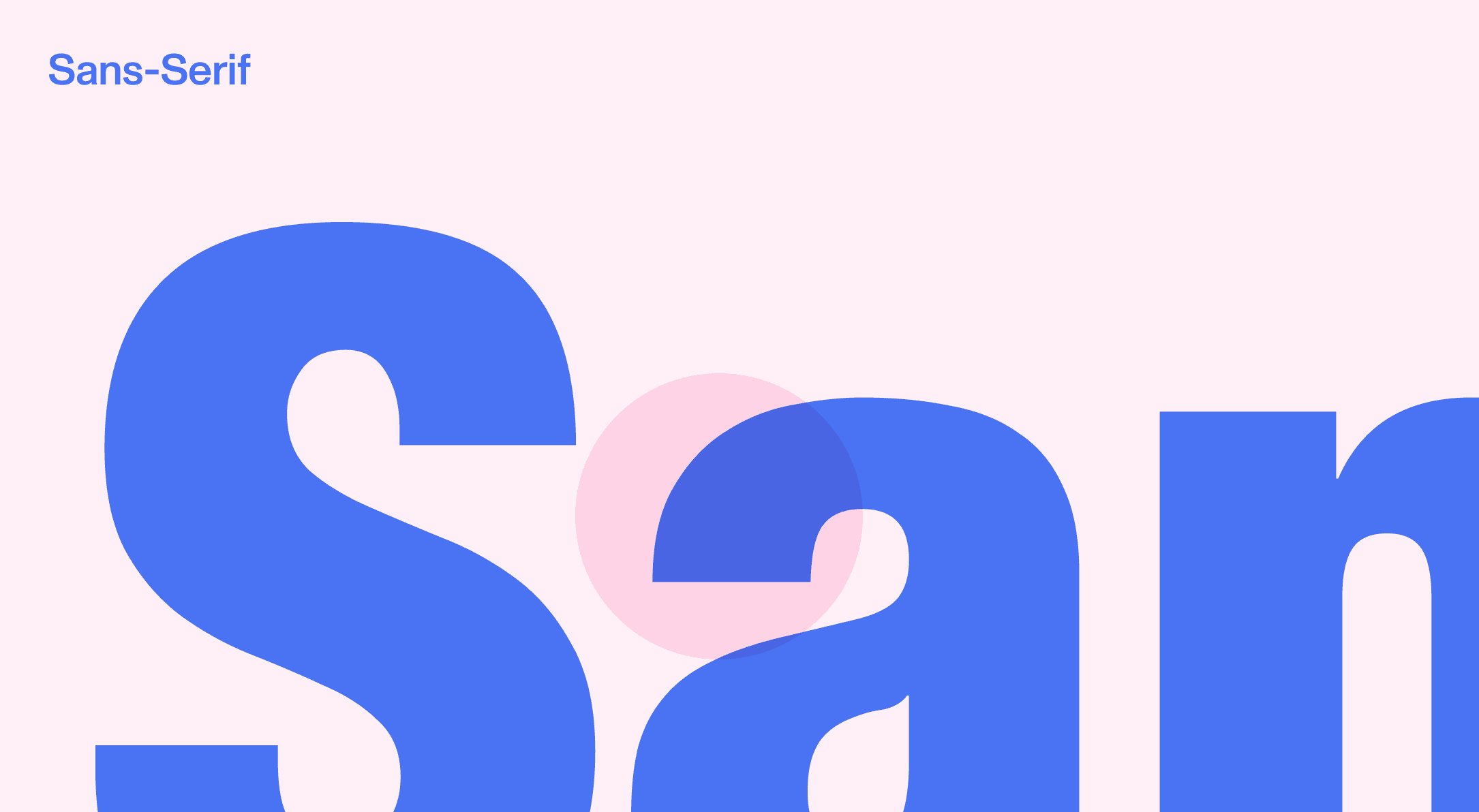
Sans-serif typefaces lack extra serifs at the ends of their letterforms. Their modern, clean look makes them perfect for digital displays, even ones with lower resolutions. Helvetica, Arial, and Verdana are all sans-serif typefaces.
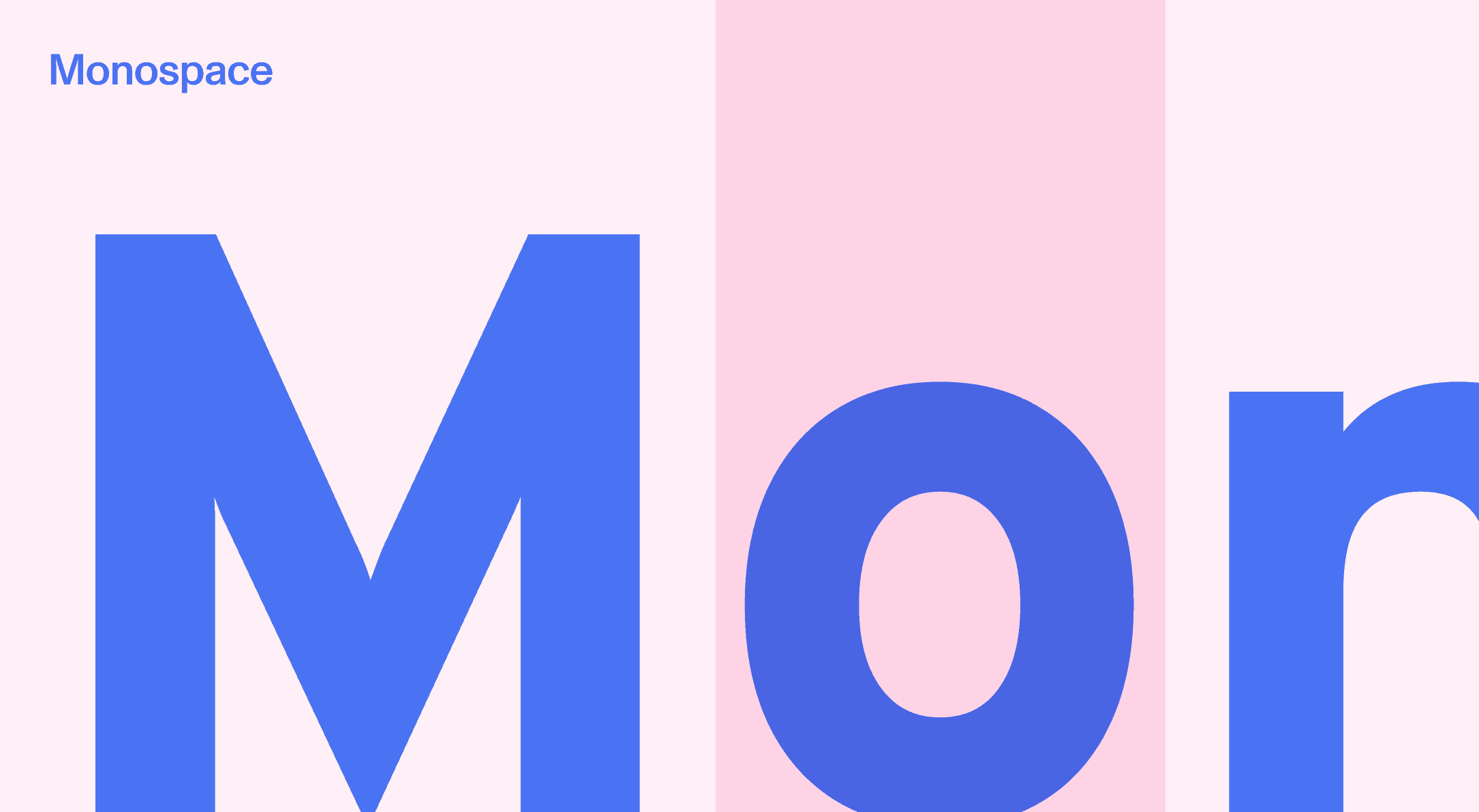
Monospaced typefaces have a fixed width and spacing for every character.
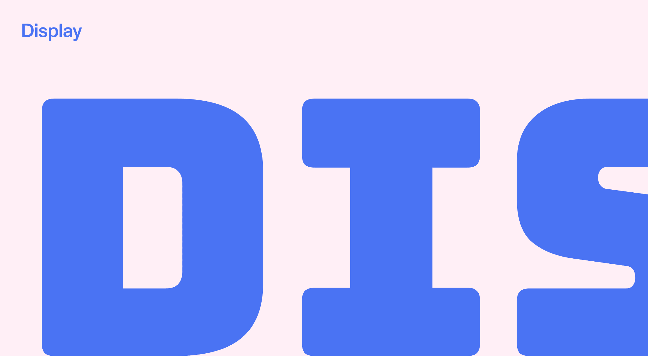
Display typefaces are larger versions of letters and characters that are meant to be used as headings.
Script typefaces imitate cursive handwriting.
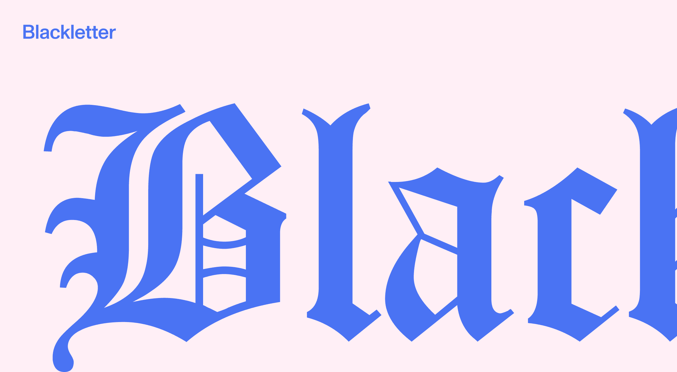
Blackletter typefaces are characterized by dramatic strokes and intricate serif swirls. Blackletters were used in early manuscript writings and their origins date back to the early 12th century. They’re usually Gothic or Old English-inspired.
Font
A font acts as an extension of a typeface. It specifies the typeface’s weight and size, and dictates whether it’s roman, bold, italic, condensed, etc. This applies to uppercase and lowercase letters and punctuation marks.
Technical Elements in Typography
Hierarchy
A typographical hierarchy establishes how text is presented or organized, and it lets readers know in what order text should be read. It often follows a headline-body copy pairing and it plays with font sizes and a page’s layout.
Leading
Leading is the distance between lines of copy — think single or double-spaced paragraphs.
Kerning
Kerning determines the spacing between two letters or characters.
Tracking
Tracking is similar to kerning but instead of adjusting the space between two letters, it modifies the spacing between all letters of an entire word.
Alignment
Alignment, or justification, regulates how text, photos, or graphics are aligned within their margins.
Left-aligned content is placed to the left margin.
Right-aligned content is placed to the right margin.
Centered content is placed in the center or middlemost area of the margin.
Justified content adjusts the spacing between letters and words so they are aligned with both the left and right margins.
There’s more to typography than most people realize, but it’s an important part of the entire design process. If you’re looking to revamp typography for your company or brand, send us a message.

