What is Minimalistic UI? A Guide to the Art of Minimal UI Designs

Minimalism is a concept derived from the world of art with one core tenet: “Less is more.” As a design concept for user interfaces (UI), minimalism is a graphic design philosophy that encourages developers to use simple, readable colors, the lowest number of elements, and the simplest shapes to convey the most information possible.
UI designers must understand the basic tenets of minimalism if they want to create functional, easy-to-use programs and applications with a simplistic design.
The Use of Blank Space
One of the core minimalist design principles is its acceptance of blank space, also called white space (even if the background elements aren’t white). Instead of filling the available space with more information and page elements, a website or application with a minimal design intentionally uses the blank space to make the relevant content stand out, minimizing or excluding the superfluous.
The primary objective of minimalistic UI philosophy is to reduce the reader’s cognitive load, making it easy to absorb and understand information. An overly busy page can be overwhelming. In fact, a 2016 literature review shows that simplistic design in websites work better to retain visitors’ attention and improve user engagement.
Color Scheming
Although white is a frequently used color in website and app design, most minimalist apps employ simple color schemes, providing visual identity without sacrificing readability.
Minimalistic graphic design typically uses soft colors, such as pastels, that are easy on the eyes and effortlessly contrast with the text and content. Minimalistic color schemes tend to be monochromatic (all colors derived from a single primary color) or bichromatic (two primary colors). These basic color palettes make the overall design easy to read.
Images, Illustrations, and Shapes
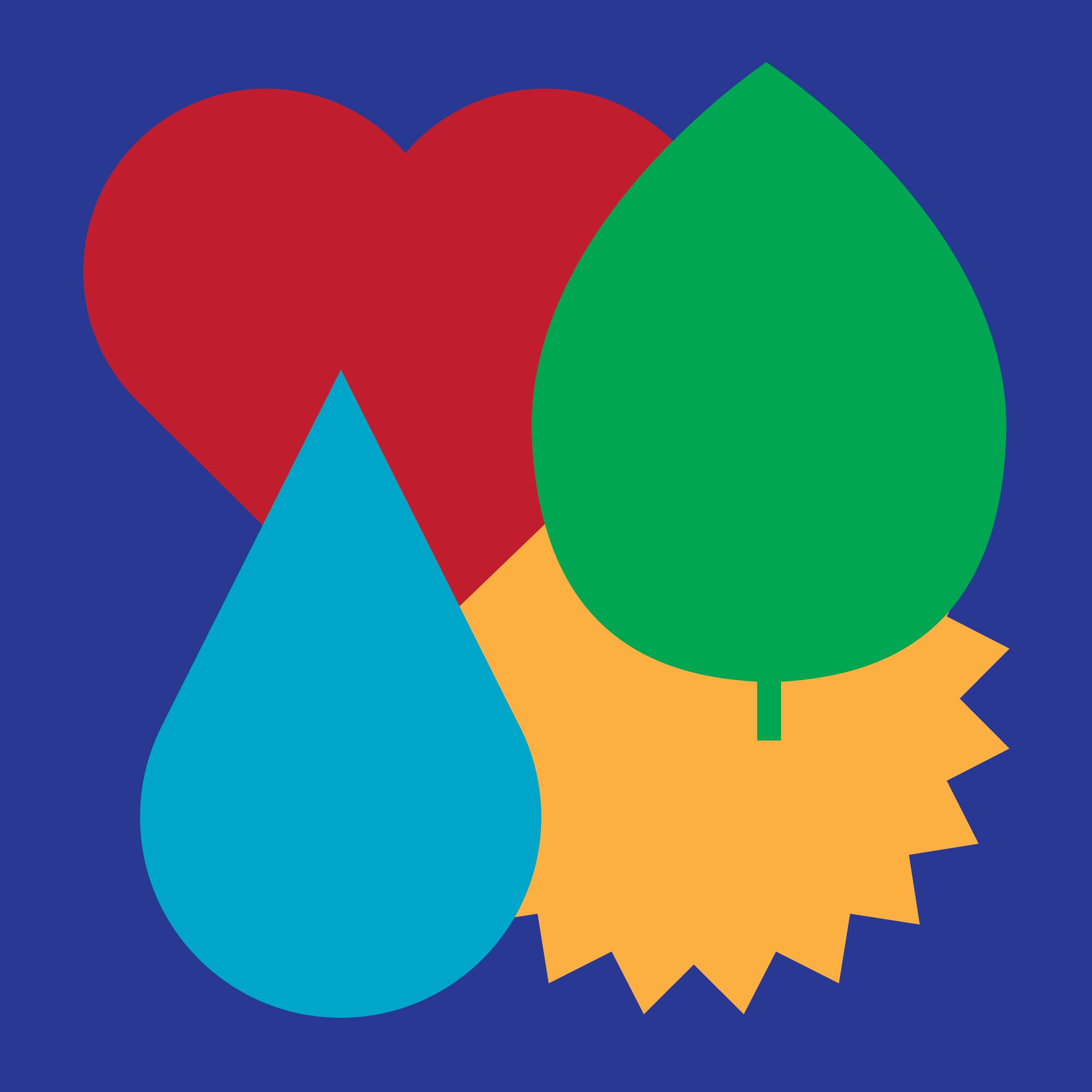
Another common trend of minimal UI designs is the heavy reliance on illustrative elements, such as images, photos, and shapes. It’s common for illustrations to take up the majority of a minimalistic page’s space, serving as design elements themselves without the use of borders, lines, or comparable separator elements.
If images and photos aren’t relevant to the content, a common practice in simplistic design is substituting them with geometric shapes and patterns. By doing so, the page’s composition improves without overwhelming the user’s attention.
Examples of shapes commonly used in minimalistic UI include circles, half-circles, rounded squares, stripes, and triangles. They often employ the same color scheming philosophy as the rest of the website or application.
Fonts and Typography
Although many minimalistic designs favor airy, modern, sans-serif fonts, many types of serif and sans-serif fonts can work in minimal UIs. The primary criteria for developers looking for a suitable minimalist font are legibility and clear lettering.
Legible fonts should follow the same simplistic design philosophy. They typically have clean, simple, and restrained lettering with rounded shapes, airy spacing, no italics, low to medium bolding, and no unnecessary details.
A typical example of ambiguous lettering in fonts is when there is little to no difference between characters that users may confuse for one another. Common examples of easily confused characters include the following:
The numeral one (1), lowercase l, uppercase L, and the pipe symbol: |
The numeral zero (0), lowercase o, and uppercase O
Lowercase a and lowercase o
Lowercase h and lowercase n
Unambiguous lettering in minimalism graphic design prevents these pitfalls and makes such characters easily distinguishable. You can test the legibility of a specific font by checking how it looks with a font-proofing test sentence. If every character in the sentence is distinct and easy to read, it’s probably a good choice for a minimalist UI.
A Minimalistic UI Engages Users
The primary aim of a minimalistic UI is to eliminate clutter, avoid overloading the reader’s focus, and keep them engaged with the content. Simple design elements, readable text, eye-pleasing color scheming, and a content-focused approach also offer developers and users other advantages, including higher performance, shorter loading times, and ease of development and maintenance.
Curious to discover more? Reach out and we’d be happy to share examples of past design work. Get in touch.

