Whistle
Ushering in a new era in pet tech
Whistle is a pet parent’s best friend. The company produces wearable smart devices that track pets’ locations and monitor their health. When it hit the market in 2012, it was the first of its kind. Whistle continued to innovate and improve its technology during the past 10 years, but it also learned how to shift with the times and listen to pet parents’ growing needs.
The Whistle team came to Big Human for a brand refresh — one that accurately illustrated where the company is now and what its customers want.
- Research
- Strategy
- Branding
- UX/UI Design
- Product Design
Research & Strategy
Offering a higher level of data and insights
After more than a decade in the market, Whistle has developed new products and made a pivot toward software-as-a-service with its pet behavioral data. The smart devices are now more of a vehicle, revealing previously unattainable analytics.
For a successful rebrand, we had to lean into science. We discovered this new age of enlightenment was being ushered in by Pet Insights, a research division within Whistle consisting of veterinary doctors, researchers, and scientists. With a team that integrates pet analytics into their work daily, Whistle offers a level of detail its competitors lack — and we knew this would resonate with its target demographic.
Part of the project was marrying ideas from three individual organizations: Big Human, Whistle, and Whistle’s parent company, Kinship. A time capsule of the work-from-home era, virtual workshops established a dynamic working relationship and added a strong level of trust.
Brand Positioning
Reflecting the brand’s evolution
With a rebrand of this size, we had to cover all of our bases, so we started with research of our own: competitive analysis, landscape audit, brand exploration, and client workshops to identify goals and values.
After defining who Whistle was and what its goals were, we established a few audiences and identified its core demographic: millennial pet parents who want to give their furry companions the best. In a few collaborative sessions, Whistle developed a specific promise: Give pets a voice, and provide pet parents with the insights and confidence to make more informed decisions.
As our work continued, it became clear to both the client and to our team that positioning Whistle’s three main devices was incredibly important. It was also apparent that the typical “Problem-Solution” messaging approach wasn’t going to work; the products were too complex. Instead, our team concepted a pet persona-based solution in accordance with the different products offered. Pets have personalities as unique as ours — from the Social Butterfly who says hello to everyone he meets to the Homebody who may not get as much sun as she should. In total, we mapped out 10 distinct pet personas and then identified which of Whistle’s product offerings matched their needs, making it easier for consumers to find the best fit for their pets.
Brand Design
Maintaining familiarity in a new design
Whistle’s personality is authoritative but also friendly and innovative. Its heavy emphasis on science brought on a new maturity, and brand guidelines and visuals had to reflect that evolution.
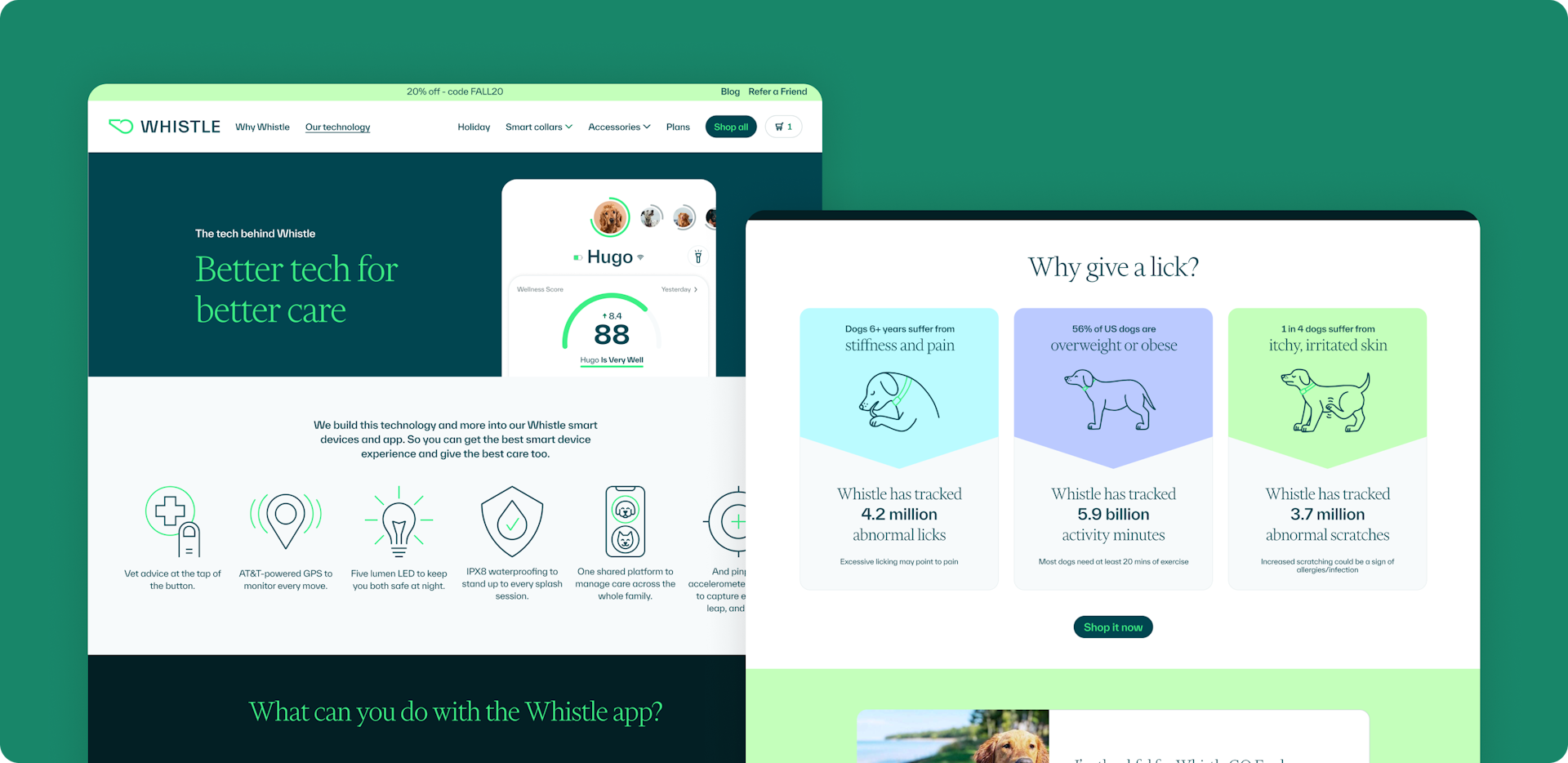
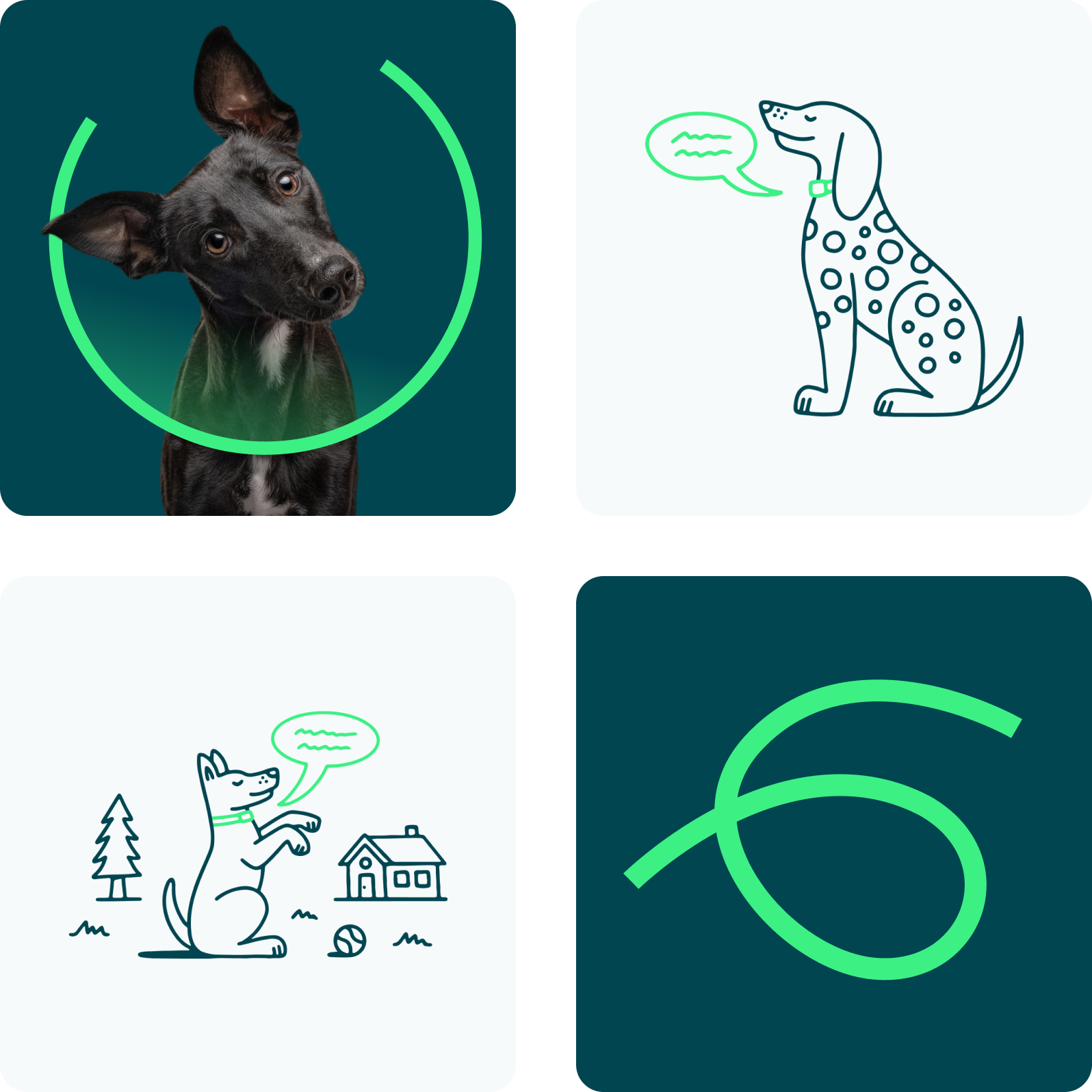
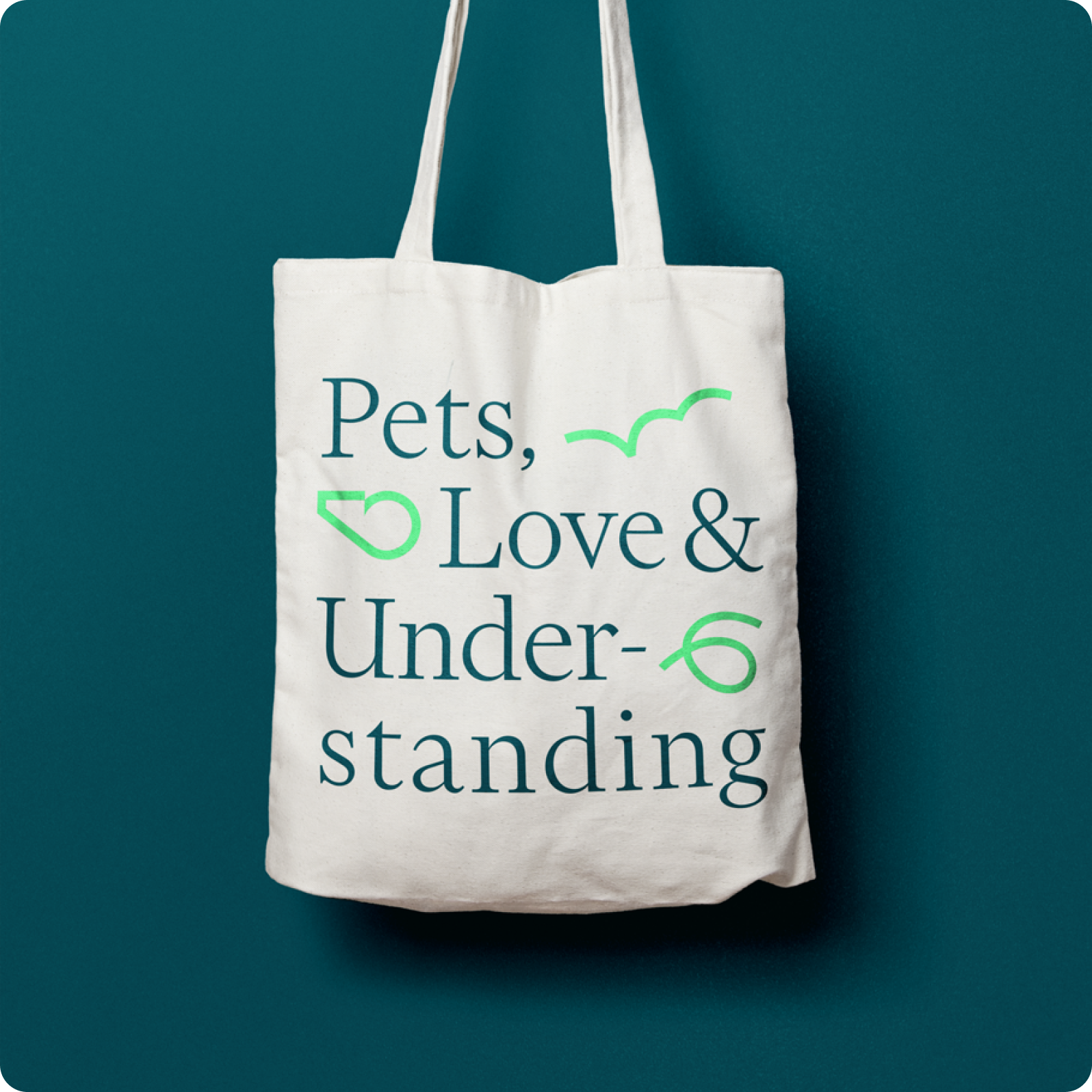
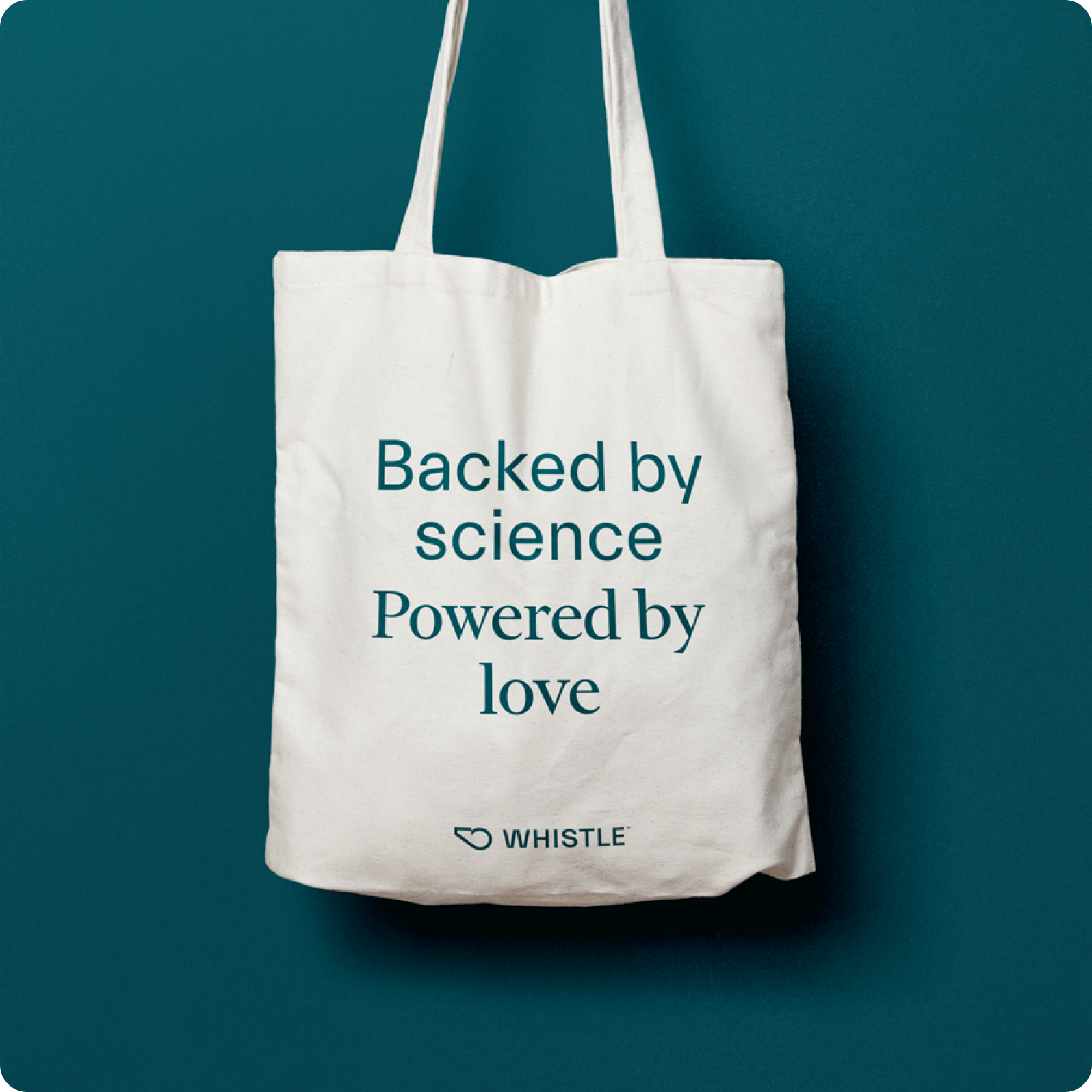
Whistle is a trusted brand, and we wanted to keep that visual familiarity and credibility. We changed its signature green to a hue that felt more mature, accented by a darker background. We then redid the Whistle logo in a way that highlighted precision, with the single line drawing representing two data points meeting. This spoke to Whistle helping pet parents connect the dots between what their pets do and what they need.
The line, which also insinuates action, soon became a dominant figure throughout the rebrand. We played with different marks and expanded the line into a full pack, creating visual storytelling devices that brought several pieces together.
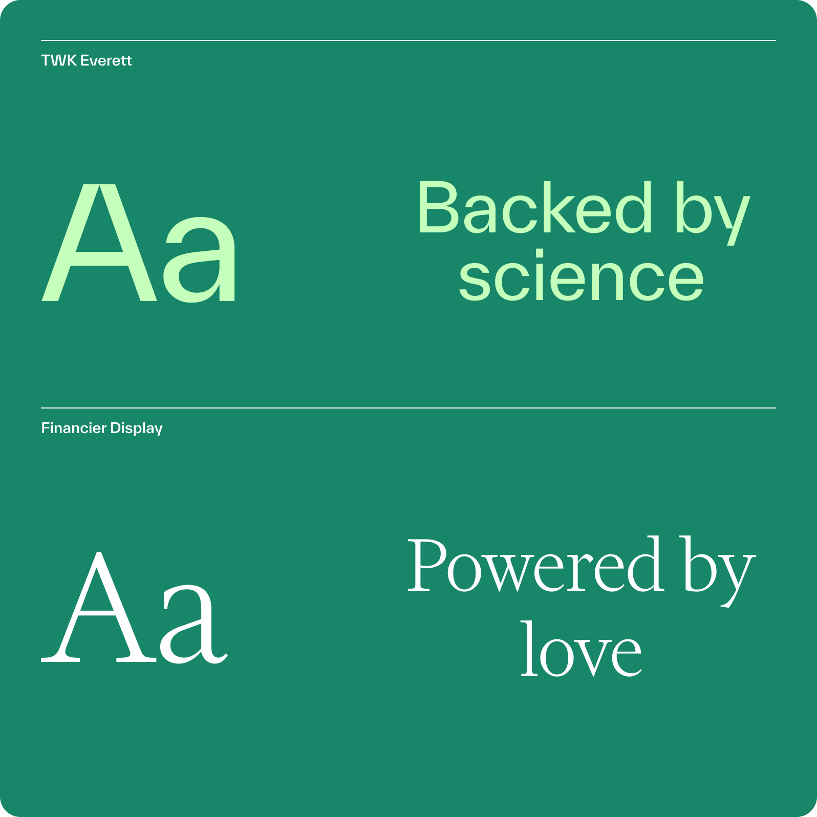
Whistle’s typography also received a new treatment with three fresh, deliberately selected fonts. The two Sans Serif fonts communicate informational data while the Serif font conveys storytelling elements. The final brand guideline deliverables also included illustrations, iconography, and photography suggestions.
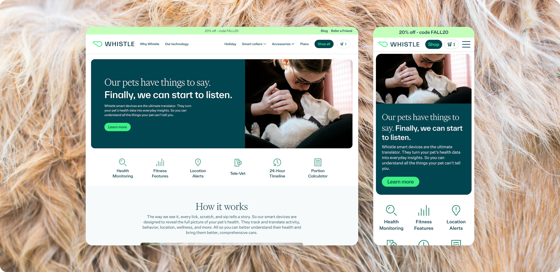
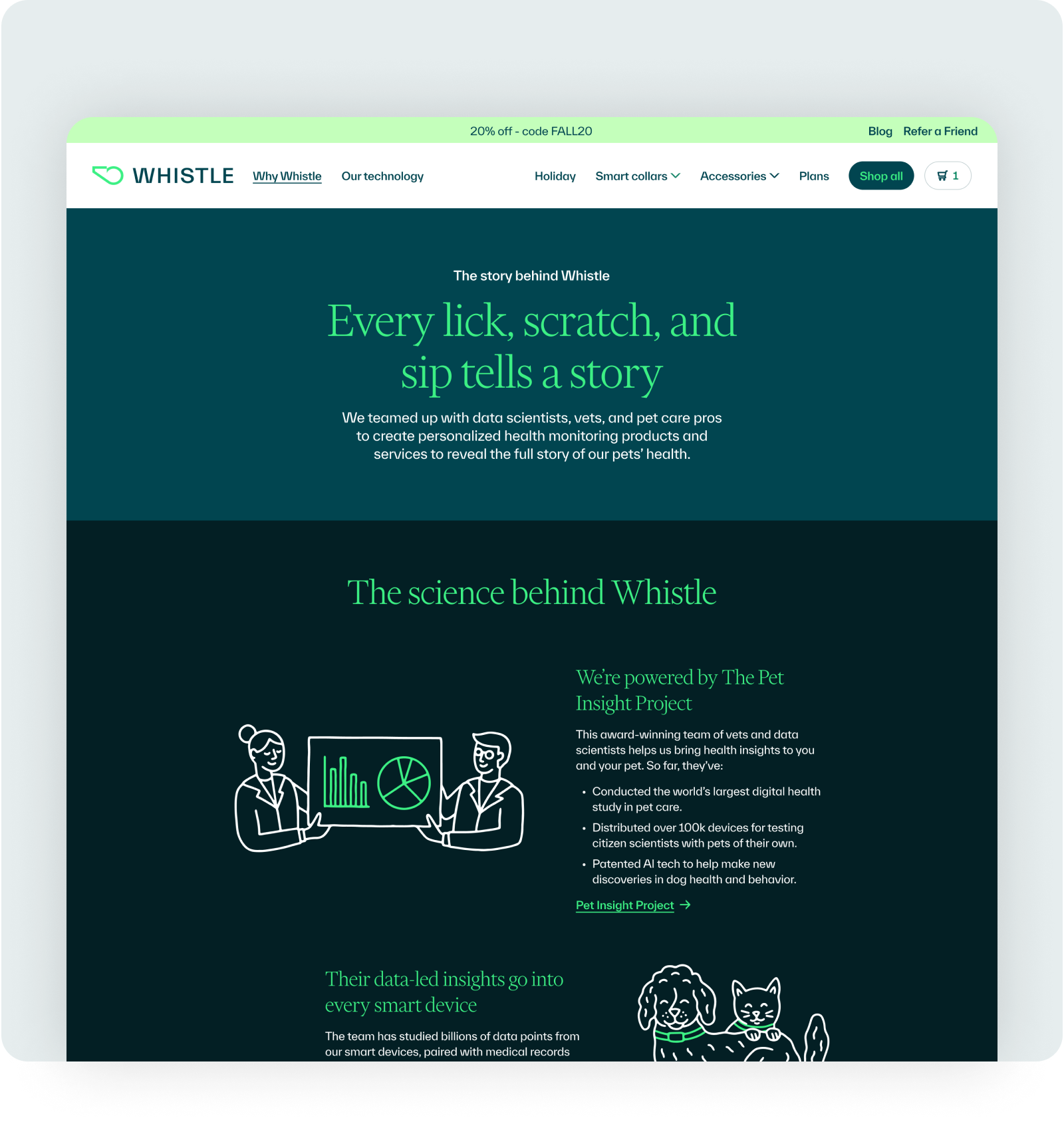
Website Design
Updating the digital identity of the website
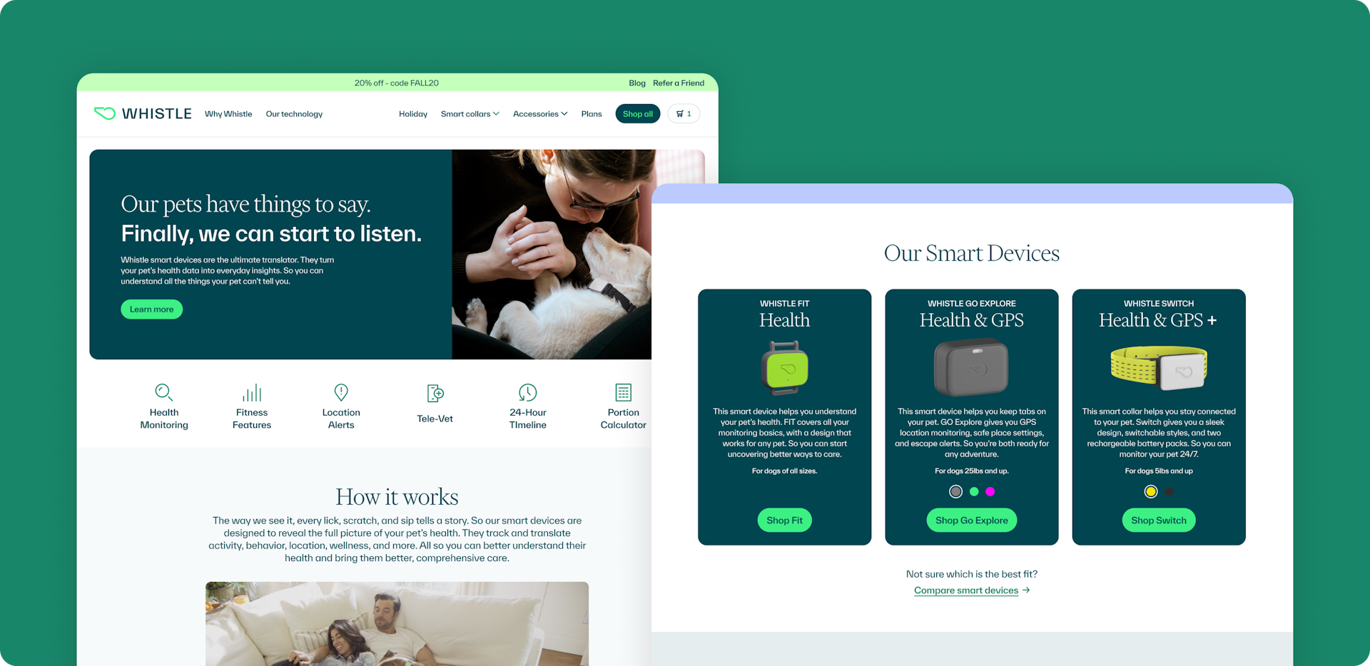
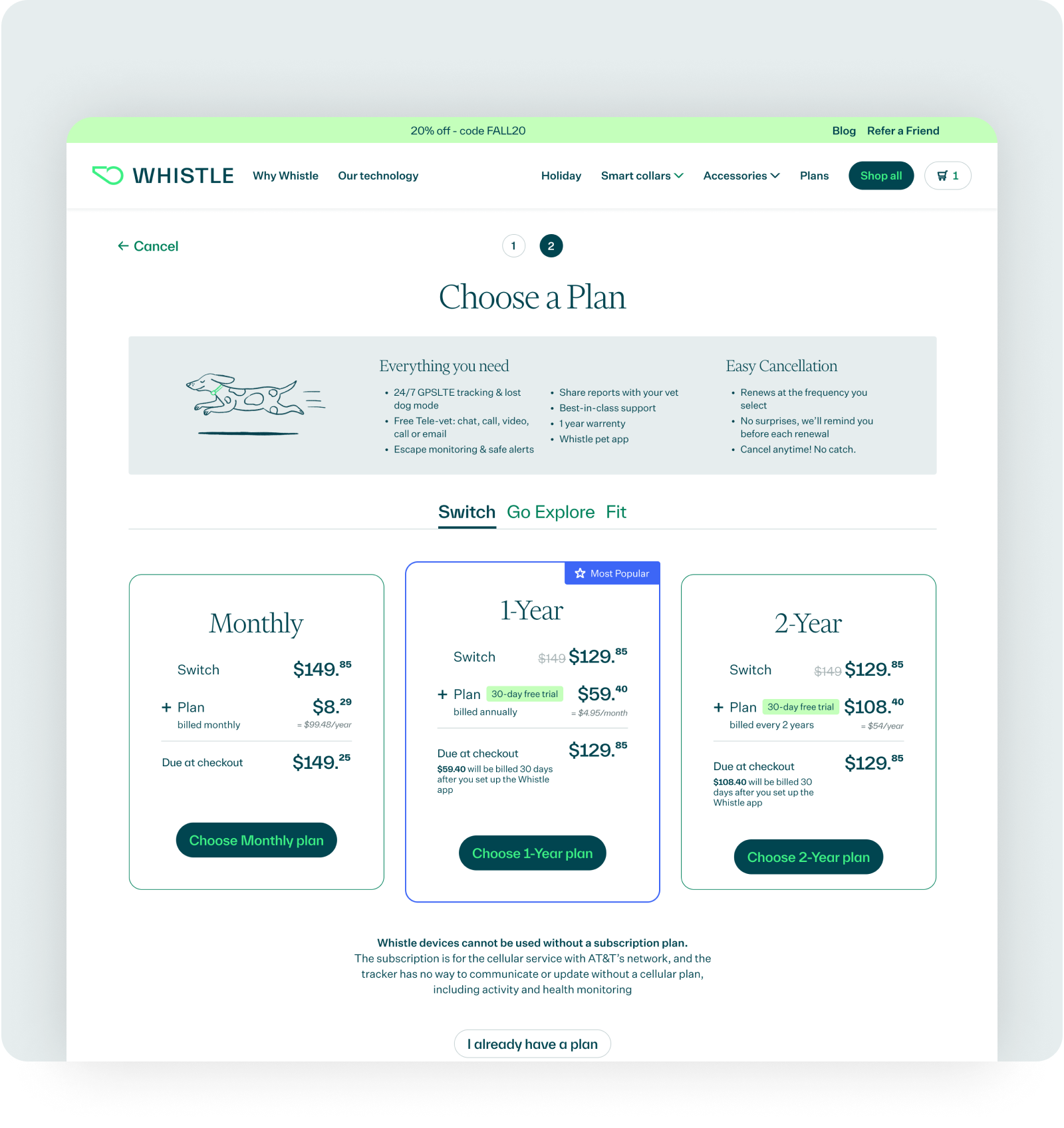
After establishing Whistle’s new design system, the next step was incorporating it into the website. The update started with reskinning its original content with the new brand elements.
To start the redesign, we streamlined the flow of the site with a new sitemap and wireframes and reorganized the navigation for efficiency. The website was an opportunity to communicate and connect the brand with its users, so we added pages that spoke more specifically to Whistle’s app, tech, and company as a whole. The strategy was to create an effective user journey by allowing the branding to tell the story.
While they’re separate products, the smart devices and mobile app are part of the same core offering and work in tandem with each other, so we made it a point to highlight them all on the website. We also made sure to incorporate feedback from user testing, specifically when it came to product offerings and checkout. The shop experience now has updated filtering capabilities and includes a comparison table for each of Whistle’s products and plans. The “Add to Cart” flow is also more intuitive and focused, allowing users to go step-by-step instead of presenting the devices and plans all on one screen.
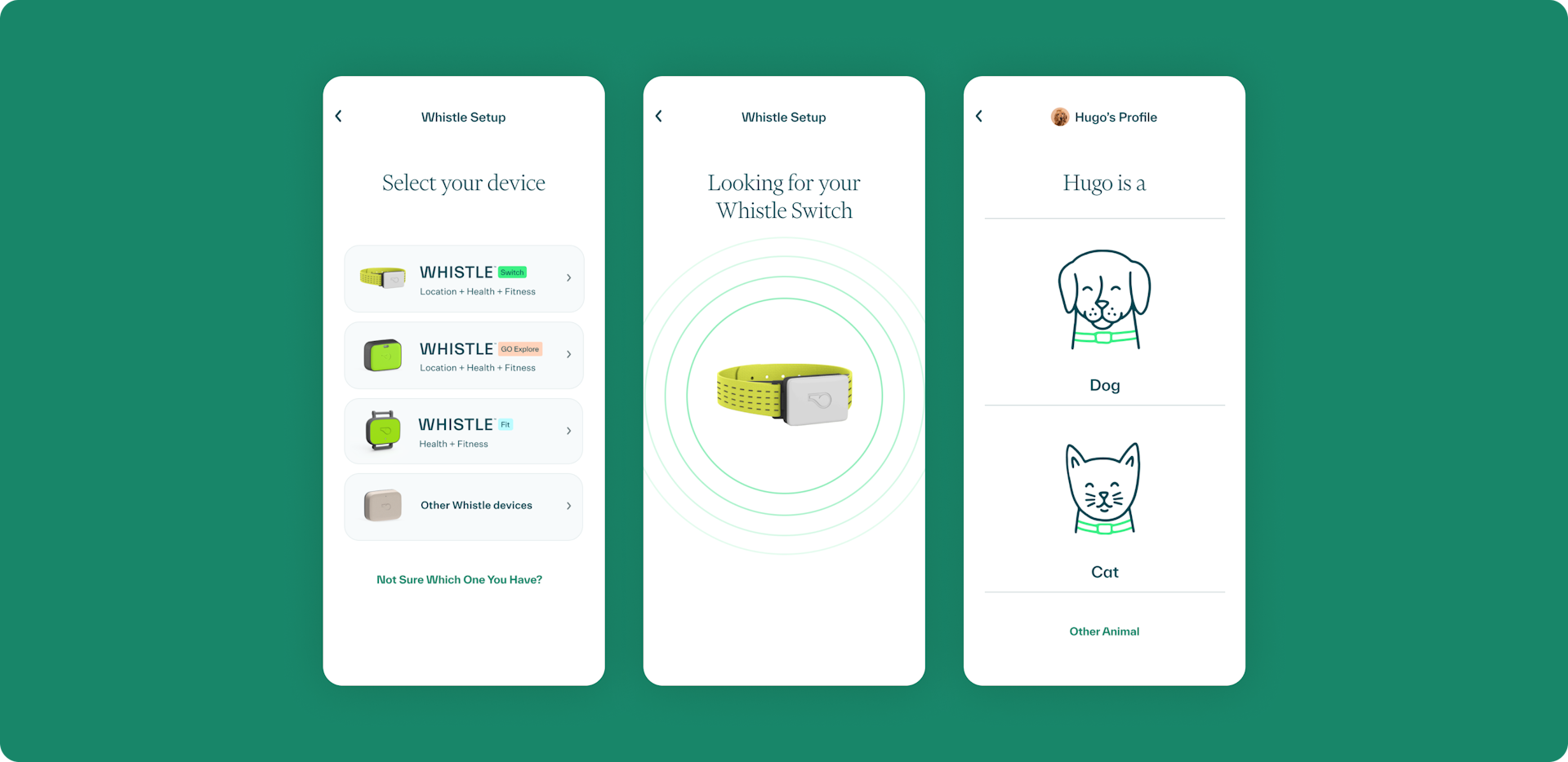
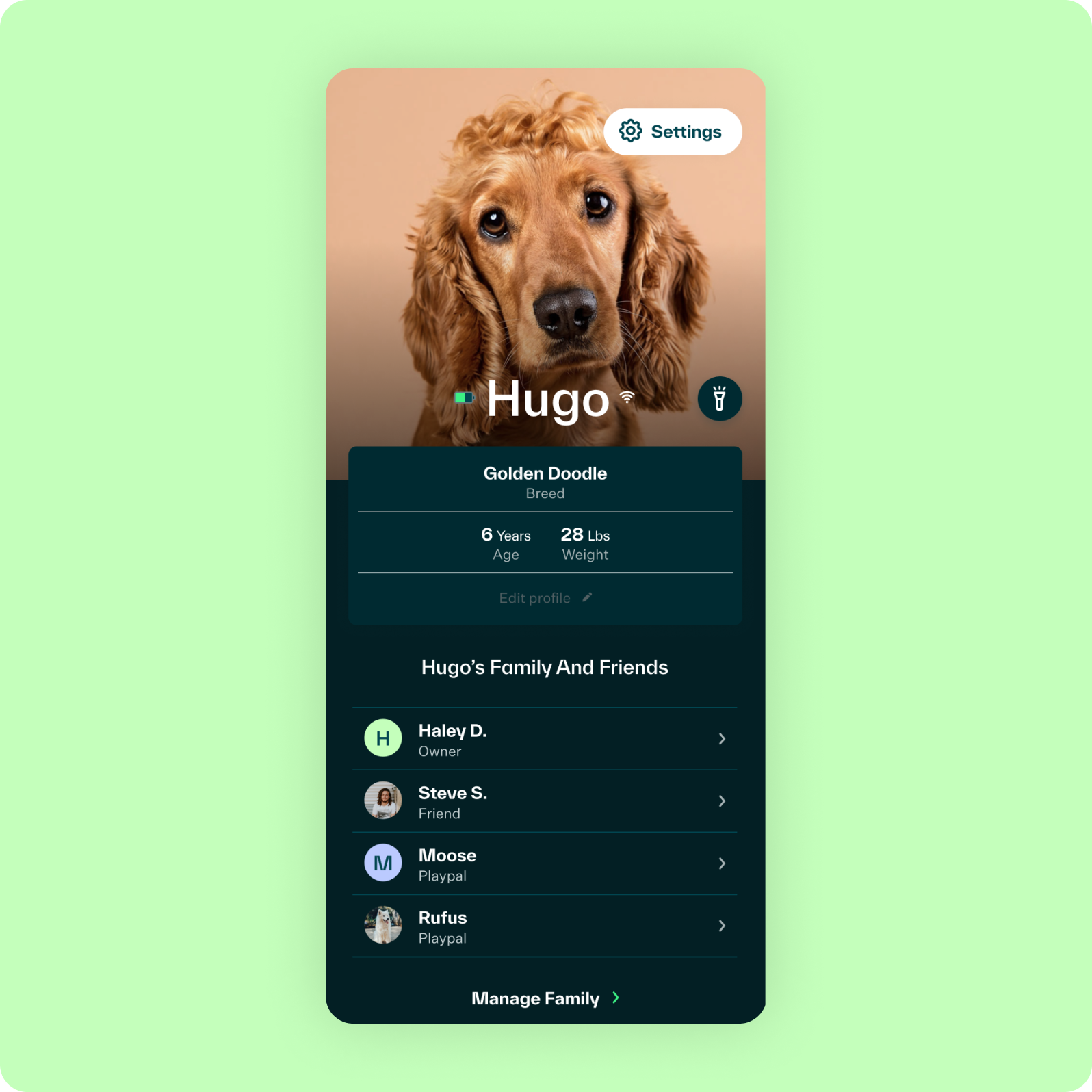
App Design
Updating the digital identity of the mobile app
Whistle wanted to roll out the refreshed branding as quickly as possible, so we applied it to the existing app ahead of the full redesign. From there, we looked at each mobile screen and went into more detailed changes. We moved elements, created new pages, and revamped other already-established components.
The app is more data-centered, so it had to be friendly enough to browse but robust enough to dig deeper into. Since we were building a new interface on top of Whistle’s existing app, the Big Human team had to make sure our proposed designs worked with the company’s tech and data. We collaborated closely with Whistle’s developers, data scientists, and product and design teams to confirm the information we presented was accurate and appropriate for the context and needs of the user.
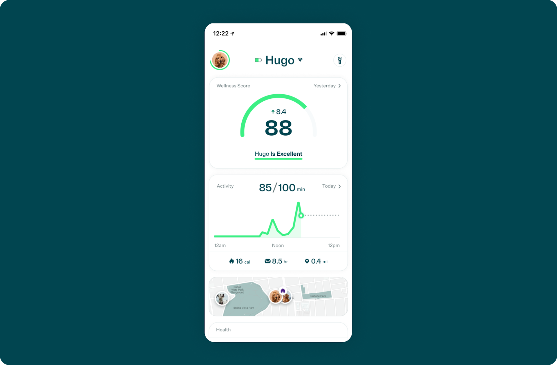
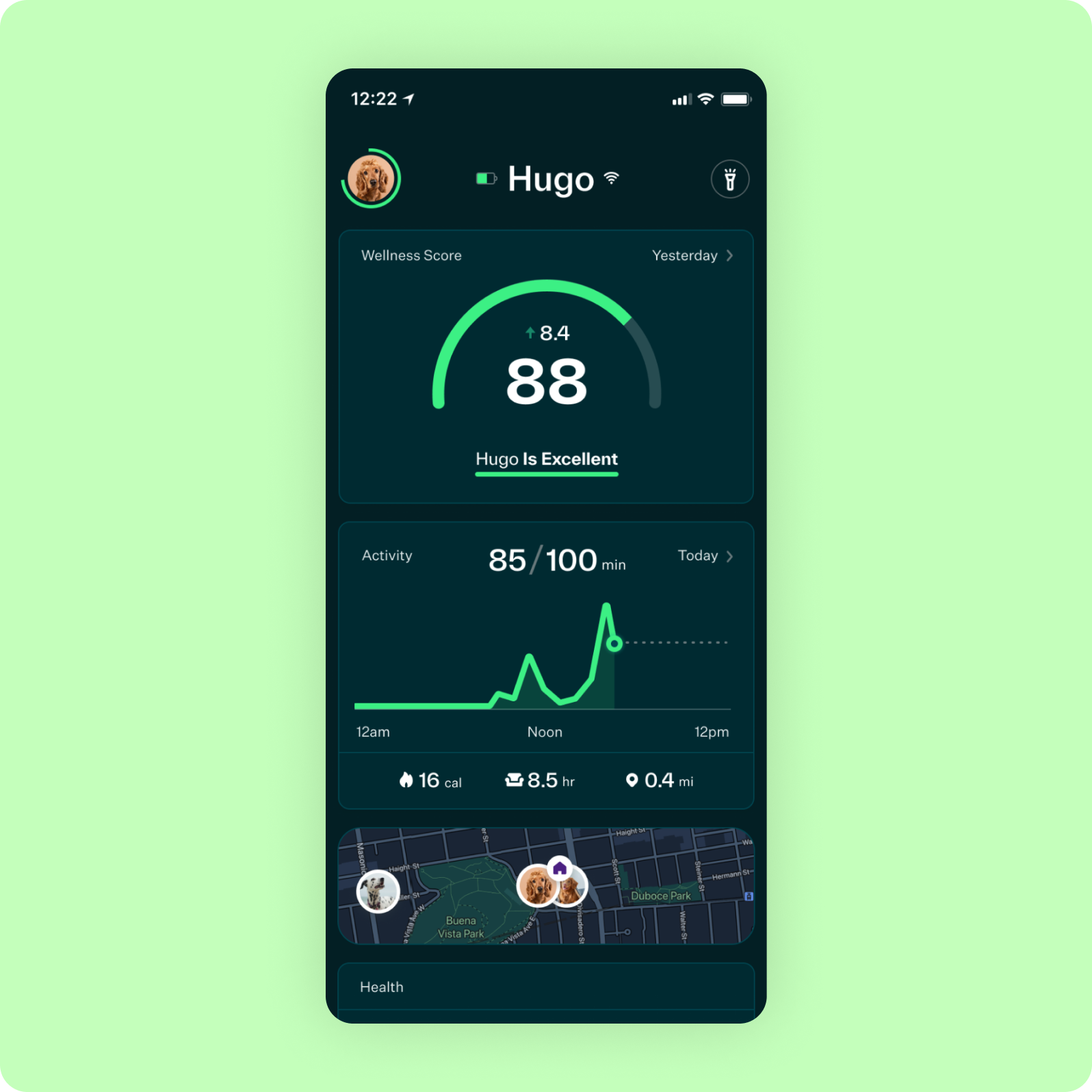
While the “Find My Pet” feature, which shows a pet’s location, remains the most popular reason to buy the smart pet device, one of the biggest priorities for Whistle was to help pet parents better understand their pets’ health and well-being. The focus shifted toward a wellness index, a new feature currently in beta testing that presents a pet’s accumulative health metric. We needed to give users a high-level overview of their pet’s health data without making them feel overwhelmed and an opportunity to learn more if they wanted to. Whistle helped us figure out what information was easily digestible enough for a summary view and what information needed a more detailed explanation. Both were validated through user testing.
To onboard users in a way that was inviting and self-explanatory, we included friendly illustrations to add context and established a new visual style for the onboarding flow. The app was designed in both light and dark mode and, as with all of our projects, we made sure the website and mobile app met accessibility requirements.
Package Design
Translating digital branding to packaging
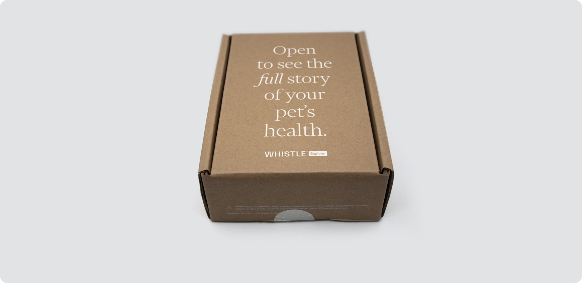
Since gaining insights into pet behavior starts with purchasing a smart pet device, the Big Human design team also had to translate the digital branding to Whistle’s print packaging. We were given two guidelines: Ensure the packaging would still meet requirements to be recyclable, and keep production costs the same.
With that in mind, we used a single color on the cardboard packaging, applied the bolder brand colors on the product guidebooks, and updated the packaging production files for all of the devices. For the boxes, we took a minimalist approach and put emphasis on the messaging, letting white typography and Whistle’s wordmark carry the design.
Results
Continuing to build out the brand
The Whistle team continues to incorporate our strategy and designs into their website and mobile app. Our collaboration also included a rollout plan for new features, which users can expect in the coming year.